 Stampede Design
Your product category page is similar to a storefront in a shopping mall. Sometimes you are drawn to a minimal but creatively displayed storefront that puts their product in the best light by removing clutter.
In an e-commerce store, at times the design gets in the way of the product. It overwhelms user. A good design blends in the background, almost unnoticeable even. The question is, how do we keep a product display page clean and minimal with so many things vying for user’s attention?
Here are 8 excellent examples of how you could do it.
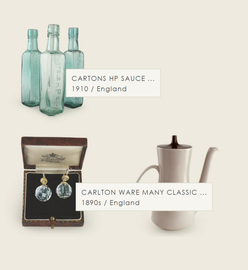
More Rare
More Rare is an online store operated by graphic designer Rieko Vining selling rare and antique vintage products from Japan. Rieko created a crispy clean site with tan-coloured background, a theme synonymous with antiquity, that displays products in a beautiful grid.
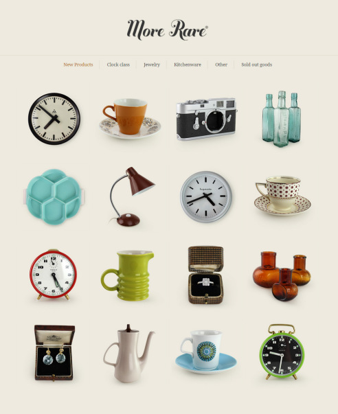
It is so minimal that you won’t see any any description until you mouse-over an item. It captures a visit to a small vintage shop, where you let the charm of a product pulls you in before learning more about their story.
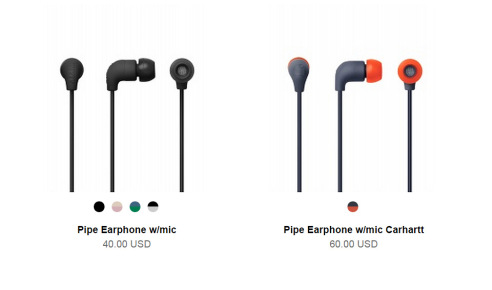
AIAIAI
Headquartered in Copenhagen, AIAIAI is an audio design company producing modern, minimalist headphones and earphones deliver clear, amplified sound. True to being Denmark’s leader in acoustic design and engineering. their online store retains the neat, grid-based layout, relying only on whitespace to distinguish one product cell from another.
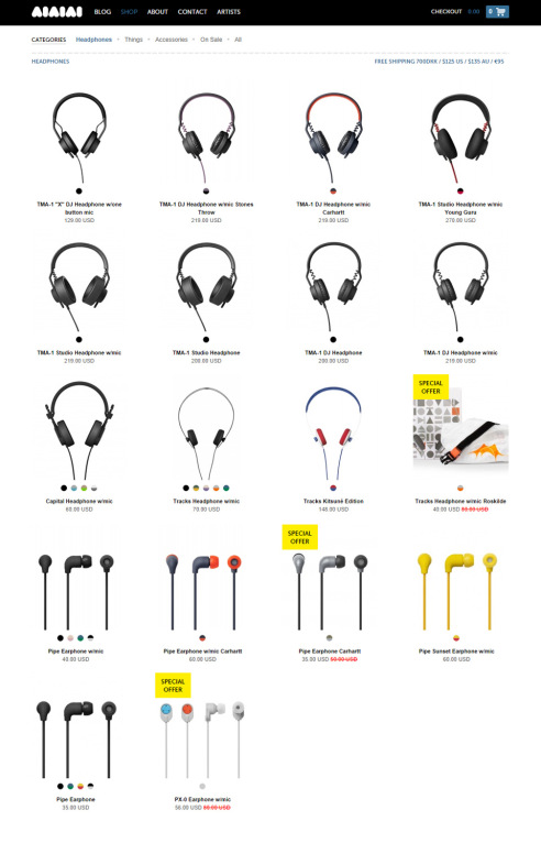
Much of the space is taken by product shots compared to the minimal footprints of product name and price. User can immediately switch between available colours simply by hovering their mouse too. This is a great option considering that most e-commerce only serves this interaction at the product card level.
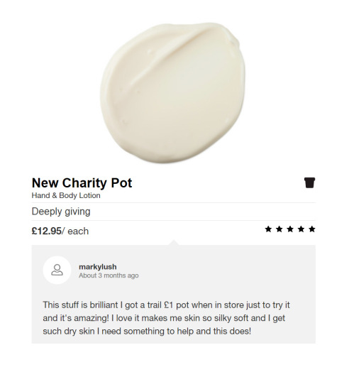
Lush
Lush is a company making fresh handmade cosmetics, headquartered in the United Kingdom. The brand uses wholely natural ingredients in their products and is an active advocate against animal testing. Lush’s products have an exclusive feel to them, almost as if every product is prepared delicately to order and sent directly to your bathroom from Lush’s famed Kitchen.
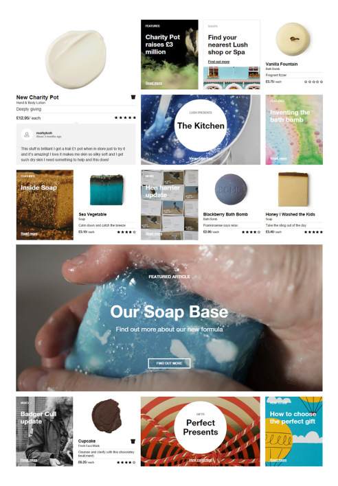
The category display is immersive. Product placements follow a form of masonry grid — named after mason fitting stones in a wall — and are scattered among different themes like News and Features. The result is not severely minimal but still maintains a clean yet whimsically cluttered look. The contrast between the busy theme and sparse product details works too. Users can easily differentiate the two and by being quieter than the busy theme, a product actually shines better.
Artiitii
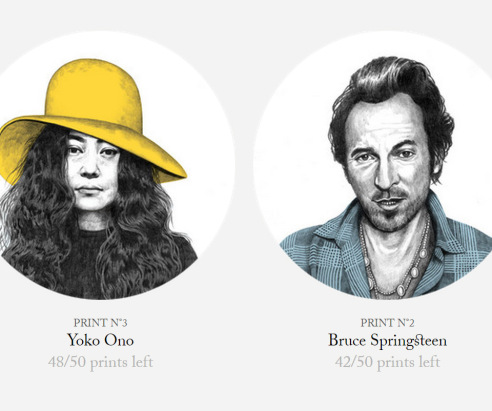
Artiitii is an online store selling unique limited edition prints dedicated to the greatest artists in the world. Run by two childhood friends passionate about the beauty of combining music, art and design, Artiitii wants to bring something unique into a world of mass production. Each of Artiitii’s product is limited to 50 prints each, all carefully hand drawn.
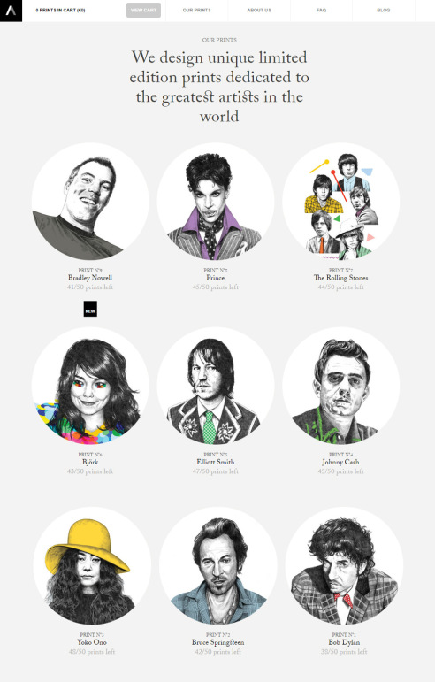
The prints are all in rectangular shape for easy framing but displayed in rounded avatar style — a very effective style useful to humanizing Internet content. Because each print is a labour of love and limited to 50, Artiitii includes the number of prints sold under every product. It gives a sense of urgency to fans and provides a motivation strong enough to complete the purchase before it goes out of print.
Anyi Lu
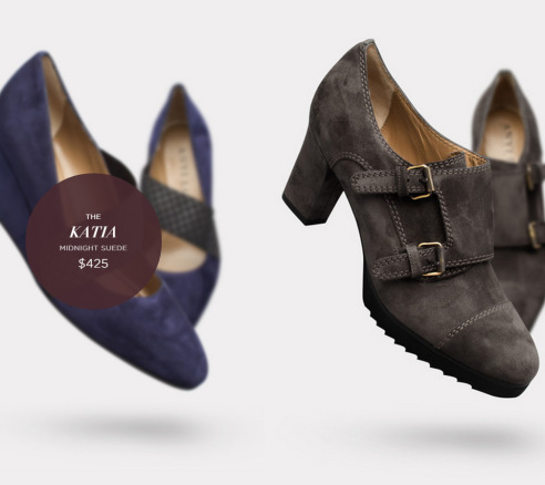
Anyi Lu is another website that relies heavily on good product photography to hint users that more information is available by interacting with each product. They do take it up a notch through depth perception in every product shot. The grid is varied between 3 and 2 columns, with generous room to breathe, reminding us of those luxuriously sparse shelf space in high-end stores.
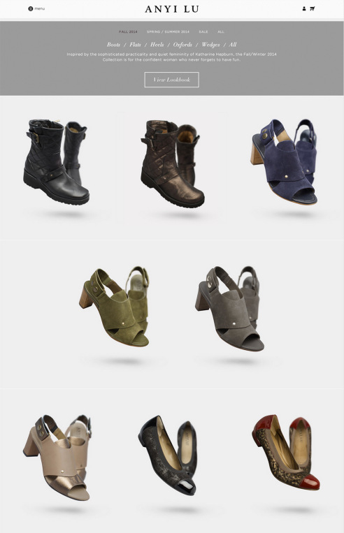
As user hovers their mouse on a shoe, something interesting happens. The product will blur and recedes to the background a little to bring forth its name and price. It’s all done very stylishly though the effect is somewhat laggy for the first few tries.
HeyShop
An online store from Barcelona, HeyShop is the storefront forHey Studio, where they display and sell personal projects like posters and books. Hey is a small studio so the posters will be made on demand using digital printing and high quality paper. Similar to Artiitii, this print-on-demand service differentiates their products from other mass-produced items.
Products are displayed with minimal description but in different format, based on types. Books are placed in shelves, bags hanged and prints framed on the wall. Despite the different display modes, they all in the end feel like a unified gallery and it serves the Hey brand beautifully.
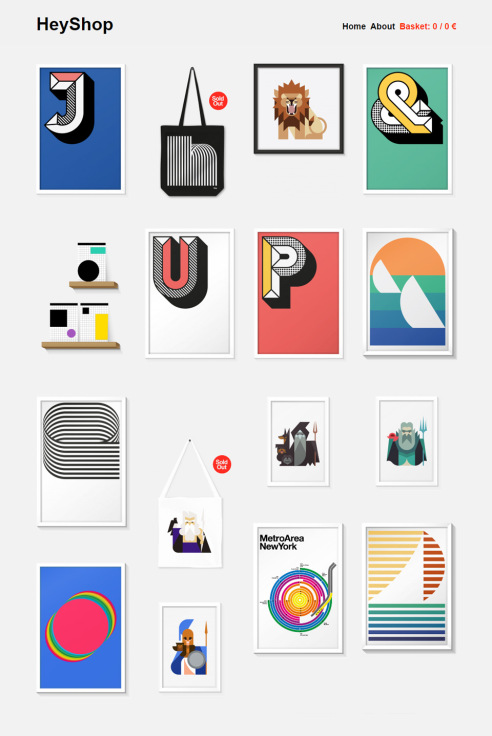
Interacting with specific product will bring about a simple black panel, completely obscuring the image with product name, dimension (for prints), price as well as a link to view more info. What could be more amazing is if these items could do a little flip and show all information at the back of their frame, wall or book cover. It’s definitely a not a major feat with CSS3 nowadays.
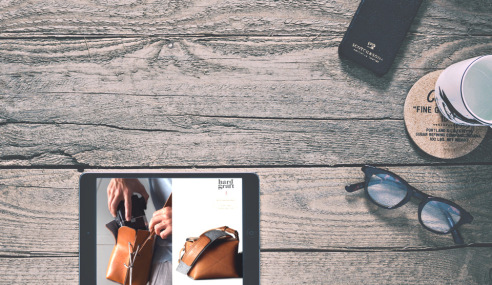
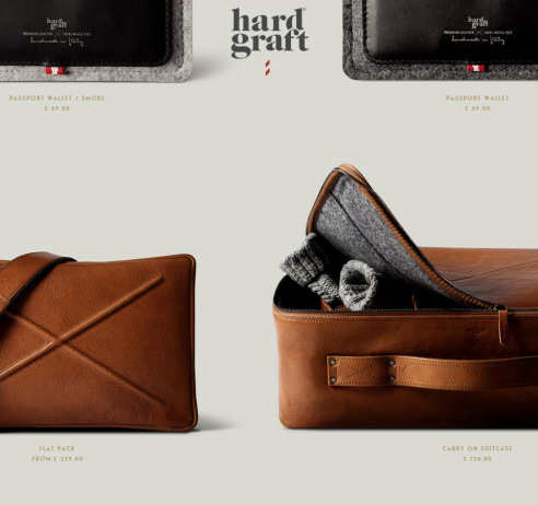
Hard Graft
Founded in 2007 by designers monie.ka and James Teal, Hard Graft produces upscale lifestyle accessories using premium leather and good old-fashioned workmanship. The brand carries beautifully crafted leather bags, iPhone/iPad cases and many more, using rich, premium and highly resourceful materials. Product shots absolutely takes center stage here, with oversized images showing the tiniest leather detailings. In deliberate contrast, product name and price are shown in tiny font sizes with the occasional sticker-style label informing user that an item is specific to a certain smartphone model.
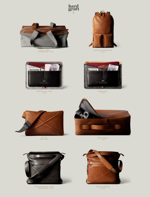
What’s interesting is how photography of the products at times breaks the grid by showing two products hanging from a horizontal bar spanning the entire page, effectively disrupting the dual-column scrolling. The result? The break serves as a resting point for your eyes and you tend to linger more to appreciate the exquisite craftmanship. Nicely done.
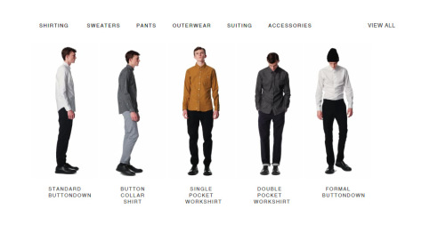
Patrik Ervell
The last in our list is quite a unique website. Patrik Ervell is an American-born menswear designer based in New York City. His designs are characterized as utilitarian, minimal and elegant and it translates beautifully into his online shopping experience. The category page is minimally done with hardly any stray elements present. No other information is provided besides product name so user will need to click to view full details on the product page.
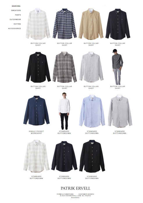
When you first land on the website, the models will start moving in several directions to show users see how each outfit looks like from front and side. It’s almost like a watching a runway show and far more convincing than a 360-degree static product display. Being able to see real-life fitting of garments is something online customers will truly appreciate.
Conclusion
As shown in the examples above, e-commerce product display can take many forms. Some industries like the vitamins & supplement rarely ventures outside their utilitarian design as it serves their purpose to provide as much information as possible for consumer comparison.
In others like fashion and lifestyle industry, you will notice more variations in getting the message across. Attractive product placements and beautiful photography truly are deciding factors whether your casual visitor will remain as one or becomes an active follower of your brand.
