 Stampede Design
There is no denying that the checkout step is the most important step in the online buying process. This is the part in the process where the user’s interest is converted into a sale, thus making it an actual purchase.
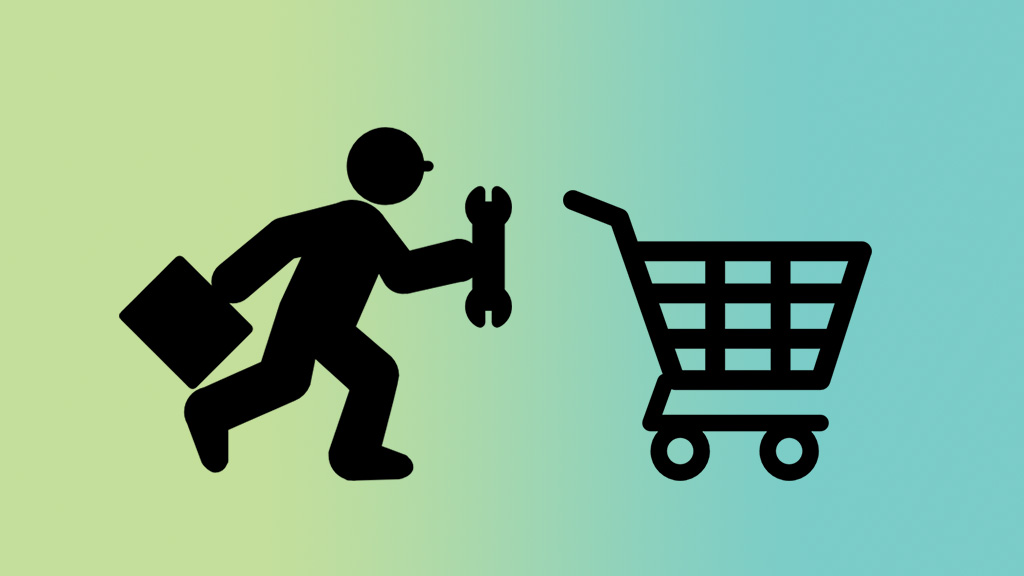
Even if the user has enjoyed the online store experience by browsing around and adding items to their cart, a faulty checkout process can abruptly cause a drop off from that point. While there are multiple reasons as to why users drop off during the checkout step, it boils down to this; the user was likely annoyed at something.
In this post, we’ll be delving into two areas; how to identify issues with the checkout process and fix it, and some recommendations & best practices that can further improve your online store’s checkout process.
What are the issues?

Because every online store’s checkout process is different, we’ll be following a common example seen below. From there on, we’ll be identifying issues that appear generically at certain points.
The sign up requirement

Your user has been browsing your website, seen a few interesting products and has clicked ‘add to cart’ a number of times. It is now time to checkout, and the screen of judgement now appears before the user. The only options are, to create a new account to proceed and login if you are a returning customer, that’s it. This is your first pain point on your checkout process. Some users may not feel like going through the sign up process because they might perceive it as lengthy or feel overwhelmed with the amount of fields to fill up.
The Fix? Offer a manual form. When I say manual I’m not saying a print form but rather a digital form that the user can fill up with delivery details etc. You’re probably thinking, what’s the point of doing that if it’s almost the exact same process as signing up? The fact of the matter is that some people just don’t like creating accounts on websites, and these people are also potential customers. Give users an additional option to continue without signing up using a bare bones form. This form should only contain details such as the recipient’s name and delivery address, enough for your business to send the package to the customer.
Costs that were not upfront earlier

Understand that your users are shopping online also to get better prices than a brick-and-mortar establishment. So when they are suddenly presented with an additional cost at the end such as ‘service fees’ or unmentioned shipping costs, they will likely drop off. While the majority of online shoppers are very aware of shipping costs, the fact that it wasn’t shown from the beginning leaves the potential buyer with feelings of being cheated.
The Fix? Make sure the information is upfront. If your business charges for shipping costs, let the user know right away at the product page itself. The best placement for this is before they click the ‘add to cart’ button. Link the user to a page showing estimated shipping costs so that they can evaluate whether it is worth spending time at your online store. Even if they do leave because of the costs, at least they left at their own choice and well-informed.
Confusing process and user interface

Unlike a brick and mortar establishment that requires visitors to physically travel there, online stores can be easily accessed and exited with just a mouse click or a tap. That being said, you want your user to have an easy time going about your website and this of course includes your checkout process. Having too many steps, badly placed buttons, and broken links are some of the many things that can go wrong with the checkout process. If this is the main issue causing your users to drop off, then your website has a very big problem.
The Fix? Keep things simple, and design a user friendly interface. Sometimes it could be the e-commerce platform that you are using that adds too many additional steps in the checkout process. Consider modifying the flow to cut down on unnecessary steps and page loads. Also, consider applying the ‘three-click-rule‘ to your process. A good checkout process has a single page for customers to check their orders and enter their billing and shipping info, and a confirmation page before they submit their order.
Unsatisfactory payment options
Each of your customers have a preferred paying method. While the majority of online shoppers would be fine paying directly using a credit card, there are also those who prefer going through secured payment gateways such as PayPal. Just before the payment step in the checkout process, if the user does not see the preferred option, that user will likely drop off.
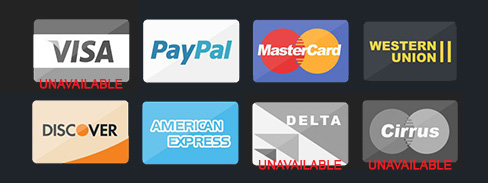
The Fix? Have multiple payment options. While payment via credit cards are a must, consider signing your business up with payment gateways. If your customers are mainly local, getting in contact with the local banks to enable direct bank in as a payment option would be beneficial. This allows users without credit cards to become potential customers to your business.
Desktop vs mobile interfaces

With so many users owning multiple mobile devices like smartphones and tablets, surfing on the go has become a norm in modern society. If your online store has been built for responsive, don’t be surprised that your visitors are making actual purchases using their devices. It’s convenient and doesn’t require the user to be in front of a computer to do so.
Now the issue lies with how your checkout system is designed on both views (desktop vs mobile). If the desktop interface was designed first and adapted to the mobile, there might be a problem with how it is being shown on the user’s mobile device. One common action, is that users need to scroll down to see more content, and this also affects your checkout interface. Know that having the user scroll down too much during the checkout phase can affect them negatively. It becomes difficult for the customer to see the overview of items in the cart.
The Fix? Design mobile first, then expand to desktop. If you have an existing online store, then this method might be difficult for you to apply on the website. What can still be done however is to design a new mobile interface first and adapt it to a desktop view. After that, the changes can be applied to the existing website. Smashing Magazine has a fantastic article on how you can design the checkout process for mobile.
Non-secured transaction
Hackers these days are known for stealing credit card information and identity theft, and online users are very aware of these cases. Website security is no longer a feature for your customers but rather a necessity for the industry. Many registered online retail businesses are imposed by their respective governments to implement basic encryption on how their website handles sensitive information. On your browser web address bar, you may have noticed a green padlock on some websites that you have visited, and it is commonly seen on bank websites. This flags the website as SSL compliant, and that the information you share on the website is secured with proper encryption. Websites that are SSL compliant also have HTTPS in it’s web address. To learn more about HTTPS, check out this post on Wired.
The Fix? Get an SSL certificate. There are many vendors on the Internet that you can order an SSL certificate from. There are both free and paid options, but for reliability and respect for your customers, we highly advise you to get a paid SSL certificate. Once obtained, implement it on your online store and you’ll start to see a green padlock on the web address bar that proves it has been installed. We won’t go into the detailed aspect of how this is done, a simple Google search can reveal multiple ways and guides to secure an SSL certificate.
How to further improve the checkout process?

Now that the issues and fixes have been identified, we’ll move on to some suggestions and best practices to further improve your online store’s checkout process. Here are some general tips on creating a good checkout process.
- Consider placing the ‘next’ button in the same location on every page load.
- Have a progress indicator to show the user how many steps are left in the process.
- Make sure your call-to-action (CTA) buttons that progress the flow can be seen clearly.
- Show all costs up front, this also includes shipping costs. Tally the total cost that the user needs to pay at the end.
- Do not promote or cross-sell during the checkout process. This will only cause the user to be more frustrated and have second thoughts. Feel free to promote after they have paid.
- Learn from examples. Websites like Apple, BeautyPro and Crate and Barrel are just but some great examples to name a few.
Conclusion
The checkout process is but one of many steps in your users’ journey. While it is very important, other aspects of your online store can make or break its success as well, so do not neglect those.
We hope that you have learnt something from this post, and if you have any comments or just want to say ‘hi’, drop us a reply in the comments. If you liked this article, do check out some of our other e-commerce related articles which may be of interest to you.
