Transforming patient experiences through digital innovation
HMI Group knew that in Southeast Asia’s competitive healthcare market, simply digitising services wasn’t enough. They needed to reimagine the entire patient journey—from first search to ongoing care—in a way that would forge genuine human connections in an increasingly digital world.
Client
HMI Group of Hospitals
Sector
Healthcare
Duration
6 months
What we did
- User research
- Usability testing
- Prototyping
- User experience design
- Interface design
- Design library
The landscape of healthcare, forever changed
Consider a patient searching for medical information online. They’re not just seeking data—they’re seeking reassurance during a moment of vulnerability. Yet most healthcare websites are designed around hospital structures rather than human needs.
The pandemic fundamentally shifted patient expectations. What was once considered innovative—online appointment booking or digital records—has quickly become the baseline. Meanwhile, Southeast Asia’s healthcare market grows increasingly competitive, with patients making decisions based not just on clinical excellence, but on the entirety of their experience.
HMI, with hospitals across Singapore and Malaysia, recognised this pivotal moment. They approached us not simply for a website redesign or patient app, but with a more profound question: How could digital transformation help them forge deeper connections with patients throughout their healthcare journey?
Outcomes
Transforming patient experience with real insights
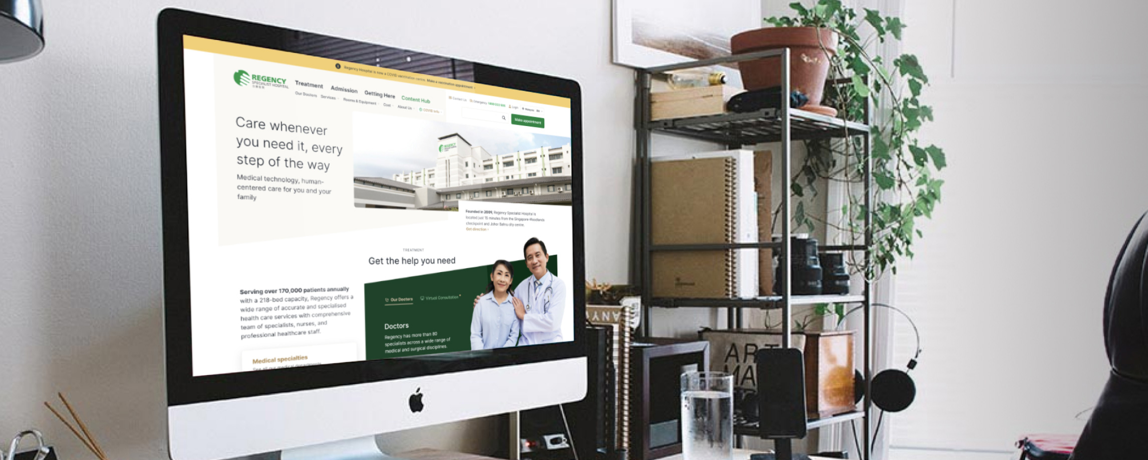
Our user research revealed a crucial insight: patients weren’t struggling with technology—they were struggling with feeling understood. By focusing on this human need, we delivered a fresh website and companion app that patients describe as “finally getting what I’m looking for” during moments of vulnerability.
No guesswork—just solid, evidence-based design
We’re not in the business of winging it. While conventional healthcare sites showcase credentials and equipment, our data showed patients needed clarity and confidence. The result is a website that’s not just visually refreshed but functions as an extension of care—guiding patients with certainty through uncertain healthcare moments.
A cohesive design system that’s ready to power future growth
We didn’t take a UI kit and slap on a new coat of paint—we built a robust, scalable design system that begins with HMI’s brand identity and extends to a consistent design language across their entire hospital group. As HMI acquires new hospitals, this system ensures every digital touchpoint immediately speaks with one voice—fresh, cohesive and unmistakably HMI.
The Approach
Designing a post-pandemic patient experience
Think of an emergency room in a hospital, and what comes to mind is probably a scene from the show ER— doctors in scrubs, nurses on the phone, an ambulance at the entrance, and a patient being wheeled in. In short, chaos. But behind that chaos, there’s a well-designed and complex system that supports the hospital’s readiness to respond to healthcare emergencies at a moment’s notice.
That complex system is ever present at the beginning of someone’s journey as a patient, throughout their healthcare experience or when they play the role of a caregiver to another. How do you map an existing patient experience that could span an entire lifetime? How has the pandemic changed the way they see and seek healthcare providers? How do you determine which friction in the experience to solve first? Where do we begin?
Despite the restrictions of COVID-19, we delivered a comprehensive three-part approach that gave HMI both immediate solutions and long-term digital infrastructure.

“We chose Stampede for their clear focus on championing patient needs. Despite working remotely during the pandemic, the process was seamless from patient interviews to alignment with our operational teams. The outcome speaks for itself—a digital platform that has been loved by our stakeholders and, most importantly, our patients.”
Dhillon Singh
VP, Customer Experience Management
HMI Group of Hospitals
Two problems, one connected journey
To begin untangling the complex problem, the team had to cover the grounds of two extremes:
- We conducted strategic sessions with the business and management team to understand the direction the hospital group was heading and how patient experience would help shape their regional strategy.
- We interfaced with the end user, speaking with both patient and non-patient users and mapping what their healthcare “new normal” looks like.
Stampede served as the bridge that connects these two extremes. Our first order of the day is to help visitors understand and evaluate HMI as their potential healthcare provider via each hospital’s website. Our second is to deliver better healthcare services to patients through digital means via the patient experience app.
Since we worked on two projects with the HMI team, the hospital’s website and the patient experience web app, let’s take a closer look at the user’s journey to see how these two touch points connect:

The hospital’s website project aimed to gain insights into the various phases of the user journey, specifically focusing on how users discover their healthcare needs, gather information about the hospital, and make appointments for consultations. The patient experience web app project research explored the phases where users receive treatment and return as patients or recommend the hospital to others.
What are the key challenges the users encounter on the hospital’s website?
The team at HMI recognised the need to eliminate frictions in their visitor’s website experience. Early assessment showed user challenges when finding information for services provided by the hospital, identifying the right departments and finding specialists. The appointment booking process felt disjointed and affected the ease of prospective patients to seamlessly schedule their appointments. The new strategy was to improve the information architecture and overall user experience starting with the Regency Specialist’s website, which later served as a model for other hospitals in the group.
How do you gain user insights on what matters when researching and deciding on healthcare?
Stampede worked closely with the HMI digital transformation team to research and document a better understanding of the user. We kicked off our problem shaping process by defining the persona and empathy map of the healthcare seeker, going deep into their needs, frustrations and influences.
But that’s informed imagination at best. To orient our research plan, we identified two main questions to ask:
- When facing a health concern, how do users research and seek healthcare provider?
- What challenges do they face when researching hospitals, doctors and making healthcare decisions?
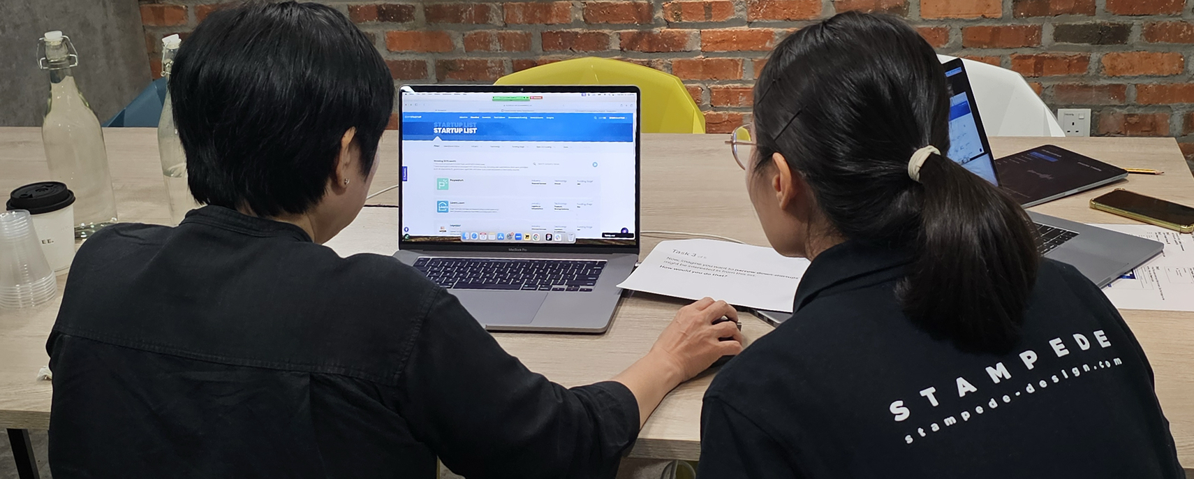
What our researcher did next was to run qualitative user interviews to validate these assumptions about the users. We spoke with five healthcare seekers individually over Zoom. As patients, caregivers (and humans) ourselves, we recognise the very real possibility for confirmation bias to creep in. To reduce this, we assigned two note-takers who captured interview data in real-time and later cross-referenced their data for neutrality and accuracy.

How do you assess the effectiveness of the hospital’s website in serving prospective patients?
One thing we do at Stampede is to not too quickly dismiss the existing product – there are always lessons to learn from what worked and what didn’t. We wanted to document how users utilise the current website and what aided or impaired them in reaching their goals. So we tested it with five users to evaluate three metrics for the Regency Specialist website.
- Ease of navigation: evaluating whether users know where to find information across the website with the current information organisation and placement.
- Information sufficiency: understanding the need for depth and detail of each information the user seeks.
- Usability concerns: include but are not limited to website behaviour that prevents task completion or takes the users off-course, or ambiguity in labels used that led to misinterpretation.
Time and time again, we’ve learned that this sort of testing continues to be high-efficiency, and high-impact as it delivered valuable product insights that helped the management team focus their effort on the high-impact issues.
How do you lay a strong information foundation for existing and future HMI hospitals?
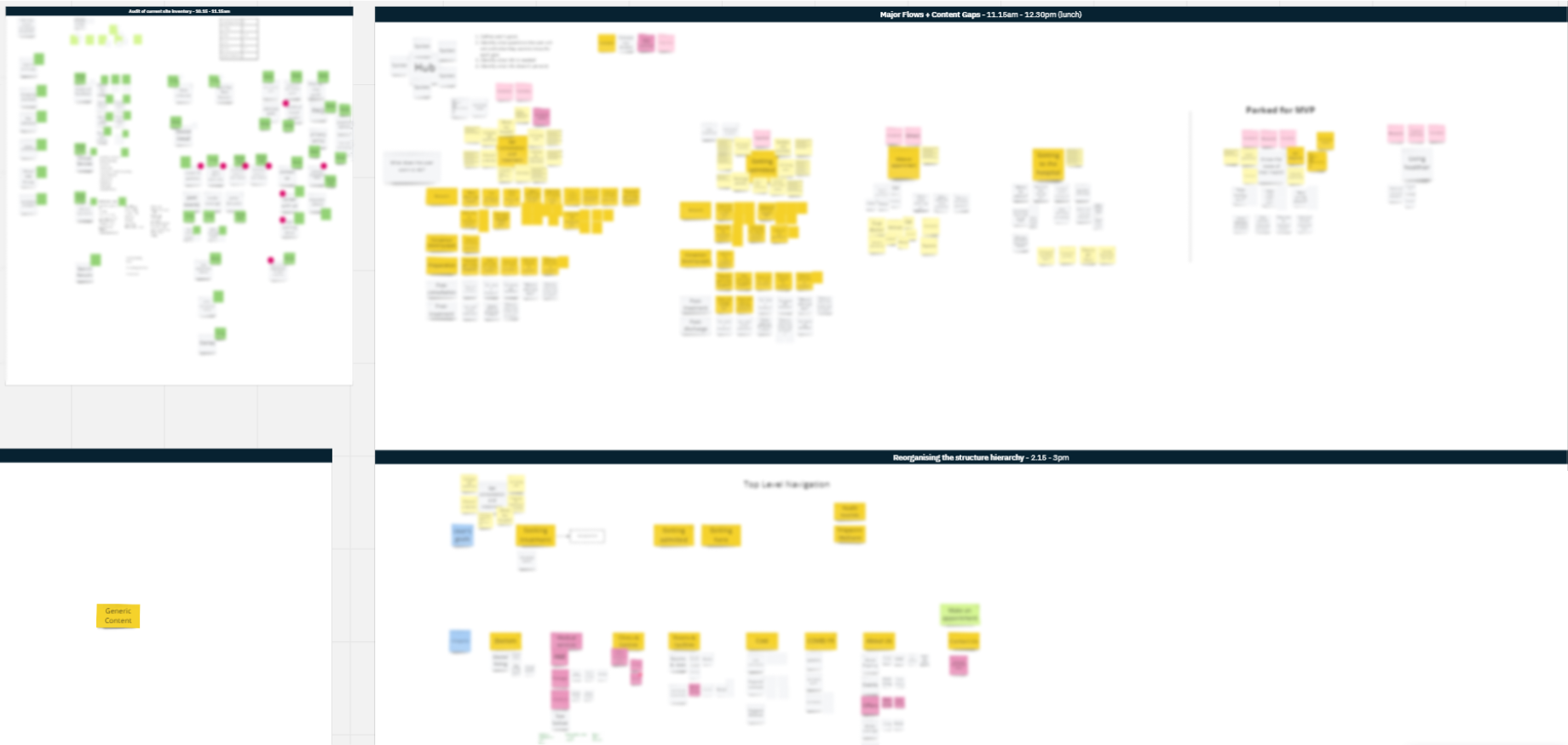
Information is rarely seen as the sexy part of a digital work, but it truly can make or break the experience, so much so that setting up a strong information foundation was first and foremost in our minds. It takes strategic alignment, rigorous planning and close collaboration with the HMI team. We ran a content experience workshop with the HMI team to broadly and deeply evaluate the current site inventory and where the frictions are. We then redesign the user flows, addressed content gaps, and restructured the content hierarchy.
This strategy ensured a more seamless and clear information flow, enabling users to navigate the website and find the desired information quicker and more intuitively.
How does the UI started shaping up and what were the rationales behind design decisions made?
After laying a strong foundation through the workshop, our next focus was to give the entire interface design a makeover. As designers, making an interface visually appealing and intuitive are our bread and butter, but we pushed the envelope one step further by designing interfaces that are engaging and inspiring confidence is users to explore the hospital’s offerings, book appointments, and ultimately choose HMI as their healthcare provider. Oour designers also drew inspiration from the hospital’s brand, infusing it in every design decision to evoke trust, reliance and care.
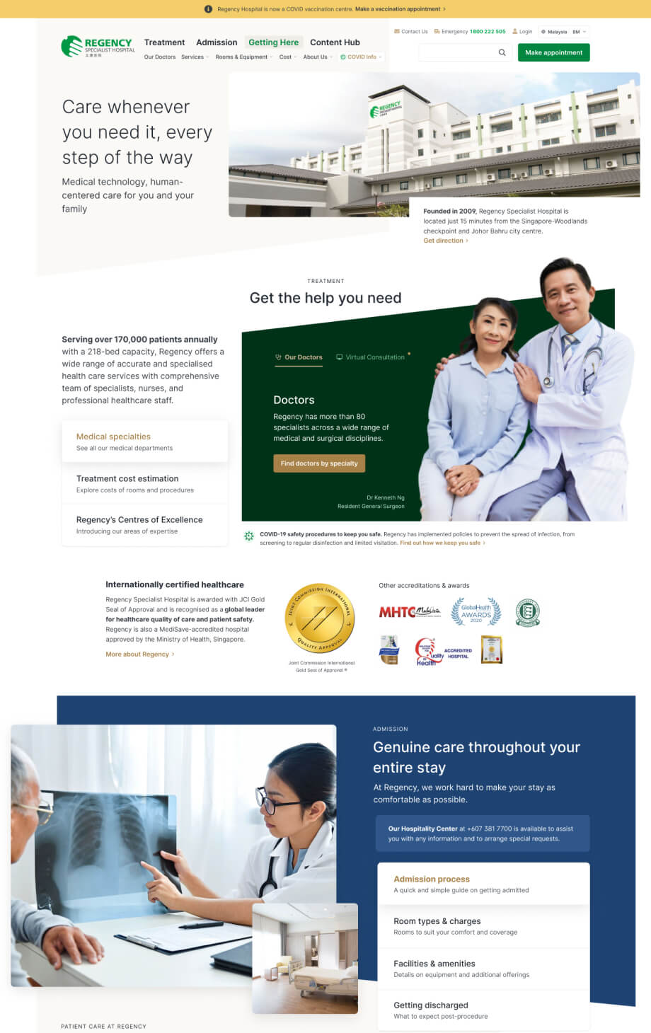
Our UI designers, who had developed deep empathy for the user thanks to our user research process, began with taking stock of the existing UI components, identifying areas of inefficiency or inconsistency and aligning the design with the hospital’s brand guidelines. A Regency-inspired colour palette was chosen, with the primary colour representing the hospital’s identity. Complementary colours were later introduced to create underlying differentiation between different functions of the hospital, again inspired by colours drawn from the staff scrubs.
Beyond brand, readability, legibility, and accessibility were prioritised in the selection of typography, considering users of all ages. Dynamic shapes and images were integrated to evoke confidence and compassion, portraying a contemporary and well-equipped environment.
The communication style adopted a clear approach, devoid of complex medical jargon and positioning the healthcare provided as both financial and informatively accessible. A seamless and intentional responsive design was planned and prioritised from day one, as many of our users will likely be mobile when browsing information on the website.
On the homepage, a clear visual hierarchy was established to guide users’ attention, strategically positioning key elements such as appointment booking, service highlights, and other HMI entities.
We collaborated closely with the HMI team throughout the UI design process, sharing designed screens and gathering feedback iteratively. This close collaboration between designers, the business team, the product team and the developers ensured that the result benefited from diverse considerations.
What is the design strategy to create a consistent user experience across the hospital group?
In delivering the interface solution, we rely on a three-pronged design strategy: optimising usability, enhancing accessibility, and ensuring a consistent visual language. The end design needs to not only achieve these three outcomes, but also be future-proofed to continue performing effectively regardless of the number of new hospitals launched or the region HMI choose to expand into.
As part of the design delivery, we built a modular design library where interfaces are organised and categorised into reusable components. Our designers went one step further by establishing design patterns and usage guidelines for each component, making it easy for developers and future designers to introduce new feature that is a seamless part of the whole sum.
While the design library plays a critical role here, it is not the only safeguard we put in place. Our UI designers also produced a well-documented UI style guide that communicate efficient and effective ways to use UI components the right way, guaranteeing a unified and cohesive appearance across the hospital group’s current and future applications.
Cross-functional collaboration makes true-to-design implementation possible
As designers, we’re 100% accountable for the design, but we couldn’t deliver design to the end user without our developer friends laying the path. Our developer handover is a ceremony that not only signal the handshake between the design ad development team, but also underlines the commitment between the two teams to ensure clarity and accuracy of the end user experience.
Throughout the project, we maintained close collaboration with the development team, offering them comprehensive design specifications, style guides, and component libraries. This approach helped onboard them early and improves the tone of the overall implementation to an equal partnership.
The new website for HMI Regency Specialist was successfully launched in September 2022.
Like what you just read?
The process of design is rarely set in stone and can be tailored to specific challenges a business faced. If you like this approach, let’s discuss how we can make it work for you.
Looking for a team to work the problem together? We’d love to hear from you.
