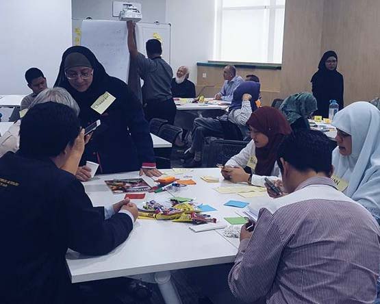
I had the opportunity earlier this month, thanks to the Malaysian Digital Economy Corporation (MDEC), to facilitate a citizen ideation programme to enhance digital inclusion in Malaysia. One startling realisation I had was this—we have all that we need to enhance accessibility and inclusivity in our government websites, particularly for users who are blind or visually impaired, if we make the space to listen.

So how does the visually impaired use technology?
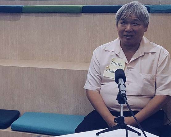
Our work with visually impaired users has revealed how technology empowers their independence in accessing information. Screen readers and audio tools are vital assistive technologies, but their effectiveness depends heavily on proper website implementation.
A common oversight in many government websites is inadequate page titling – for instance, having every tab simply read ‘Lembaga Hasil Dalam Negeri’ instead of specific titles like ‘LHDN Guidelines for Filing Income Tax’. If you have visual impairment and rely on screen readers, this means having to listen through entire pages to find the right information.
It’s these details we often take for granted, not realising their impact on the disadvantaged. Good thing there’s such a thing as the WCAG 2.0.
WCAG what now?
Web Content Accessibility Guide (WCAG) is a document developed by the World Wide Web Consortium W3C to explain how to make web content more accessible to people with disabilities.
It has three levels, with Level A covering baseline UI practices many web designers are familiar with (like error prompt when filling in a form or ensuring all images come with alt text). Level AAA promotes highest compliance in ensuring people with disabilities can benefit from web content, like handling of time-based media and suppressing interruption.
We know this because Stampede adopted WCAG 2.0 AAA standards in all of our work for Australian city councils since 2008. Under the Disability Discrimination Act 1992, Australian government agencies are required to ensure information and services are provided in a non-discriminatory accessible manner.
So while accessibility is not new to us thanks to our global work, we are now in the position to advocate for web accessibility in Malaysia too.

The advent of new MaGIC
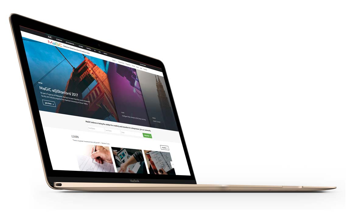
Recently, we worked on the UX and redesign of the new Malaysian Global Innovation & Creativity Centre (MaGIC) website. If you are part of the Asian startup ecosystem, you probably have heard of MaGIC. Launched in 2014 by then-President Obama, MaGIC serves as the catalyst for creativity and innovation for entrepreneurship in Malaysia and Asia.
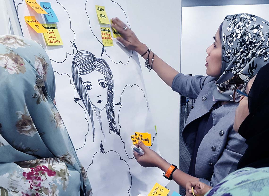
As a project, it remains one of the biggest UX workshops we have run to date, spanning four days, eight departments, 28 people, and 787 sticky notes. The next release will include a customized experience depending on your goal as an entrepreneur: whether you’re interested in learning new skills, growing your business, getting inspired, or initiating a social enterprise movement.
Closer to the launch, we realized that MaGIC, being a government website, was almost too good of an opportunity to pass for doing the right thing. We started simply by giving unique and descriptive page titles to pages on the MaGIC corporate site. We simplified the URL and moved MaGIC out of its default /en/ path. We made sure the 404 page gives useful options in case you’re lost. It went live a week ago and we’re still making tiny daily adjustments based on the data we capture.
Why do it?
Does this add extra work? Not really. Accessibility was not part of our deliverable for MaGIC, but as web practitioners, we didn’t lose anything by implementing it. We still launched on time. With tools like Yoast, improving page titles is easy. Semantic use of HTML tags is not only good for accessibility; it boosts your SEO, too.
But more importantly, as UX designers, it is our responsibility and civic duty to design for inclusion. When you are designing for commercial audience or a small community, accessibility might not be a major consideration. But when you’re designing for scale, when you’re designing for an entire nation, you have a moral and ethical obligations to champion inclusivity for all.
The way forward
There is more to accessibility than page titles—things like contrast, focus order, handling of time-based media, etc. MaGIC is a multi-phase project and we have a big bucket list. But I do hope we can continue to ensure future phases will inch closer towards WCAG 2.0 compliance.
1. Guide
If your design and development team is interested in implementing WCAG, Stack Overflow has you covered.
2. Reach out
Connect with Stampede if your team needs help making your first steps towards WCAG compliance.
3. Share your experience
If you have been advocating for designing for inclusion, share your experience and inspire other designers to make the same call towards good.
Together we can make design a powerful tool and catalyst for building better nations.
Update: In Jan 2022, MaGIC merged with Technology Park Malaysia into the Malaysian Research Accelerator for Technology and Innovation (MRANTI).


