 Stampede Design
For all the buzz it has generated in 2018, you would need to be a hermit (or at least someone who doesn’t work in web-development) to not have heard of WordPress version 5. I’m of course referring to its game-changing feature — the new block-based editor, Gutenberg. The new editor radically changes the writing experience in WordPress because of its block-based system. Content authors can now treat content editing with more of a page building approach, akin to popular page-builders like Elementor and Divi.
Gutenberg by default comes with a handful of block types that should cover standard web content updating needs. However, it also has a nifty Block API for adding custom block types if you need them to display specially designed components for our website. In this tutorial, you are going to add a custom Gutenberg block type so that the output is a notice box with a few predefined styles that accepts arbitrary text input from the user.
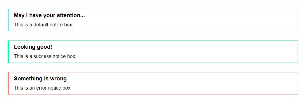
This is what you’re going for.
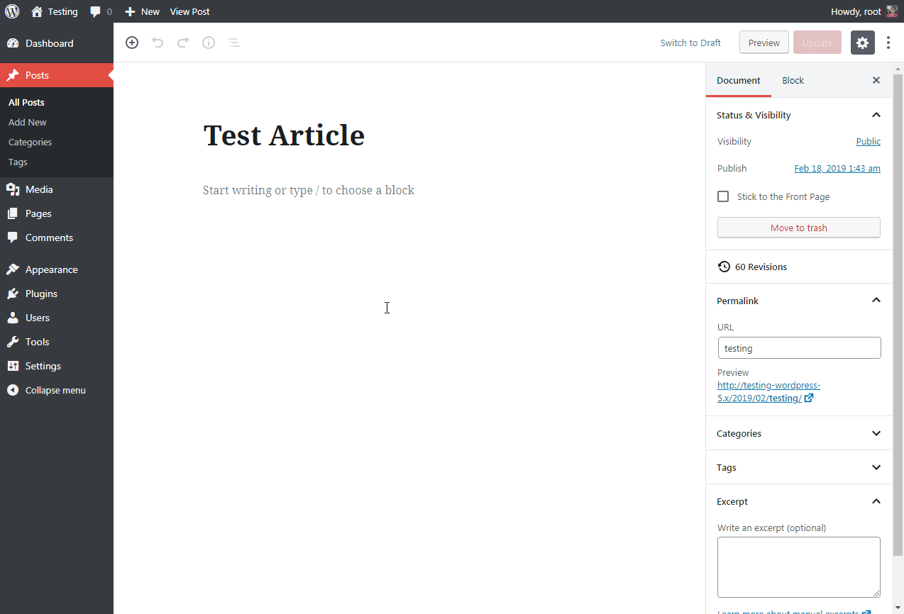
And here is how it looks from the admin’s side.
Alright, let’s get to coding!
Step 1: Create a plugin for the new block type
You will be creating a custom block type as a WordPress plugin. This will allow you to decouple it from any themes you are using and in case anything goes wrong, you can simply deactivate it.
So create a new folder in the WP plugins folder and let’s call it gutenberg-notice-block. In this new folder, create a plugin.php file with the following code:
/**
* Plugin Name: Gutenberg Notice Block
* Author: Shaiful
* Description: A notice box with a few predefined styles that accepts arbitrary text input.
* Version: 1.0
*/

// Load assets for wp-admin when editor is active
function shaiful_gutenberg_notice_block_admin() {
   wp_enqueue_script(
      'gutenberg-notice-block-editor',
      plugins_url( 'block.js', __FILE__ ),
      array( 'wp-blocks', 'wp-element' )
   );

   wp_enqueue_style(
      'gutenberg-notice-block-editor',
      plugins_url( 'block.css', __FILE__ ),
      array()
   );
}

add_action( 'enqueue_block_editor_assets', 'shaiful_gutenberg_notice_block_admin' );

// Load assets for frontend
function shaiful_gutenberg_notice_block_frontend() {

   wp_enqueue_style(
      'gutenberg-notice-block-editor',
      plugins_url( 'block.css', __FILE__ ),
      array()
   );
}
add_action( 'wp_enqueue_scripts', 'shaiful_gutenberg_notice_block_frontend' );
Basically what this file does is initialise the plugin by loading the necessary JS and CSS files at the right place and at the right time. The code above is looking for block.js and block.css, which you will create momentarily.
At this point, you should be able to see the new plugin listed in your WP Plugins admin page. Go ahead and activate it.
Moving forward, all of your coding will be done in JavaScript with some ReactJS flavour to interact with the Gutenberg Block API.
Step 2: Register the new block type
Create a file called block.js in your custom plugin folder. This file will hold the entire logic of the custom block type for the admin-side and frontend of your website.
Start by adding the following bare-bones code.
/* block.js */
var el = wp.element.createElement;

wp.blocks.registerBlockType('shaiful-gutenberg/notice-block', {

   title: 'Notice', // Block name visible to user

   icon: 'lightbulb', // Toolbar icon can be either using WP Dashicons or custom SVG

   category: 'common', // Under which category the block would appear

   attributes: { // The data this block will be storing

      type: { type: 'string', default: 'default' }, // Notice box type for loading the appropriate CSS class. Default class is 'default'.

      title: { type: 'string' }, // Notice box title in h4 tag

      content: { type: 'array', source: 'children', selector: 'p' } /// Notice box content in p tag

   },

   edit: function(props) {
      // How our block renders in the editor in edit mode
      return null;
   },

   save: function(props) {
      // How our block renders on the frontend
      return null;
   }
});
The code above registers your new block type with the name “Notice”, using a light-bulb Dashicon and putting it under the Common Blocks panel in the Gutenberg blocks browser. You should be able to see the new block in your editor at this point.
You also specify the attributes (and their data type) that your new block will be storing which are the box type, the box title and the box content.
Lastly, there are two functions called edit() and save(). The edit() function is responsible for rendering your block in the editor while the save() function outputs your block HTML on our website’s frontend.
Let’s explore them now.
Step 3: The edit() function
The edit() function controls how the block will appear in the Gutenberg editor for the user to interact with.
For your custom Notice block type, the goal is to accomplish two things:
- The user can select the notice box type as well as enter the box title and content.
- Selecting different notice box types will show a simple live preview of what the box is going to look like on the frontend.
Add the following code into the edit() function.
/* block.js */
edit: function(props) {
   // How our block renders in the editor in edit mode

   function updateTitle( event ) {
      props.setAttributes( { title: event.target.value } );
   }

   function updateContent( newdata ) {
      props.setAttributes( { content: newdata } );
   }

   function updateType( event ) {
      props.setAttributes( { type: event.target.value } );
   }

   return el( 'div',
      {
         className: 'notice-box notice-' + props.attributes.type
      },
      el(
         'select',
         {
            onChange: updateType,
            value: props.attributes.type,
         },
         el("option", {value: "default" }, "Default"),
         el("option", {value: "success" }, "Success"),
         el("option", {value: "danger" }, "Danger")
      ),
      el(
         'input',
         {
            type: 'text',
            placeholder: 'Enter title here...',
            value: props.attributes.title,
            onChange: updateTitle,
            style: { width: '100%' }
         }
      ),
      el(
         wp.editor.RichText,
         {
            tagName: 'p',
            onChange: updateContent,
            value: props.attributes.content,
            placeholder: 'Enter description here...'
         }
      )
   ); // End return

},  // End edit()
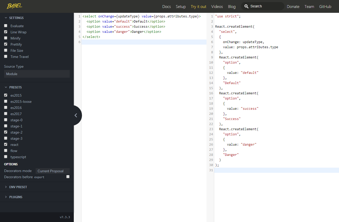
Line 16-49 is the main code you will use to display the user interface in a way that allows you to update the content in your block type. The code is written in ReactJS specifically the React.createElement() function is used to create new DOM elements. Do not worry if ReactJS is unfamiliar to you. You can make use of this specific tool to compile JSX template code to React.createElement() functions.
Here is an example.
It’s a good idea to create your block.css file right now so that you can test the live preview functionality in the editor. Make sure the CSS file is saved in your plugin folder.
/* block.css */
div.notice-box {
   border: 1px LightSkyBlue solid;
   border-left-width: 5px;
   padding: 10px 15px;
   margin: 30px;
}

div.notice-box.notice-success {
  border-color: MediumSpringGreen ;
}

div.notice-box.notice-danger{
   border-color: LightCoral ;
}

div.notice-box h4 {
   font-size: 18px;
   margin:0 0 10px 0;
}
div.notice-box p {
   font-size: 16px;
   line-height: 24px;
   margin:0;
}
At this point, you should be able to add your Notice block type into the editor and see three different fields for configuring the notice box. The dropdown for selecting the notice box type should also gives you a live preview between the default (blue), success (green) and danger (red) box types.
Step 4: The save() function
The save() function for your Notice block type is pretty straightforward. You just have to construct the correct HTML structure and populate the title and content into the notice box <div>. Once again the DOM elements creation code has to be written in ReactJS.
Here is the code:
/* block.js */
save: function(props) {
   // How our block renders on the frontend

   return el( 'div',
      {
         className: 'notice-box notice-' + props.attributes.type
      },
      el(
         'h4',
         null,
         props.attributes.title
      ),
      el( wp.editor.RichText.Content, {
         tagName: 'p',
         value: props.attributes.content
      })

   ); // End return

} // End save()
That’s it!
Your Notice block type should now work on both the admin and website’s frontend.
Here is the link to download the completed plugin.
Something to keep in mind
Looking at the save() function, you’d imagine that updating the HTML output in there would cause a global update for all instances of the Notice box that you have populated on your website. It’s natural to expect this (it is, at least from our experience with working with WP shortcodes). Unfortunately, this isn’t what happens.
Making any changes to the block HTML output would trigger a conflict with all existing instances of the blocks that have been populated. What’s worse is that the only way to fix this is by repopulating the blocks one by one. This is the caveat of static block types.
To work around this, make use of the Dynamic Blocks feature which hands over the save() function from JS to PHP to generate the block HTML output on the fly.
Final thoughts
The ability to create custom block types is very cool and opens a lot of possibilities for content customisation. After trying it out myself, I would say the basic concept is fairly easy to follow. The real challenge, however, is presenting the custom block in the best possible way to give content authors the best editing experience, especially for blocks with complex functionalities. I find that the official developer documentation for various attributes configurations or working with RichText field for example, are still lacking. It will improve surely but the best reference materials we have at this moment are online articles and the existing blocks that came out of the box with WP5.
On another note, I am personally looking forward to the Advanced Custom Fields (ACF) plugin taking on the custom block types with their own ACF Blocks for Gutenberg. This new addition should lower the barrier for WP developers to take advantage of Gutenberg block capabilities in a more intuitive way.
