 Stampede Design
The strategists at Stampede are up to something again. One day, Jared the Content Strategist, who ran Constructs, and I sat down for a meeting about interfaces in general.
We ran through a number of websites we liked and as we cooed over every single detail that makes the user experience even more delightful, we decided to create our own Slack channel called #ui-inventory. There, we shall post our favourite interface elements, be it icon, copy, buttons, forms etc. This shall serve as references for both of us as we work on our strategies for projects as well as for our UI/UX designer, Shaza. Who knows what shall we do with the repository later?
What are microinteractions?
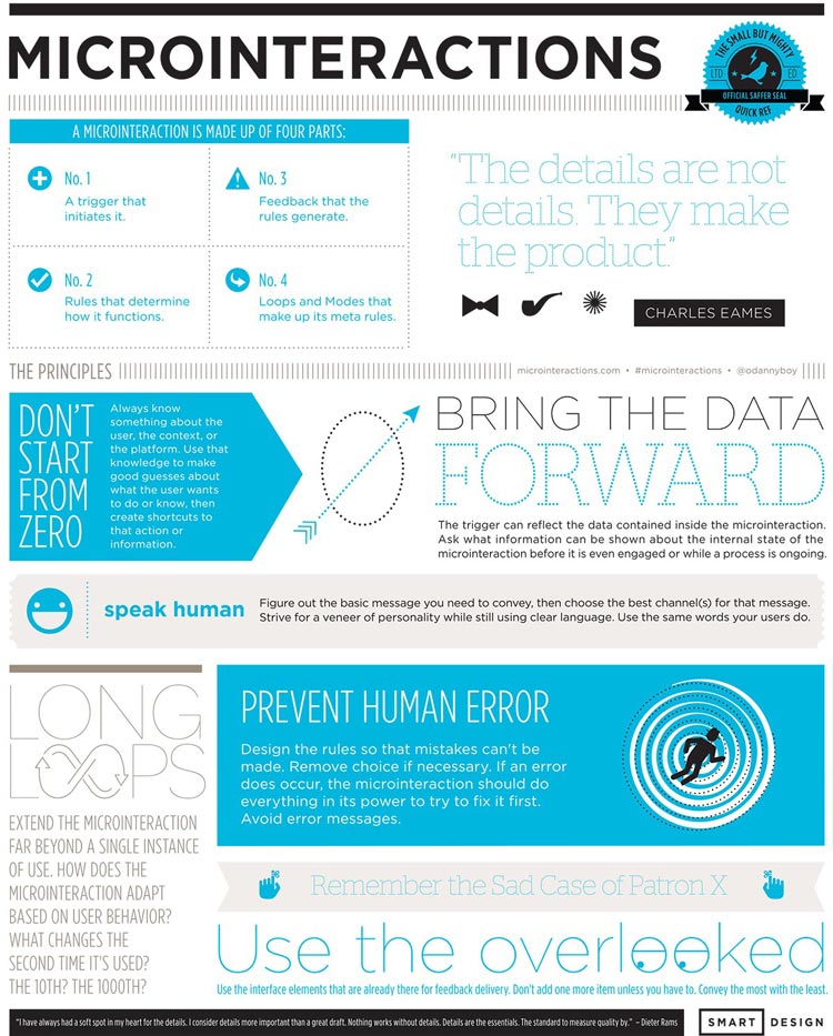
Microinteractions can be defined as ‘contained product moments that revolve around a single use case—they have one main task’. They can impact things such as:
- Turning things off or on
- Commenting in any digital medium
- Changing a setting or process
- Viewing a notification or message
- Sliding down the “screen” on a mobile device to refresh content (maybe with sound)
- Interacting with a data element, such as checking the weather
- Accomplishing any single task
- Connecting devices, such as those for multi-player games, or printing from your laptop
- Sharing or liking a photo or video on a website
Dan Saffer, Director of Interaction Design at Smart Design and the author of the book Microinteractions, says “Every time you change a setting, sync your data or devices, set an alarm, pick a password, log in, set a status message, or favourite or “like” something, you are engaging with a microinteraction. They are everywhere: in the devices we carry, the appliances in our house, the apps on our phones and desktops, even embedded in the environments we live and work in. Most appliances and some apps are built entirely around one microinteraction.”
The book Microinteractions is inspired by Charles Eames’ maxim, “The details are not the details. They make the design.”
Examples of microinteractions in UI
We have seen microinteractions. They are nothing new and we encounter them every day, often adding joy to our experience when they are done well.
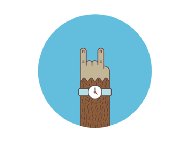
Mailchimp’s series of monkey hands are my favourite microinteraction so far
We see them when we see new friend requests in Facebook, the iPhone 6s’ new 3D Touch feature, the Uber rides waiting for requests around our block, that the new cute iPhone cases we added to the cart while shopping are already highlighted so that we don’t forget which ones, the new Psy videos in Youtube, that we have successfully sent that email campaign in Mailchimp, the simple case of figuring the strength of our chosen password and even in our favourite Slack, when our password which consists of mixed cases and numbers got too dreadful for us to type in mobile.
How do you know you need a microinteraction?
Simon Proudfoot from Demac Media has given a great analogy on how to know whether you need a microinteraction — ask yourself two simple questions:
- Does adding this microinteraction potentially take away from the user interacting with some other part of the site? (if no, proceed)
- Does this add experience to the user? (if yes, proceed)
Otherwise, they are not necessary. In other words, think of microinteractions as some final personal touches to your product on top of the already amazing existing product.
The future of microinteractions in UI
The Next Web outlines some great guidelines on making sure microinteractions work well:
- Micro-interactions must live on through repeated use. What’s fun and quirky on first use might become annoying after 100 uses. Be cautious of gimmicks or odd design cues.
- Simplicity rules. Simple type, simple language, simple colors, and simple design. Don’t make the design any more complicated than the action.
- Give each micro-interaction a human voice. Text should read like people talk, not like a machine.
- Add a fun divot with animation, but don’t go crazy. Consider the bouncing icon in the dock of your MacBook as a program loads. It lets you know the program is responding with a simple animation but does not get in the way of what you are doing.
- Create a visual harmony with other elements. If your app has a blue color scheme, micro-interactions should use the same hues so that the visual connection to the parent design or app is there for users.
- Don’t overthink it. Overdesigning a micro-interaction can be lethal. Let’s go back to the simplicity of the text message notification. Just a simple, singular display on the screen with enough information to be effective – who the message is from, what the message contains and a way to respond.
- Consider each detail with care. Because micro-interactions are so small, every element of the design matters. Ensure that every detail, down to the last pixel, is perfected before launch.
- Think about further adaptations or how subsequent micro-interactions will work. Does the exact same thing happen every time for every user? Or are there changes to the micro-interaction over time? (Consider the alarm that gets louder each time after the snooze button is hit.) These smart details will set the best micro-interactions apart from everything else.
If done well, the tiny humanising details in microinteractions have the power to add delight to the websites or apps. They could not be done half-baked, yet they could not be overdone.
They are the details that could make or break the website or the app.
This article was originally posted on Curated@Stampede.
