 Stampede Design
I used to think having all the data meant having all the answers. Metrics, dashboards, traffic reports—they felt like the key to understanding users. But over the years, watching products succeed and stumble, I’ve learned something else: numbers don’t explain why people leave, why they don’t convert, or why certain features just sit there, unused.

That’s where engagement analysis really matters. Not just tracking behaviour—but understanding it.
You’ve probably seen it too. The traffic looks decent. Users are clicking around. Session durations seem healthy. The data piles up… but something still doesn’t feel right.
And if you look closely, maybe conversions are stuck. Maybe people are dropping off before they complete anything meaningful. Your data’s saying something—but it’s not the full story.
At Stampede, we see teams face this all the time. Businesses reacting to numbers without stepping back to look at the bigger picture. That’s why our approach goes beyond dashboards—we turn signals into steps that help the product move forward.
This isn’t a checklist. It’s a set of ideas to help teams read their engagement data more meaningfully—and act on it.
Common engagement pitfalls
Even the best digital products hit rough patches. Maybe people drop off just before converting. Maybe onboarding doesn’t quite land. Or maybe users bounce before doing anything meaningful.

Sometimes the issue is technical: slow load times, poor mobile responsiveness, clunky forms. Other times, it’s more subtle—confusing copy, unclear next steps, or a mismatch between what users expect and what they actually get.
Without a plan to re-engage users, we find that these friction points build up and is slowly impacting product growth.
That’s where engagement analysis helps: it helps us see where things aren’t working, so you’re not just guessing—you’re acting on something real.
What engagement analysis data can—and can’t—tell you
Metrics gives us signals. But they don’t tell the whole story.
Let’s look at a few:

Drop-off Rates
People are leaving mid-flow. That’s often a sign of friction—unclear next steps, or a process that feels too complicated. It’s also maybe a sign that user actually get what they wanted, qualitative study might reveal something here.

Time on page / Session duration
Are they staying because they’re engaged—or because they’re confused? Numbers can’t always tell. Heatmaps and user recording can reveal scrolling patterns, clicking behaviours or hovers on several key elements. These further observation might be able to help triangulate the root cause.

Return visitors / Retention
If users don’t come back, there’s likely a missing hook. Something didn’t stick. Return users means the product is useful or providing a value that’s worth returning for.
Click-through rates (CTRs)
Weak CTAs, confusing layouts, or messaging that doesn’t connect can all drag these down. From my experience, A/B testing can help you make a quick tweak and see subliminal user preferences.
Conversion rates
If the value isn’t clear—or the process feels like work—people will leave before committing. Improving value proposition, flow continuity and actionable CTAs may help you improve. Learning from qualitative data will help you the most here.
Synthesising data can be tricky, we have existing biases, pre-conceived notions and assumptions. For example, sometimes long sessions are a good sign. Other times, they’re a red flag.
We’ve encountered long session durations that’s actually good for the user, for example on a long content page where users might be reading, or during highly interactive screens. Long sessions might be bad for tasks that are supposed to be simple like onboarding, sign ups or submitting an application.
That’s why context matters. Pairing data with qualitative insights—like user interviews or usability tests—helps explain why something’s happening, not just what.
And here’s the key: not everything that looks broken actually is—and not everything that’s working needs to stay exactly the same.
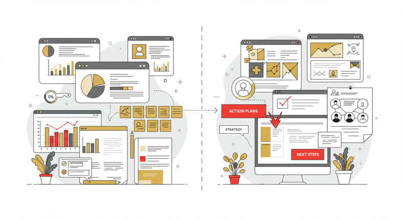
Making quantitative data actionable
Once the patterns has been discovered, here’s how to move from insight to real change:
- Pair data with research. Do usability sessions, product trials—get a feel for what users are actually experiencing. Read more on our approach on product testing.
- Prioritise on what matters. You don’t need to fix everything. Focus on what aligns with your goals.
- Test and iterate. Small changes can go a long way. Improve, validate, tweak—then do it again.
Small UX changes, big impact
One small but powerful fix: we once saw users drop off after using a key feature—because the next step wasn’t obvious. Adding clearer CTAs on the results page reduced drop-offs and improved retention.
A few other low-effort, high-impact ideas:
✅ Clearer calls to action
✅ Shorter, simpler forms
✅ Personalised content or suggestions
✅ Progress indicators in long flows
Sometimes it really is the small stuff that ends up making a big impact.
How engagement analysis evolves with your product
This isn’t a one-time thing. Engagement analysis evolves as the product grows.
- Early-stage – Spot friction early, refine before scaling.
- Growth phase – Optimise based on real behaviour, not gut feeling.
- Mature products – Catch churn risks early and keep up with changing user needs.
From my experience, engagement analysis was often used to continuously refine user flows based on evolving user behaviours. For many teams, this approach has directly improved onboarding and significantly reduced drop-off rates, leading to higher adoption and retention.
Done right, engagement analysis becomes part of product growth. It feeds into larger gap analyses and connects to our broader research and product strategy. Our work analysing engagement for a team as a part of a gap analysis of a government platform, alongside user research, product testing and comparative benchmarking yielded highly actionable recommendations for platform improvements. Read the case study about our gap analysis approach.
Overall, it helps with:
- Investing time and effort where it matters most.
- Aligning teams across design, product, and marketing.
- Removing friction and boosting satisfaction.
- Building longer-term user relationships.
Engagement analysis, the Stampede way
At Stampede, we don’t stop at numbers. We connect the dots.
Instead of handing over spreadsheets, we tailor insights to different teams—from product managers to marketers to leadership. Everyone gets what’s most relevant to them.
We focus on storytelling—turning data into something meaningful. Something that drives decisions.

And because our teams work closely across design and development, we look at the full picture—user patterns, tech limitations, performance quirks—all of it. That cross-disciplinary lens helps us see things others might miss.
So if your platform’s seeing drop-offs, low conversions, or inconsistent engagement, maybe it’s time to dig deeper.
We’re here to think with you, to dig deep, ask better questions, and uncover insights that actually help your product grow. And when your product grows, it builds better experiences, better worlds. If that’s what you’re aiming for, drop us a line.
