Time tracking software is essential in the web business. Every ticking second could mean cost and revenue for us developers or the clients. We don’t want to overcharge our clients nor do we want our tracked hours to be lost in space. Hence two important rules for a time tracking app are that it must have both reliability and stability.
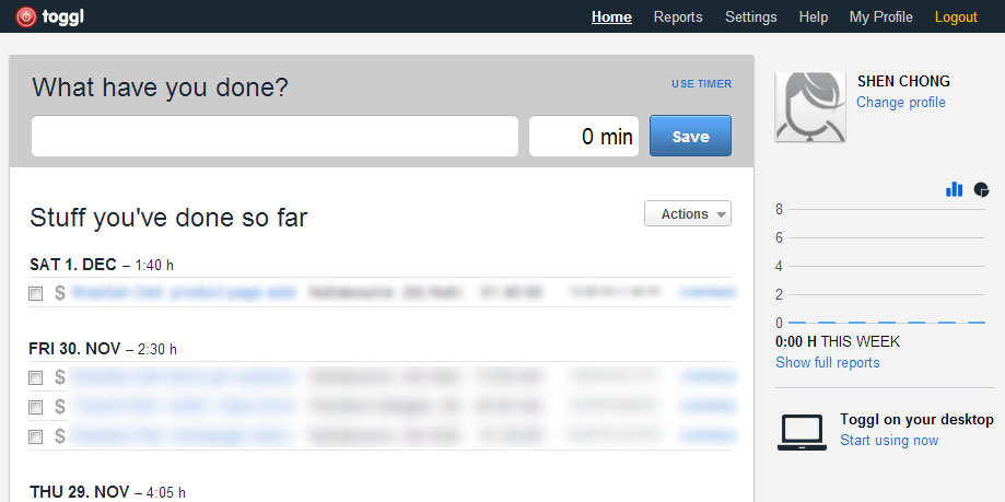
First page of Toggl. In-your-face and straight to the point. One click and start working.
I was working as usual with Toggl running a few months back and suddenly its load balancer suffered, causing my tracked tasks to fail when submitting to the server. I tried to submit a few more times only to find out much later at the end of the month that multiple entries had been inserted. Client was almost billed for the same tasks multiple times. That, my friend is credibility and trust lost on Toggl. Lesson learned.
I decided to give Harvest, a simple online time tracking software a try. The mission is to find out if it is a worthy opponent to Toggl, the one that we have been using for the company all these time.
So what are my first impressions and what do I think about Harvest after a week of mild usage?
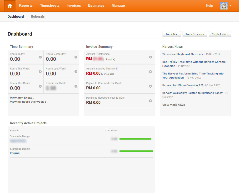
First page of Harvest. Clean and informative, but at least 3 clicks to get the timer going.
First of all, the dashboard on Harvest isn’t really that dashy at all. You have to click at least 2-3 buttons to get the timer to start. I like Toggl’s in-your-face interface more where the first screen is everything you’ll want to do – start timer and work instead of clicking which task, add entry, etc.
The other functionality on Harvest like reports, invoices and estimates are definitely much better and cleaner. I feel that the reports are generated much faster, maybe it’s because I only have a few tasks tracked in Harvest thus not having a heavy database.
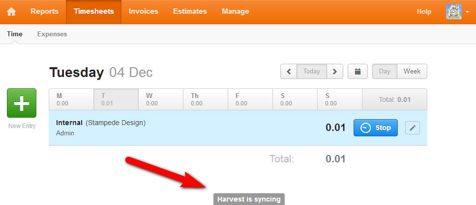
The eye-catching sync message that you surely cannot miss.
As for the timer, the Ajax functions are much robust and faster. The sync message is concise – it only shows you a text that it’s actually syncing instead of Toggl’s loading image without any text. I find myself not noticing the loader image in Toggl sometimes, which is bad. If you want the user to wait for the sync to finish, have a more animated sync message like Harvest is better in my opinion.
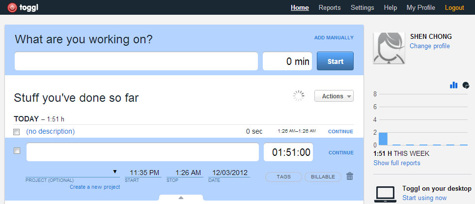
Can you tell where is the loading indicator?
However, I do like the homepage of Toggle timesheet more. It shows your tracked task in one-page Ajax timeline instead of Harvest’s multiple steps of selection before you can start tracking your time.
Recently, I also discovered that Toggl has ‘offline mode’. It is where you can track time in Toggl even when you don’t have Internet connection. All the data will be stored offline in your computer and synchronized with Toggl servers automatically once you’re back online. This is especially useful if I am working on the go without an Internet connection and I need to track my time.
The Verdict
We are sticking with Toggl, but definitely will bear in mind about the extra bits and bobs that Harvest is able to offer.
So, what about you? What time-tracking software are you using for your company?
