 Stampede Design
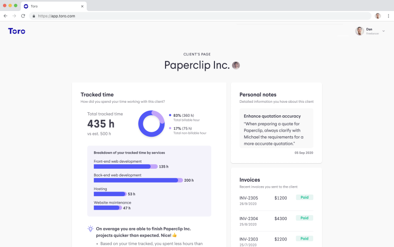
When I first joined Toro, which is a product team in Stampede (torotimer.com), the team was in the midst of a sprint. For those who are not familiar with sprint, it is a set period of time during which specific work has to be completed and made ready for review, usually involving the product owner, the design and development teams. The outcome is usually a prototype or solution to a problem, alongside valuable insights about customer needs and preferences.
In my case, the sprint focused on a freelancer product, which we internally called as Toro Freelancer. My colleague Luqman and I set out to build a new prototype for Toro, as well as being responsible for the testing research plan and participant recruitment.
Lesson 1: It’s okay to take a step back to solve the problem
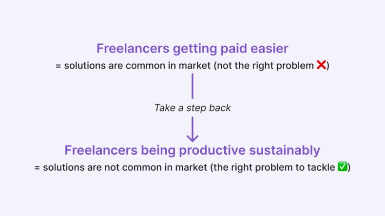
From the ideas we had, the product owner selected a few viable ones, but also realised that they were skewed towards a known solution space. There are many solutions out there to help freelancers get paid easier, and beating this dead horse won’t really help our users in a meaningful way.
What we missed were strong ideas for helping our freelancer improve their productivity in a way that is sustainable for them. Realising this, we took a step back to shift our focus on the right problem.
Lesson 2: Standing out from the competition
Initially, I thought it was merely a minor issue to miss the step of having solid ideas for the right problem. But after the testing later on I realised one more lesson, which is that in making a product, we need to differentiate ourselves from the competitors, not just create another similar tool in the market.
Focusing on user’s problem in being productive sustainably really tested our product market fit. If we did not take a step back to focus on that opportunity, we might just waste our time creating another common quotation/invoicing tool, getting further from our goal of making freelancers subscribing for Toro.
Lesson 3: Be selective about what we want to test
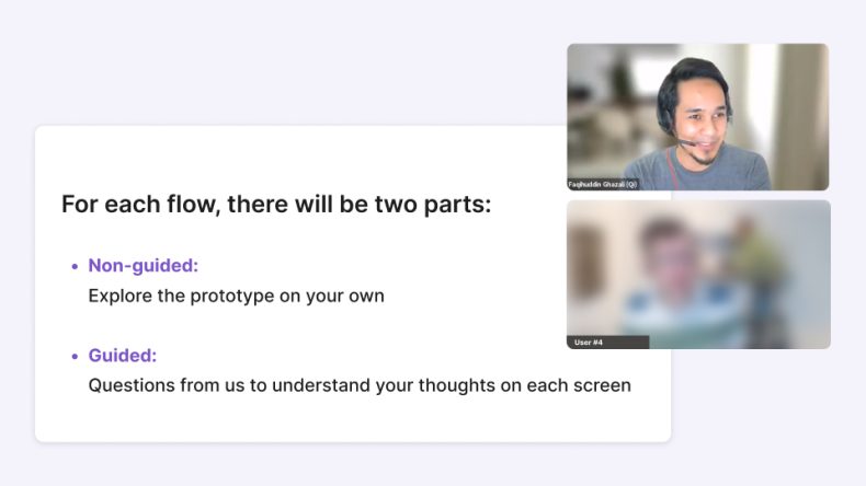
One lesson that I learned from prototyping is that we need to be selective in what we want to test. Not everything has to be interactive in a product test. Sometimes we may want to keep a non-interactive item like a button that cannot be clicked, so we can ask the user to guess where it might lead. Test time is limited and this will help us to be more efficient and focused on the actual hypothesis we are testing.
Lesson 4: Be intentional in design
Another lesson is to be intentional in prototype design, to the small details. I learned this from a situation where I only randomised the variation height of bars in the chart, without any deep thought. However, during the testing, the users interpreted the bar chart in a certain way, like the chart was designed intentionally to show something. At that moment, it exposed my bias that some users actually do think and care about the tiny details.
Being intentional with the details is also another reason why we need to design the prototype with a smooth continuity so that users are not confused, surprised or distracted. For example: add a confirmation modal first to smoothen the flow, remove an existing CTA which can distract the user from the tested path etc.
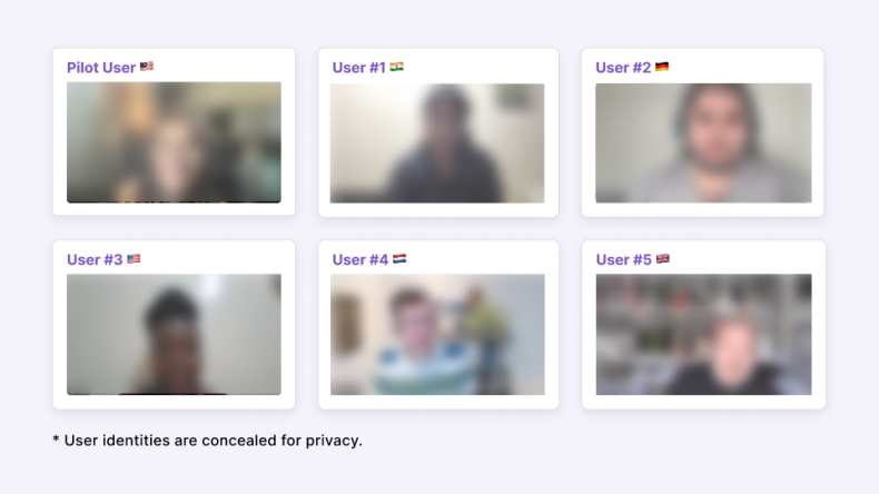
Lesson 5: Ask the right questions to screen the right users
As I was taking the lead for user recruitment, initially I was thinking of an easy path: Edit an existing screening survey, spread it anywhere, pick the users and schedule the slots.
I did not expect it would be hard and time-consuming to find the right users. It was a moment of clarity for me as to why a certain UX agency has dedicated researchers only for user recruitment.
The screening survey attracted many scammers because of the monetary incentives, plus it was posted not in the right channels. We mitigated this by verifying through their LinkedIn profile or portfolio link.
Asking the right questions also means only asking the essential questions. I learned the hard way that sensitive questions, such as gender and marital status can be intrusive, especially when they do not carry any weight in finding the right users. Essential questions could make the screening form shorter, which would mean less friction for the users while providing enough info for designers to filter them.
Lesson 6: Be pragmatic, not dogmatic
Finding the right channel to funnel quality users was also important. What worked in the past might not work this time. After getting so many wrong users in the list, I started to think “If I were an established freelancer, where would I be to connect with like-minded people?”. I eventually hit a jackpot when I found a few Slack channels that vet the users to ensure a sustained professional community.
The benefits of getting the right users would later be manifested in the quality of the testing. The users could really relate well with the prototype especially when it was able to solve their pain points. I was super relieved when the right users stress-tested the prototype. Seeing what worked or did not work for them gave us some ideas on how we were gonna tackle the next step of the product.
Lesson 7: Making mistakes is a part of growth
Understanding different accents, handling internet connectivity issues, users being very prescriptive or just providing short simple answers, and managing time limits can be challenging to the facilitator. Having diverse users tested my ability to manage these sessions. As it was my first time handling a testing, having a more experienced designer observing me and providing detailed feedback improved my facilitation skills after each session.
I made the mistake of asking too many questions early on about what the user understood from the prototype. This consumed a lot of time and did not provide insight into whether the feature was useful (and how) or not (and why not). The reason we had testing in the first place was to test the prototype by understanding users’ thoughts on how the prototype would or would not solve their problem.
After conducting the testing, I feel more confident to do user interviews/testing. At the same time, I want to keep training those muscle memories until my interviewing skill becomes natural.
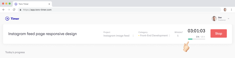
Another lesson that I learned is we sort of established rapport with the users. They could be a great resource if we have questions related to our product research, such as the reason they are using separate tools for invoicing and time tracking. Some of the users were so willing to help us, and they were just an email away 🙂
Lesson 8: On deciding what to ship
As a product designer, I had a sense of ownership to carry the product to success. However, I had a lot of uncertainty about how to nudge the team in the right direction when prioritising features for the minimum payable product (MPP).
During the testing, we tested a lot of features based on our research. However, in reality, achieving the ideal state of a finished product requires going through multiple release cycles, which can take months or even years.
So how do we prioritise certain features to ensure we are on the right path for users to start paying for Toro? What if our MYP is similar to all the other tools in the market? Will users be willing to pay for it?
The testing showed that we have a Unique Selling Proposition (USP) module that can differentiate us in the market, as it solves major pain points for users. However, shipping that module requires a lot of effort and other foundational features to be shipped first.
Since we do not want to release a half-baked product, should we build all those features, including our USP module, before releasing the subscription plan?
All of these questions were on our minds. After further reading and asking a few designers in the industry, we initially thought that a prioritisation workshop would provide more clarity on the path forward due to the inputs from the team. However, in our case, Shaza as the product owner, is well-versed in the feasibility, viability, and desirability, and this part is the product owner’s call to make, not the team’s. We learned that we should have discussed with the product owner first the best way this should be done.

Lesson 9: Learn from history
Later, I learned that Figma did not have the collaboration feature when it was first launched. There are many examples of successful startups that launched their products without their best-known features yet. What is more important is to ship, measure, and learn, rather than dwell in the uncertainty of which features to ship first.
Nobody can predict the future, but we can try to make the best decision at the time with the info that we have. If we fail, we need to fail fast and iterate. If the minimum viable product does not go the way we wish, at least it saves us from wasting our time and effort on the queued features. At least we learn what is working and what is not.
Lesson 10: Size the development effort carefully
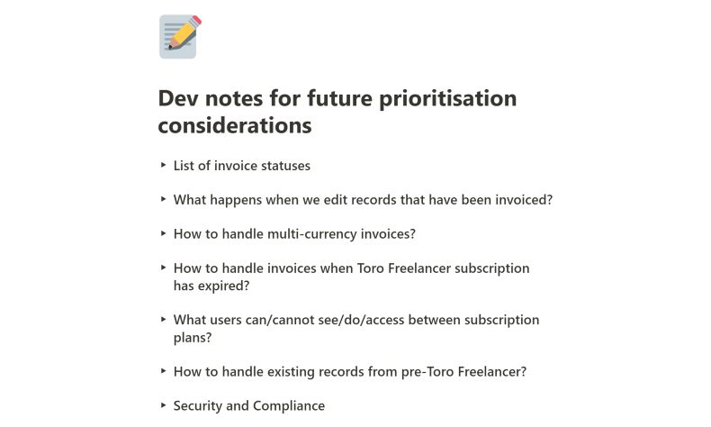
I also learned that a feature might carry more complexities than I initially thought. If we overlook certain details, it might surprise us in the development phase. For example, can the user edit the invoice that has been sent? What if we allow the invoice to be edited if the client hasn’t seen the invoice on Toro platform? How sure are we that the client hasn’t seen the invoice?
Thus, it is important to collaborate with the developer to understand what the considerations and technical constraints are to build the feature and to be specific (to a certain extent) so that developers won’t undermine the actual efforts needed.
That concludes our 10 lessons. If you have any tips or best practices for designing valuable products, please share them in the comment section 👇
