 Stampede Design
Hello, Sani here. In my first ever tutorial post I am going to show you how to produce a CSS sprite technique.
What is this CSS sprite technique & why?
CSS sprite, as interesting as it is called, is also an interesting CSS method itself. This approach involves changing an image to another different image, or the same image but different colour scape (greyscale, sephia etc.) upon hover.
The advantage of using the using css sprite technique is that the web page will automatically load all images at once, instead of one by one. This will speed up the loading time and there will be not much delay for users with slow Internet connection.
But how?
When we hover on the block, the background image will change smoothly to second image. If we use separate image for hover effect it will take time for website to load that image from server thus, will create ± 1 second empty space on hover. This will be a problem for user with slow internet connection.
Interesting. Show me how.
Here we go. Take a seat.
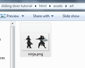
First of all, get any images or sprite to start. I would suggest an image with transparent background. In this tutorial I am going to use this Ninja Sprite from 36peas. Choose any two images – one for normal state and another for hover. Save them on some canvas by side or top and bottom.
Before we start, it’s a good idea to show some simple css background code.
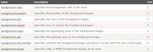
Single line css background code in correct order would be:
background: color position size repeat origin clip attachment image;
In this image, each ninja will have width:227px and height:298px.
Total width for both ninjas in one canvas would be width:454px and height:298px.
In this tutorial we will only need a combination of three css background codes. Width and height set will just be for one image.
On hover, just change position of the image. Background image in this tutorial I put straight to image file. So the code should be like this:
Normal state:
display:block;
height:297px;
width:227px;
background-position:0 0;
background-repeat:no-repeat;
background-image:url('ninja.
png');
Hover state:
background-position:-227px 0;
Normal state in shortcut css:
display:block;
height:297px;
width:227px;
background:0 0 no-repeat url('ninja.png');
Hover state in shortcut background css:
background:-227px 0 no-repeat url('ninja.png');
or
background-position:-227px 0;
If you would like to see how it looks like, you may view the demo links here:
Correct syntax for shortcut background css :
background: color position size repeat origin clip attachment image;
For background-position, always remember all browser read css background position code from x-axis to y-axis. In these examples:
- background-position:(x-axis)px (y-axis)px;
- background-repeat: By default, all browser will use value ‘repeat’. To make it one image simply put ‘no-repeat’.
There are some bits of notes about background-image: – back during my first time doing css background, it was a bit confusing to do relative path if the file images are in different folder.
Here are some examples to show what I meant:
The location for the html file.
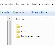
The location for images and CSS folder.
The location for the image file.
By default, the browser will find image in same folder where we save the CSS file. The solution for this problem would be that we have to jump outside the CSS folder by typing ‘ ../ ‘ which means going back to one folder:
Here is an example based on my local html and css folder.
background-image:url('../art/ninja.png');
Here are some links for you to play around:
Awesome! I am going to try now!
Yay! And if you do have some questions, suggestions or examples, do drop them links in the comment.
(Thanks W3C for being my main point of references.)
