Mobile commerce is now taking over online shopping. Rapid growth of smartphone technologies and people’s consumption of smartphones and devices other than desktop computers contribute very largely to the growth of mobile commerce. According to the Internet Retailer statistic, in June 2013, 55% of online shopping come from mobile devices. If you have an online store and it is not yet optimised on mobile, you are missing out big on sales – and that’s a shame.
However shopping on a mobile device can be a nightmare because of the screen size and other limitations, for example mobile shoppers need to be on high speed of 3G connectivity to be able to experience mobile shopping to its fullest from browsing till purchase. From the web development perspective, how to create better mobile shopping experience?
Below are some 5 tips to create a great mobile shopping experience based on my observation.
Speed
Have you ever encountered a limited time sales on your favourite products online? Browsing their websites on mobile and the process takes forever to load, and that’s really frustrating. Scenario: While waiting, a Whatsapp message comes in and you abandon the shopping cart and you forget altogether what you had been trying to buy.
Here are some tips web developers could do to improve speed and performance for e-commerce websites:
- Optimise pages so that they load fast hence users on data roaming to browse won’t bounce immediately and leave your site. According to online survey (Dyn) 3 seconds is the longest user will wait for a shopping website to load. Nearly half of users expect a web page to load less than that.
- Try to optimise content, code and the server. Remove unused Javascript and keeping the HTML/CSS as tight as possible to strike the balance of quality against images file size.
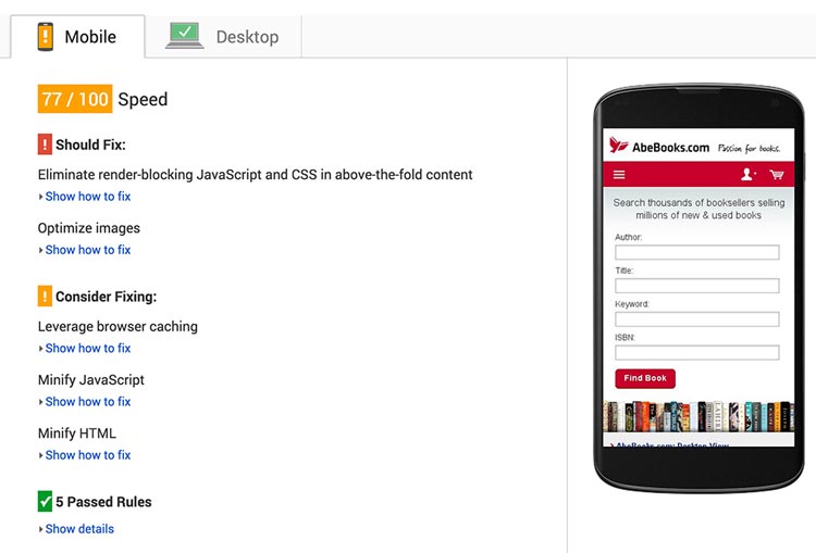
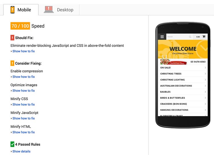
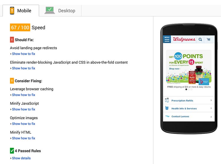
- There are several tools you can use to assess and analyse the speed of your website, for example Gmetrix and shown here is Google Pagespeed.
Cut the Fat
Mobile shopping experiences are the best when the focus is put primarily on the products. After all, it is about selling products anyway!
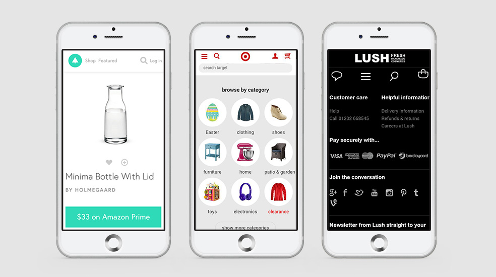
- Don’t clutter your page with excess navigation, excess information or excess promotions. Hide and remove all unnecessary parts. Let the user shop without delay and difficulties. For example, use hamburger menu for navigation to save space and not distracting user with unnecessary graphic or texts.
- Organise information nicely and clearly. Mobile users don’t want to have to hunt down what they’re looking for. Make things obvious to your visitors. Provide all necessary information where users should see your products, view very brief product information, and be able to proceed to checkout. Label tab or categories clearly, it will be very helpful.
To put it another way, imagine what would happen if you put all your clothes in your closet and not in folding form, just scatter them all over the place. What would happen when you’re in a hurry and trying to find your socks? Stressful and frustrating, isn’t it? That is roughly what it’s like when you clutter your page with so many things in a small screen size.
Quality Images
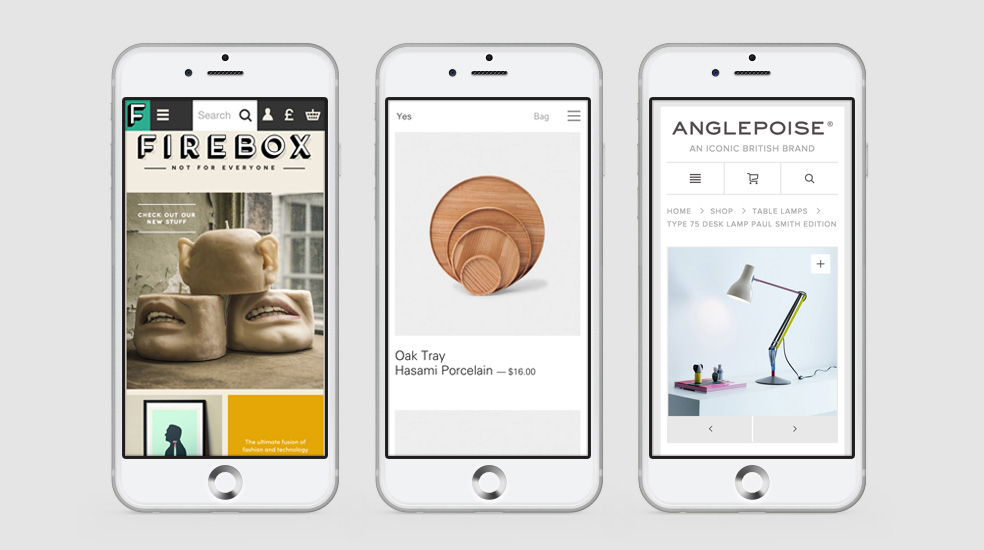
Because of small screens on mobile devices, products images should be big and of high quality. Good quality images are a key tool for online sales. The products need to be seen in detail. Blurry and small images make it difficult for users to browse your online store and this will annoy them, hence the bounce in the website.
- Larger images and good quality will make the user keep browsing your products and attract them more to buy the product.
- Make the shopping experience easy by preparing a multiple close up product image.
Big and beautiful images will embrace the limitations on mobile shopping. However be careful here, because big images means large data and slower browsing. What you need to have are images which are big, visible and nice enough to see on small screen size but keep the file sizes low and properly compressed.
Tips on image size:
- Typically, large high quality images should be kept between 100K and 60K.
- Smaller images should be closer to 30K and lower.
Legible Buttons
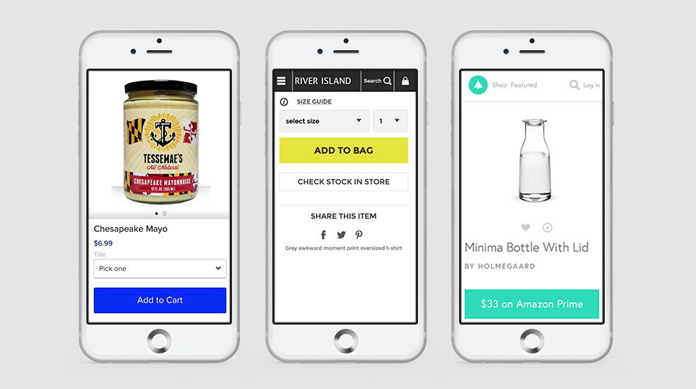
Mobile buttons should be thumb friendly. When your users are ready to be converted into customers, make it easy for them to finish the process.
- Make the call-to-action buttons noticeable. The checkout button should be big and available anytime an item is in the cart.
- Also take note that by using big buttons, jumbo sliders and giant input fields will increase user engagement and reduce bounce rates rather than using standard input fields.
Simple Processes
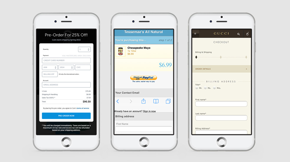
This is the most important factor in mobile shopping. Users want to go quickly from start to end. When designing a checkout experience, the step should be as simple as possible. The fewer steps required to make a purchase on a phone, the better.
- Speed out the checkout process by eliminate unnecessary steps such as user registration. Too many steps can break the flow and user will likely abandon the shopping process.
- Users should be able to find, evaluate and purchase an item as quickly as possible. If the checkout takes more than a couple of steps, display a progress bar that allows the user to see how many steps remain till payment process so that they are excited to receive their purchase.
- Providers should offer different ways to pay instead of just debit or credit cards.
Conclusions
There are many ways to create great mobile shopping experience. The 5 tips above may seem simple, but they can generate such a big impact on your online sales. In short, provide a simple, easy, and seamless experience for users and give shoppers an experience they won’t forget!
Do you have any tips of your own on how to improve mobile shopping experience?
References:
- Practical E-Commerce: E-commerce Design Trends
- Web Designer Depot: 4 Simple Ways to Perfect the UX of Mobile E-Commerce
- E-Consultancy: 6 Thoughts on Google’s Mobile-Friendly Search Announcement
- Kissmetrics: Surprising Mobile E-Commerce
- Shopify: Mobile Now Accounts for 50.3% of All E-Commerce Traffic
- MyCustomer: Mobile Commerce’s Nine Ways to Improve Your Customer Experience
- Shopify: Creative Ways to Improve E-Commerce Customer Experience
- Lemonstand: 9 Expert Tips on Designing Better Mobile E-Commerce Experience
- 3Q Digital: 3 Simple Steps to Improve E-Commerce Experience 2015
