In Part 1 of the User Experience (UX) Research series previously, we talk about the importance of conducting user research before we embark on design and development tasks. This is so we are set on the same page of building a product for the users we intend to have, instead of loading up on features and functionalities we think are good, when we are not the end users.
In UX Research Part 2, we shall take a look at one of the biggest questions that we had been asked: how do we know which methods to use, and when to use them?
To make this easy, I shall elaborate on the common methods we use based on three phases of UX project:
- Research
- Design and development
- Deployment and maintenance
Research
If we are about to define who the users and customers are for our product, there are several ways to find out:
Survey
Survey is one of the cheapest ways to find out who the users and customers are since most of the survey softwares out there are mostly free or affordable, and in next to no time you can whip something up and start gathering feedback from real users. Implementing the survey is the easy bit, the tricky part is preparing the questions as you won’t get the feedback you’re after if you don’t ask the right questions. Some examples of good questions would be:
- How did you learn about product X? Why did you decide to use product X?
- What were your goals when you started using product X? Did product X meet your expectations related to these goals?
- What are the the most frequent tasks you do using product X? Explain how you do these tasks (step by step)
- What other products do you use to accomplish similar tasks and why?
- When you are using product X, do you find anything frustrating that you wish was easier/different?
- Is there anything that you wish product X allowed you to do that it doesn’t allow now?
- What comes to mind when you think about product X (how would you describe it to a friend)?
- What do you like the most/least about product X?
You may find some other examples of good questions here in UX Stack Exchange, but bear in mind that the questions you prepare need to adhere to your specific set of users, otherwise we are not getting the feedback that is valid.
Persona

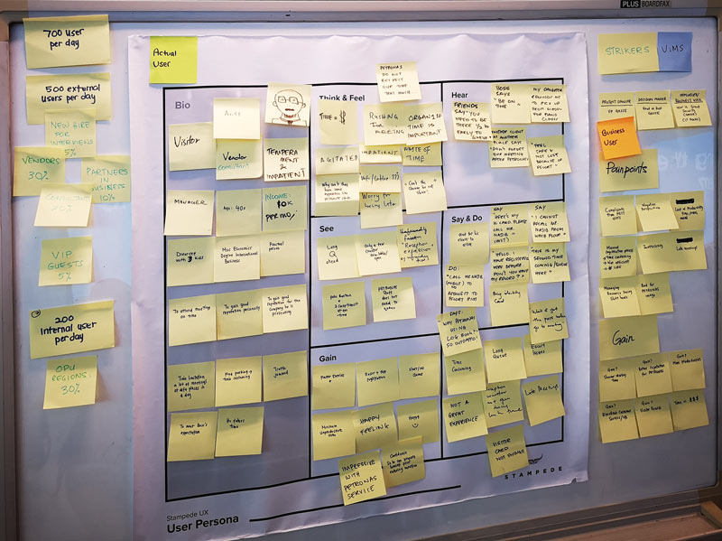
A persona by definition is a representation of the goals and behavior of a hypothesised group of users. What functions do they want, and when in certain stage of decision do they care the most? Think beyond gender, income and age, and look to tasks and domain experience as key differentiators. I have written about how to determine a user persona in a previous Stampede blog post.
Competitive Analysis
“Competition brings out the best in products and the worst in people.” says American businessman and pioneer in radio and broadcasting, David Sarnoff. Competitive analysis in UX context is a method for identifying the strengths and weaknesses of competing products or services before starting to work on our own prototypes. Here’s a good guidelines on how to conduct and prepare competitive analysis report.
Stakeholder Interviews
Stakeholder interviews are conducted with the key stakeholders of the organisations for the product: this could include customers, bosses, subordinates, or peers both within and outside the organisation. The interviews allow you to step into the shoes of your interviewees and see your role through the eyes of these stakeholders, which should answer the questions, “What do my stakeholders want from me? What do they need me for?”
Usually stakeholder interviews should provide enhance clarity on how your work as the UX team matters from their viewpoint, how they plan to assess the outcome, as well as identifying barriers and ideas to improve the situation.
Task Analysis
Task analysis, as defined in Interaction Design Foundation, is a simple and effective process for laying out tasks from a user’s perspective. It is sometimes also referred to as “user scenarios”. It is close to a creating a user story as defined in agile methodologies.
This approach helps you avoid the mistake of automating the frustrations that already exist or repeating past mistakes. It gets you to the bottom of what the user will want to do and the simplest, most effective way of doing that. One of the key challenges when conducting task analysis is to let go of what you already think you know and allow the user’s needs to guide the process instead.
Design and Development
As we have moved on to design and development phase, there are several questions before we move on to build final products:
- How will the interface look like?
- How effective will it be?
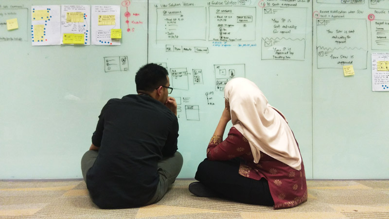
In Stampede, we use wireframing and prototyping approach to showing clients how the interface will look and function before we move on to design the final product. Ensuring that it works as intended for the target users in the minimum viable product (MVP) stage before we move on to the next phase, would save a lot of time as there will be only be minimum tweaking on the wireframes and prototypes before we finalise.
Wireframing

A wireframe generally is a skeleton of a page, showing the priority and the organization of things on the screen and how users will get to other parts of the site. While wireframes will vary in their level of detail, they reflect the designer’s ideas about the placement of elements on the page, the labeling of elements, site navigation, and how the user will interact with the site. Wireframes are usually shown to the clients during the early phase in design, ensuring that all parties involved in the UX project – designer, developer, client – are all in the same page about what should be in the interface.
Prototyping
A prototype can be defined as “a simulation or sample version of a final product, which is used for testing prior to launch.” The goal of a prototype is to test products (and product ideas) before sinking lots of time and money into the final product.
Prototyping is essential for resolving usability issues before launch. It can also reveal areas that need improvement. Once a draft of your product idea is in the hands of real users, you’ll finally see how they want to use the product. You can then go back and adjust your initial guesswork.
There are a number of prototyping tools for non-coders out there that turn images and sketches into functional, clickable screens like Axure, Sketch and Balsamiq. Your pick!
Deployment and Maintenance
Now that everything is functioning, it is time to understand how usable the product it is as we release it to our clients or users.
User Acceptance Testing (UAT)
As we adopt agile methodology in our UX projects, UAT is conducted by preparing a series of test scripts detailing functionalities and objectives according to user stories. The document is then presented to the client to conduct the testing, as well as to log the notes of defects. At the end of the UAT, the tests are compiled, assessed based on severity, and assigned to the team.
There are many ways to do UATs as well as adapting the UAT template to your liking. We personally use Google Spreadsheet as it is easily accessible to everyone, but if you have quite a number of testers, I would suggest to use tools to conduct UAT. Tools like EngageUAT have been receiving good reviews, so we look forward to try it one day!
Usability Testing
There are two ways to conduct usability testing post-launch: moderated and unmoderated.
In moderated setting, users are to attempt tasks under the watchful eyes of observers. These observers shall record their reactions to using the website or product, as well as encouraging them to voice out their opinions, whether pleasant or unpleasant, loudly. However, the observers are not to tell them what to do – instead, just watch as users interact with the product and record them.
There is an easier way to do this through unmoderated setting. Users can now attempt tasks remotely while we record their behaviour using tools such as Hotjar, UserZoom and UserTesting. Decide a goal, start recording, and watch results from dozens to hundreds to users in the same day.
Comparative Benchmark Study
Comparative benchmark study is what we do when we ask users to perform the same tasks in the products we built against other products mentioned in the competitive analysis. We would define some core metrics to be compared and tested between our products and competitors’ products like completion rates or checkout time taken and assessed the strengths and weaknesses in of our own products.
A/B Testing
Being Stampede, we are always trying to improve on things, for example, what would happen if we do enlarge this button or move it to the left – do you think it would affect user experience? As design and improvements don’t stop upon releasing, our rule is this: don’t guess, test. However, we do take into account of if time and budget allow us to further experiment, otherwise, the improvements are done gradually, subject to the clients’ approval.
Can you tell us more about the tools?

Now that there is a simple guideline on which UX methods to use in every phase of UX project, you might be asking – there should be tools to improvise each and every method, is that so? The answer is yes absolutely! We shall take a look at these tools in the Part 3: UX Toolbox.
What are the methods you often use during your UX projects? How have they helped you understand your users and build your products? What have you learned? Tell us about them in the comments section!
