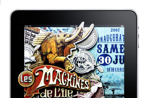
In my wonderful years of working as a web designer, I’ve developed a habit of browsing visuals and keeping a snapshot of anything intriguing. I snapped colors, color names, shapes, the immaculate use of white space, serifs, uncanny headings, scientific drawings, book covers, vintage packaging (hell, vintage anything!) and even hand-made circus illustrations circa 1910.
I’m not a classically-trained designer, so from the day I naively decided to be one, I rely primarily on observation and the readiness to stumble really badly and then gain a hopefully steadier footing. As a result, I rarely need to visit web design galleries prior to a design work. It’s good because all the snapshots I’ve kept steers me away from directly copying another designer’s work. It also brings about passive inspiration – the type that burns in your brain for quite a while before you find some good use for it. I’m happy to report that I have six years’ worth of this happy design baggage.
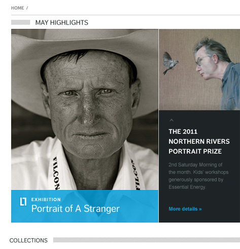
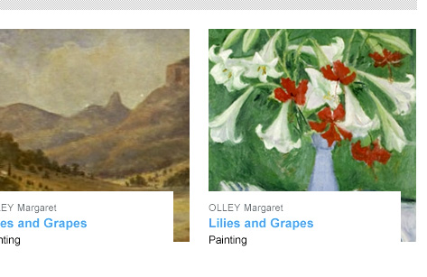
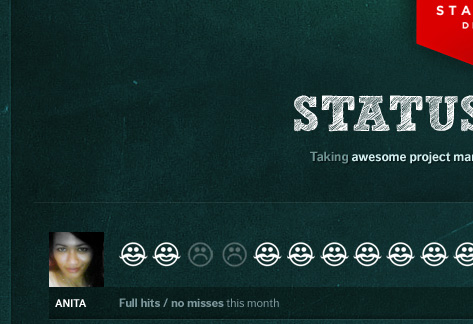
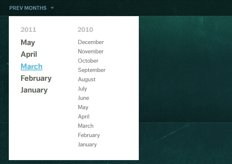
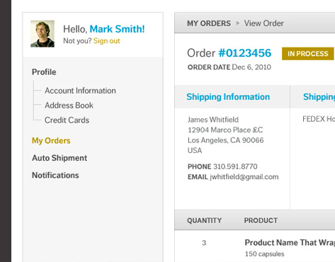
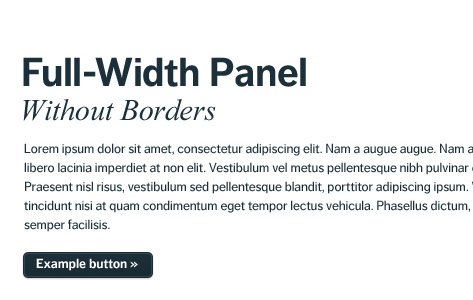
Here is a collection of a few design and UI work I did at Stampede for May 2011. Instead of a full shot, I’ve chosen bits and pieces that matters to me when observing another web designer at work.
In a way, this is a monthly design journal, but I do hope anyone who shares the same peculiarities as mine would find these useful for their very own visual musings.
