I think it’s really important you empower employees who wants to get better at what they do. Or help the growth of their fellow colleagues. Does that sound like a no-brainer? Not nearly enough.

The (real) good stuff is not money
Motivation and employee empowerment often takes a back seat when compared to sales, profit-margin, leads. You know, the money stuff. While monetary viability is the bloodline of any business, your people should be the pulse. Are they excited to be part of the team? Or are they just registering placid interest, day in and day out? After all, we’re talking of very smart people here. There are greatness in them that inspire you to hire them in the first place.
Case in point
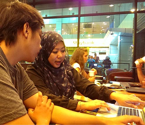
Our designer Dahlia is now in Langkawi for the next one week to work side by side with me. The moment I picked her up from the airport, she hit me with an idea of how we could help Sani, our front-end developer grasp all the small nuances of design and translate these little details into his HTML/CSS work. We decided that Sani, who only ever opens Photoshop to slice up layers, should design his own website.
We get from ‘Hey what if…’ and ‘I was thinking…’ to ‘Let’s do it!’ and ‘Who wants in?’ within a matter of minutes.
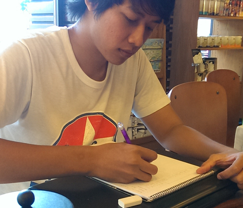
We work from Starbucks at Cenang Mall because well, coffee, and they have these really huge tables with enough space for all our mousing needs. Within 2 hours of Dahlia telling me this idea, Sani was already sketching his first website. It’s really exciting to know that your team is nimble enough to maneuver ideas into execution at such a short amount of time. We get from “Hey what if…” or “I was thinking…” to “Let’s do it!” or “Who wants in?” within a matter of minutes.
Sani’s big love is with inline skating (read his blog here) so we asked him to design a webpage for his SKROLS club. On his own. When he’s done, he’s going to build this website in Bootstrap.

Along the way, he’s learning a crash course in web design from us. Between Dahlia and I, we have over 14 years of design experience. But this placed us in new territory — we needed to communicate design by going back to basic, but not get too technical lest we lose the audience. We showed him how subtle differences makes for good design, emotions associated with colors, how to apply masking, understanding visual weight and hierarchy, Gestalt principles, typography for web, grids and folds and many more. We also demonstrated different ways of working with Photoshop and the considerations when designing a responsive website, going beyond the tools you use.
There were a lot of haphazard sketches and awkward finger gestures. Thinking back, Sani was probably too polite to say no to two trouble-making girls 🙂 No, we haven’t gotten to the Pen tool yet but when we do, we’re pretty excited to see him cringe.
If you’re in Langkawi this week, do stop by Starbucks in Cenang Mall — we’re 2 mins from the beach — and say hello!
