Malayan Banking Berhad has the most popular online banking website in Malaysia. They are also the pioneer of online banking services in Malaysia and among the first to introduce online banking facility, Maybank2u back then in year 2000. All major banks in Malaysia have since followed suit.
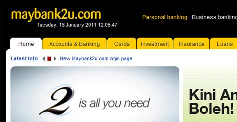
Maybank2u – Malaysian’s favourite online banking service
I have always been hoping that Malaysian websites would become better at adopting web technologies and employing smarter user experience design. I must say that despite being the most visited Malaysian website, Maybank2u does not take lead in both areas. In terms of design, it’s probably how a banking website should look, though I have seen better ones. Plus, I’m not in a good position to comment as I’m no designer.
Flashback…
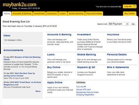
Personally, I think the navigation structure is somewhat unintuitive. I remember the first time I logged into the website some four years ago and was overwhelmed by the Dashboard. There was no visual focus on banking functions useful to me. I became distracted and felt a little lost.
Does your OS come with a digital clock? If not you can use ours!
So I decided to explore one banking options after another. The first one said, quite naturally, ‘Accounts & Banking’. Clicking the link took me to a page with a secondary navigation menu on left. But hold on, what’s that about ‘Bill Payment’? I thought I saw something about bills in the homepage?
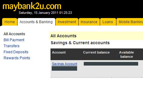
We have another link for you to pay your bill, in case the first link is, erm, down.
I then clicked the back button in my browser. It didn’t take me to the previous page. Instead it says, due to security, I was not allowed to use the back button at all and the system promptly logged me out. I felt frustrated and confused – how could the back button possible cause any security issues? (Update: It appears that the website now supports use of back button, notwithstanding their initial security concerns. I didn’t realize it until I test it again in preparation of this post.) I have tried another online banking websites before, but they let me browse the way I do, back button and all.
So I logged in again. And I saw that the homepage has a link that reads ‘Bills & Statements’ (although they meant different things). I was puzzled by the logic used by the UI designer when designing the navigation structure. When I clicked on the link, it took me to a page with a totally different main navigation structure. While the style looked the same, the main navigation structure was so out of touch that I’m certain they were built with the only integration to each other being the link.
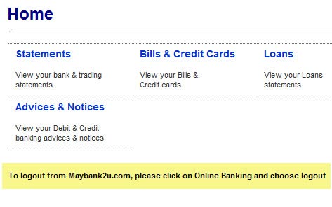
You must click on ‘Online Banking’ first before you log out, because… you are not on an online banking site now?
I felt uncomfortable browsing a banking website patched up like this. So I decided to go back to the previous section I landed on when I first logged in, to get some bearing. Again, forgetting about the ‘security’ reason for disabling the usage of the back button in browser, I clicked on it and I was logged out again.
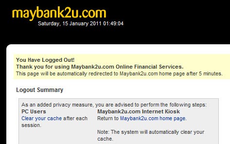
No, it wasn’t like this (this is when the user logs out on his own). I remembered clearly that they said I was not allowed to use the back button in my browser because it was not secure.
I couldn’t get used to how I need to change my browsing habits and got fed up by it, so I decided to discontinue exploring any further until I absolutely need to use its online banking service.
What Went Wrong?
I think what went wrong for me was:
- Confusing navigation structure
- Lack of visual cue on things ought to be focused on
- Enforcement of browsing habits change
Four Years Later…
It has been four years since I started using Maybank2u and I realized that the only thing they have improved is the support of the cautionary back button (duh). I don’t know when the change was made because since my first or second visit, I have made myself adapt to their no-back button policy until today (damn, I feel so stupid).
Maybank2u is not the only Malaysian banking website that causes my itch, but I will save the rest for another day. 😉
P.S.:
I tried to access Maybank2u today by the address maybank2u.com.my and it didn’t work. My gut feeling told me it’s probably caused by one of the most common issues with Malaysian websites—the www and Only www Syndrome.
So I tried www.maybank2u.com.my. Voila, it works, and I’m right about the www and Only www Syndrome. 😉
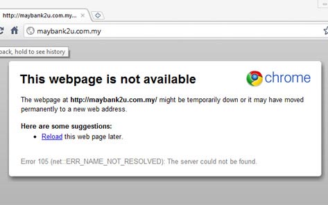
We vow not to serve any visitors trying to reach us without ‘www’ in the web address.
