 Stampede Design
Welcome to the third and last part of my Stampede UI/UX Apprenticeship Experience story. Previously in part 2, I talked about how I learnt to be more humble and a better team player with my colleagues through various assignments and client projects that placed an emphasis on collaboration. If you haven’t read the second part of my Stampede apprenticeship experience, you can read it here!
By the way the application for our design apprenticeship May 2021 is ongoing. The deadline is on Sunday 18th April so don’t miss it!
In this final blog, I’ll be talking about the last 2 months of my apprenticeship which centred around my final UI assignment where I designed a digital product from scratch. I also worked with my colleagues to organise Stampede’s first-ever remote design hackathon. Working on designing my own product was one of the most exciting and rewarding experiences in my entire apprenticeship because I got the opportunity to design a product that is very personal to me while having full control of the style. Let’s dive right in!
The Final Apprenticeship UI Assignment
You may have recalled that earlier on in my apprenticeship journey, I spent 4 months working on UI assignments and client projects. Fast forward towards the end, I received the final assignment to design a product that would end up being my case study – a Final Year Project of sorts. The assignment was to design a product with the design process entirely from scratch. I had two goals: The primary objective was to further develop my UI design skills and fine-tune my aesthetic design sense. The second was to learn how to test and continuously improve the usability of my design.
Coming Up with the Product Idea
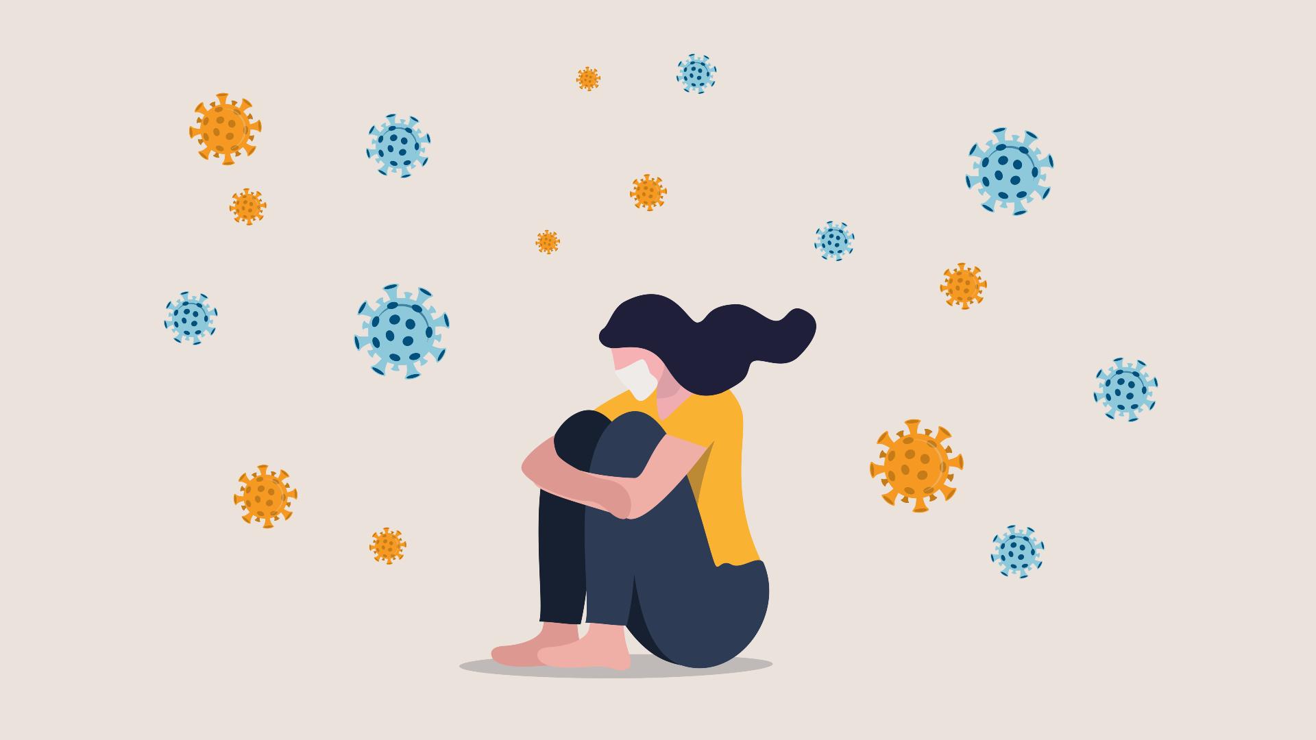
Prior to the assignment, I was playing around with a few potential ideas to choose from such as a mental health app, a home cooked food delivery app, virtual school web app for students, resume scanner etc. so that I could compare them and decide which one was both inspiring and challenging so that I could learn and grow throughout the design process. After discussing them with Shaza, the Co-founder and Principal Designer at Stampede, I ended up going with the idea of helping others be more aware of their mental health. When the pandemic hits, many countries go into lockdown, Malaysia included. The social and physical interactions we used to have in abundance pre-Covid were gone overnight. It was a hard time for many people.

Track time with Toro Timer
Toro helps remote teams stay productive no matter where they are.
The sudden lack of physical contact with others due to staying at home can leave people feeling they have nowhere to turn when they feel stressed or anxious. Previously, people could leave home for a change of scenery to reflect on their problems but the lockdown prevented that from happening. All the usual recreational activities like going out, music festivals, travel etc. were also taken away and it’s a huge adjustment for people.
In order to solve this problem, I proposed a mental health app that people could use on their smartphones and tablets so it would be easy for people to access the service. The other reason was flexibility for the user; having a mental health app can enable a user to explore options and complete mental and physical activities that improve their mental health at their own pace before deciding what the next steps might be.
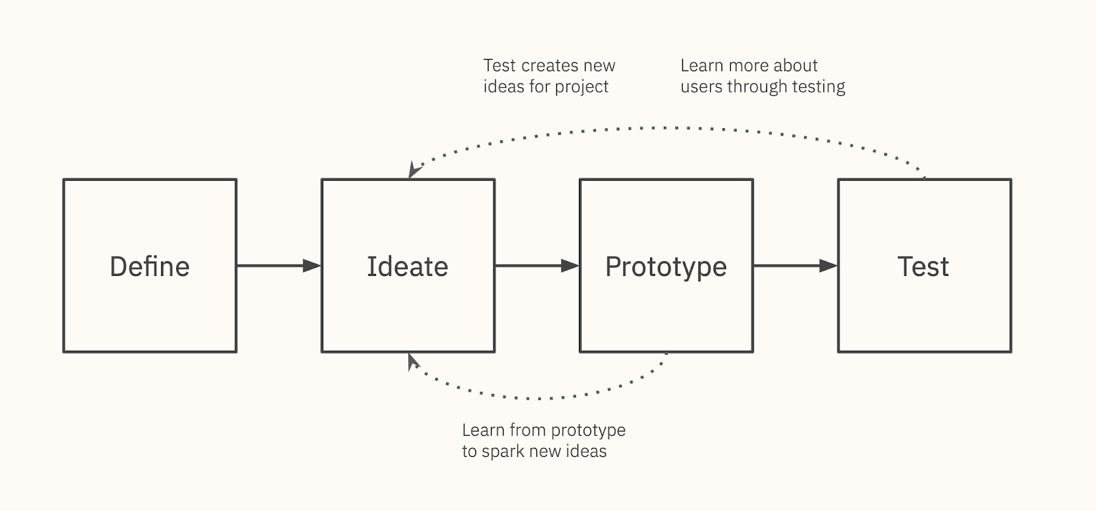
For the mental health app, I didn’t need to utilise the entire design process because the assignment focused on building up my skills on UI Design and Testing which were the last 2 parts of the process. Shaza provided me with a sample user persona and helped me define the problem to kick start my assignment. At this point, my design process would only have 4 steps as shown above. Usually, a complete design process would consist of empathising with the users first which is the first stage of the design process. Empathising consists of tasks such as interviewing potential personas, creating an empathy map from the information gathered from the interview. It would help the designers better appreciate and understand the problems our users faced thus designing solutions that solve problems for the users.
My mental health app, named Mindful, provides a self-paced step-by-step guide that guides users overcome their problems such as stress, depression and anxiety based on their user profile. It also has a special feature known as therapeutic photography that allows users to take photos of their favourite moments and create an album out of it so that the users can look back at their happy moments to destress themselves.
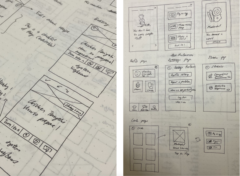
The first step of any design project is the exploration process. Sketching is a fine way to explore, but there can be other ways too. Before I started my UI design, I needed to sketch out my ideas with pen and paper because it is the fastest and most flexible way to see what the flow from one screen to another will look like or potentially work before designing them. Sketching also helps the designer check whether a button or element from one screen is connected correctly to the corresponding screen. Sketching wasn’t compulsory but it helped me to be creative and explore different versions of my ideas. I personally enjoy the process of sketching because I love the feeling of drawing on physical paper.
Components, Illustrations and Icons
After a few rounds of sketching, I moved my ideas to Figma which is a UI design tool to transform my sketches into digital components. This was the part I enjoyed the most because I got to create everything from scratch and I could also dictate the design style. I was encouraged to be adventurous and creative so I included custom illustrations called Calmly. I named it Calmly because the feeling the illustration set gave out, it calms the users looking at it with its colours. I have never done illustrations and icons set for a UI project before so this was new to me.
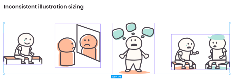
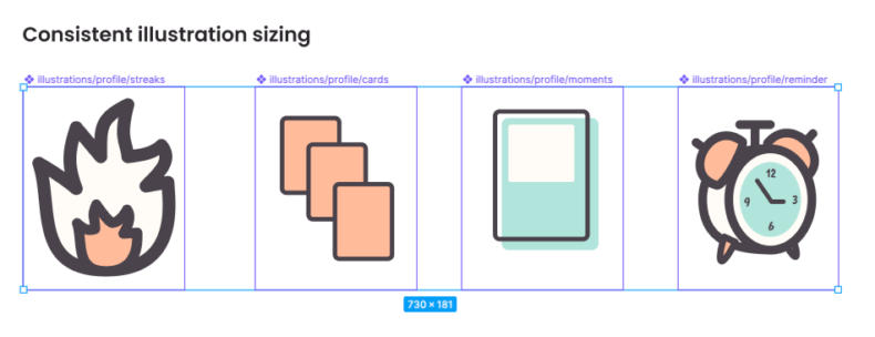
One of the biggest things I learnt was building a consistent illustration system. A consistent system would help me implement the illustrations easily on different screens without having to adjust the layout or position of other components. It would also help the developer to implement the illustration in production without them having to adjust the illustration sizing every time. I also learnt how to implement an iconography grid in my project which meant that the drawn icons would look consistent to users.
Besides learning about UI, I also learnt about accessibility in line spacing. In the course of designing, I learned to set my font’s line spacing between 140% – 160% because the extra space will enable better readability by giving each line more breathing room for the user to focus on the text.

Before testing my prototype with actual users, I excluded some of the screens like the login screen from it because they were not the core features of the Mindful app like the self-paced sessions and the therapeutic photography feature which were meant to help with the user’s mental health. Non-core features would only distract the users from focusing on the actual features. I also learnt that in general the number of screens to be tested shouldn’t be more than 30 because too many screens would extend the testing session and it would exhaust both the tester and the interviewer, affecting the overall results gathered. Another reason why the screens were kept at a minimum was because it sets a good constraint for designers to focus. It helped us to ask “How can we achieve the goal with as little screens as possible?”
Learning to test and improve a product
Usability testing is a process that is done in the last stage of the design process. Testing the product with actual users allows the designers to identify usability issues because real users may run into different kinds of issues while using the prototype. These issues would help validate the designers’ assumptions so that they can improve it later.
I learnt to prepare a few things so that my testing session would go well. Those things were a test plan, testing script, Miro board, and also scheduling the time with 5 actual testers. During this period, I received help to prepare the testing session from Ayu and Mabel who’re UX Designers in Stampede and are very knowledgeable on usability testing and user interviews. They taught me how to write the test script for the usability testing session which contains a list of questions for a section of the app that we wanted to test so that the interviewer can ask these questions to the users to gather feedback. I also learnt how to be mindful about other people’s time because I need to ask for their available time slot to do the testing as early as possible so that I would not interfere with their work.
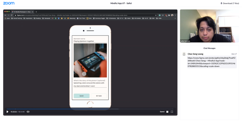
Each usability testing session usually involves 4 people who are the interviewer, the user who is testing the prototype and 2 note-takers. The picture above shows a recording of a remote usability testing session I did with Saiful, one of the Stampede designers. The reason why we have 2 note-takers is not only so there are enough people to catch all of the information the user is providing in the test, but also to have more than 1 point of view so that the notes don’t become biased because each note-taker might interpret an explanation differently based on their own perception and understanding. I alternated my role as note-taker and interviewer with Mabel so that I could train both of those skills.
After the testing sessions were completed, I used a virtual collaboration tool called Miro to consolidate the notes by combining them into one summarised and easy to understand explanation because not every piece of information provided by the user was useful for designing. There were also 2 types of notes taken. The first one was unmoderated notes which were notes about the tester’s interactions with a UI without any guidance from the interviewer. This reveals usability issues of the prototype. The moderated section focuses on going through each individual screen with the user and asking them about the screens in more detail. This part usually reveals additional ideas for improvements of the prototype and sheds light on what they may have struggled with or didn’t understand and why they did certain things.
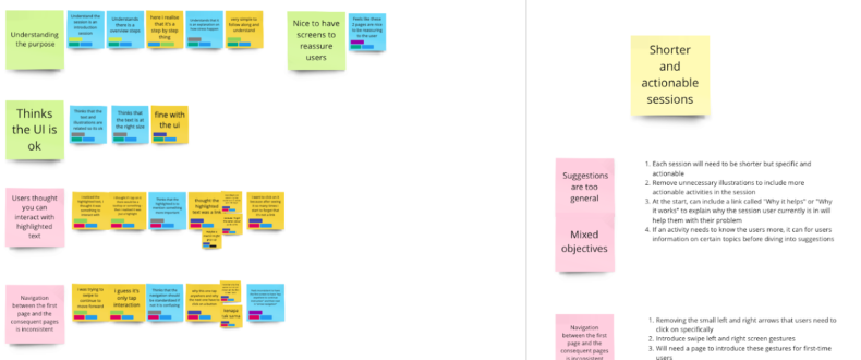
After the testing, I had to crunch all the notes taken from the testing. Data crunching is one of the most challenging parts. I needed to analyse consolidated data from the notes and come up with a simplified version of it. The simplified notes would help identify what was working in my prototype and what wasn’t. A simplified note is a summary of multiple notes combined, not only it helps the designer to write a concise and straightforward report, it could also act as an easy reference for designers to come back and refer when they are improving the UI. To do so, I needed to identify what was negative and positive feedback. The positive feedback was written on a green sticky note and the negative feedback was written on a pink sticky note. If the data crunching is done carelessly like not going through and understanding the meaning of all the notes to come up with a summarised version it would affect the report being written later because the end result produced was not backed by solid and convincing evidence and data.
So Did I Get It Right?
The last part of the process is writing a Findings Report. The report tells the client what works and what doesn’t so they can make better informed product decisions. As this was an internal assignment, I presented my report to Shaza and my other designer colleagues. The report includes findings such as how the user used the prototype and if they found it easy to use (positive findings) or got stuck (negative findings) and also recommendations for how to improve the product where there are usability issues.
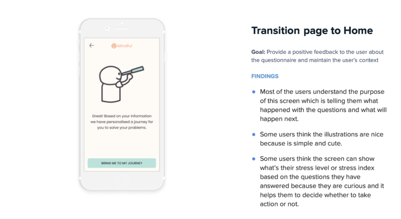
I actually failed the first time writing this report because my recommendations were solving surface level symptoms and didn’t propose solutions that addressed the root causes. This meant that the solutions suggested were ineffective at improving Mindful’s usability. I had to redo the entire report and one piece of advice Shaza gave me was to include the goal of each of the screens in each finding. By introducing the goal I was able to write better solutions that focused on solving the root problems with the app. After I finished the report, I used the recommendations from the report I have written to iterate my prototype and test it again with another 5 users.
When I was redoing my report, I learnt to identify the root causes of the negative findings written in my report by slowing down and thinking of the bigger picture. I would re-read the notes in my Miro board and sometimes replay parts of the recorded testing session to find out what I missed. The other thing was learning to set a goal or purpose for what I was doing. Shaza’s advice on setting goals for each screen helped me scope down my recommendations and saved me a lot of time identifying them.
With the information inside the findings report I created, I revised my prototype and repeated the process from preparing testing materials and platform to writing my second findings report from the second testing session. The second testing session was way better than the first one because the prototype had a more solid purpose and goal to help users improve their mental health. The biggest takeaway from this UI assignment for me was knowing the importance of setting a goal for each of the tasks I needed to complete. Setting a goal helped me to come up with suggestions that were concise and effective to solve the problem.
Stampede Designathon
Besides focusing on the Mindful app assignment, I also assisted my fellow designer, Adiel to organise Stampede’s first ever design hackathon a.k.a. designathon. It was a surreal experience to be honest because it brought back some fond memories when I was an active hacker in the hacking community before the pandemic hit us.
The designathon was only 1 day and the goal was to help people get to know each other better by working together, as the team had almost doubled over the past few months, some of whom had not had the opportunity to work with each other on projects. During the designathon, we had to design something that could improve our colleagues’ productivity, communication skills and mental well-being.
We have 6 teams and each of them consists of 2 designers. We also gave each of the team names related to famous cartoon characters duos. I personally like Team Mario & Luigi even though I was not part of it because I’m a huge Nintendo fan.
I teamed up with Mabel, our UX designer who specialises in user research. Mabel has been my mentor when it comes to research during our and I was excited to do pair-designing with her. We worked hard together and actively discussed the design we wanted to do for the entire day until it was time to present our designs.
At the end of the day, each team presented their designs to all the designathon participants. Mabel and I presented our design which was a Figma template that acted as a guide to anyone about design techniques or tools used in Stampede.
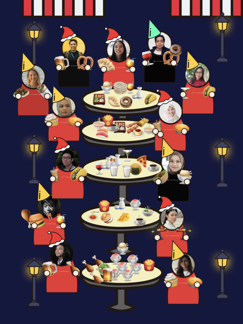
We also had a virtual after party a.k.a. Stampede Mamak at Figma which I built. We were just chilling at our virtual buffet session and also took a virtual photo from it.
Graduating from my Apprenticeship
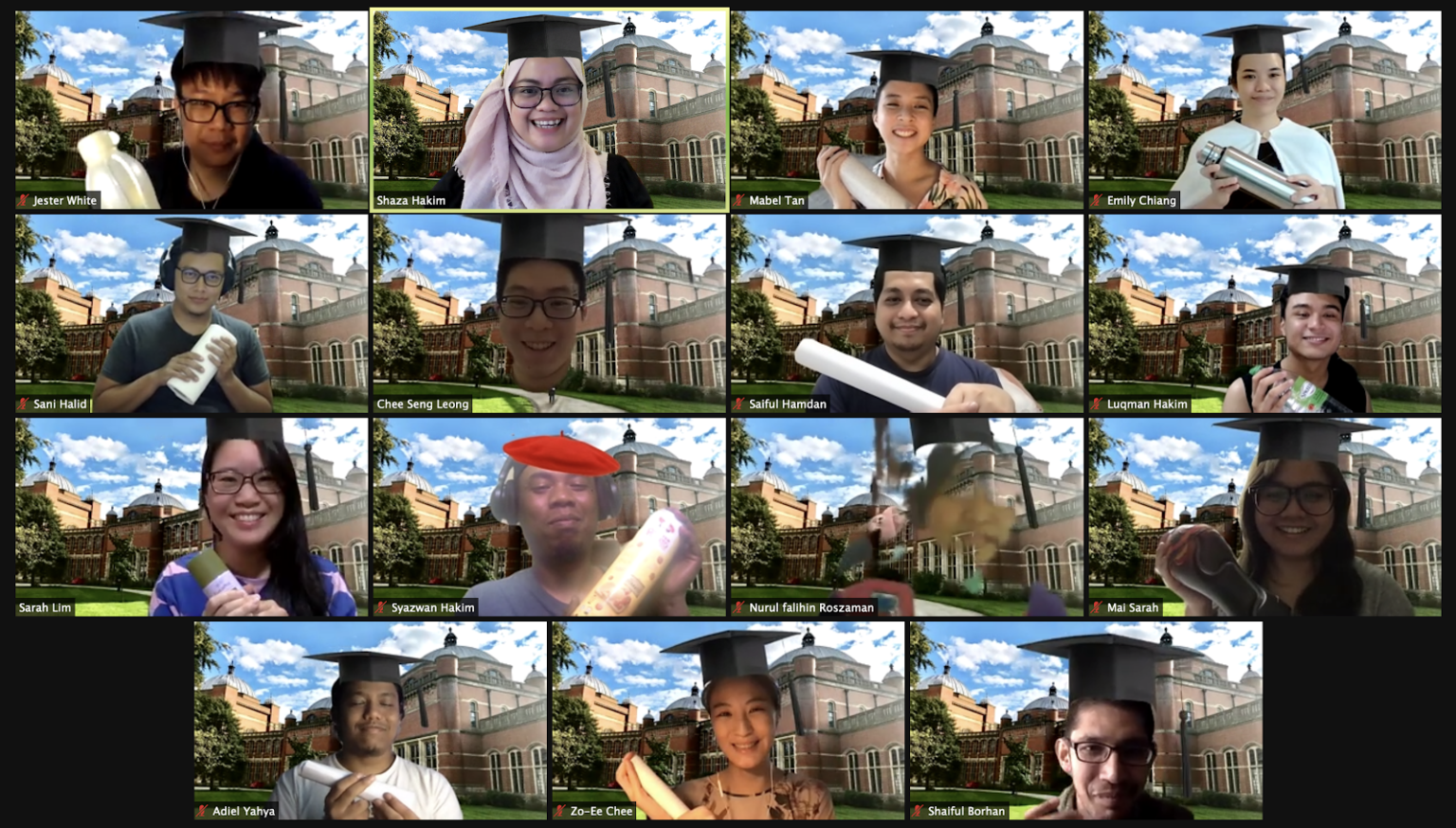
After 6 months of being a UI/UX Design Apprentice, I finally graduated as a design apprentice in early January 2021! We had a short remote graduation ceremony where everyone celebrated it by wearing a virtual mortarboard. To this day, I don’t know why Iwan decided to wear a red beret and hold a sandwich! I was also the only one who was not holding anything at all.
Takeaways from my 6 month Stampede Apprenticeship
Overall, the apprenticeship experience was very satisfying and fulfilling. I learnt more in 6 months at Stampede than I did as a solo-designer for the past 2 years.
Quality over Speed
During the early stages of my apprenticeship, I placed a lot of emphasis on learning quickly, completing my tasks and learning as fast as possible because I always felt insecure about my own skills and not being knowledgeable enough about any topic. However, there’s a downside to speed. I completed tasks without providing a solution that will solve root problems and the so-called solution will never last because it is only solving a symptom and not the primary cause. Shaza taught me to slow down and focus on understanding the core issue before looking for possible solutions. Going deep will enable me to go far because it enables me to solve the real problem in a lasting way. As I get used to doing this over time, I will inevitably get faster. Going slowly does not mean doing things slowly but to spend a reasonable amount of time to understand the problem well and find the right tools and methods to solve the problem.
Stay Hungry, Stay Foolish
Hunger for knowledge has always been my good friend throughout my entire design career but I got a little too confident in the middle of my apprenticeship about the things I thought I already knew. As a result, I was advised to be open to new ideas and learning from others. It’s about understanding other people’s viewpoints such as my colleagues’ and clients’. By thinking about what points they’re making, I can strengthen my own critical thinking, ability to discuss issues and ideas with others, and work more effectively as a team. This beginner’s mindset helped me to put aside my ego and helped me learn more effectively.
You’re an apprentice, you’re also “not an apprentice”
Even though I was an apprentice in Stampede, the company gave me the equal opportunity to try things out and contribute to actual client projects just like my colleagues who are full-time designers in the company. I was treated equally as well; colleagues would ask me for my opinions if I had experience on certain topics because Stampede encourages everyone in the company to be humble and ready to learn from others.
“Communication can make or break a team”
Overcommunication is better than assumption
In Stampede, everyone is encouraged to over-communicate their knowledge with each other because the company is remote and almost all of our communication is done through calls or messages in Slack. Assuming someone already knows something will lead to miscommunication between team members and brings unnecessary risk to projects like extra time spent to rectify the mistakes.
The Journey Continues…
My apprenticeship journey was only 6 months long but during this period, I learnt more about being a good designer, how to unlearn and relearn knowledge and most importantly, how to be humble. Those are important because they enabled me to build good relationships with my colleagues and be less stressed out and fearful when trying new things and developing new skills.
And so that’s the end of that’s my journey as an apprentice at Stampede. Beyond the apprenticeship, Stampede offered me to come onboard as a full-time designer. I happily accepted and am now practicing my design craft everyday with my mentors and colleagues.
This is the last part of my 3 part series talking about my apprenticeship experience at Stampede. If you are curious about my previous parts of my apprenticeship experience, be sure to check out Part 1 which talks about the stampede remote working culture, my apprenticeship assignments and Part 2 which talks about collaboration with my colleagues and my hands-on experience working with clients.
If you’re interested to become our design apprentice, Stampede runs this programme annually and the next intake is May 2021 which is now. You will be part of our Beta Class, learning the ropes and learning alongside world-class designers like I did. Application deadline is Sunday 18 Apr so grab it before it’s gone. Apply here!
