 Stampede Design
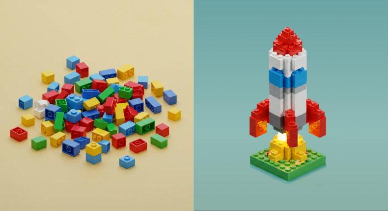
We often see this: A company has built out their digital presence across web and mobile, serving millions of users. Despite pouring resources into digital transformation, the cracks are showing. Somehow buttons, fonts and interactions feel disconnected. Users struggle with inconsistency, developers waste time reinventing components and the brand presence is diluted. What should be a seamless product becomes a patchwork of mismatched elements, like a digital Frankenstein.
Now think about your favourite digital services: the ones that just feel effortless to use. Every interaction flows naturally, and it all feels part of the same trusted experience. That’s not by accident. It’s the result of a well-structured design library, working behind the scenes to create consistency, scalability and trust.
As both a designer and a user, I’ve had my fair share of frustrations with clunky interfaces and mismatched branding in UI. And because of that, whenever I kick off a new project, I’m determined to avoid those pitfalls by building a solid foundation: the design library.
So in this article, I hope to share why building a robust design library is the key to tackling these pain points and creating seamless user experiences at scale. It’s also why I’m driven to write this: I’ve seen firsthand how a well-crafted design library can transform not just a single app, but an entire organisation’s digital ecosystem, something I’ll share further as we go along.
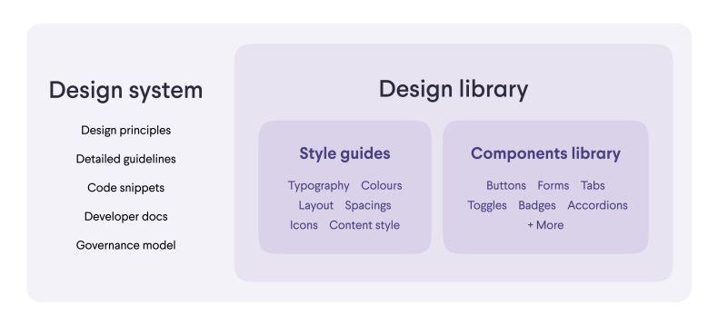
Design library vs design system
I will focus specifically on design libraries in this article rather than the broader concept of design systems. In simplest terms, a design library is a curated set of style guides and reusable interface elements like typography, color palettes, and buttons, that help teams maintain a consistent look and feel. A design system, on the other hand, goes a step further by having code-ready components, more extensive documentation, and processes that unify the way teams update and govern the design system.
While design systems offer a more comprehensive framework involving deeper collaboration with developers and product teams, most organisations might not need to start there. Instead, a solid design library lays the groundwork, setting the stage for a more scalable design system as the product and organisation evolve. Think of it as an early-stage design system, delivering immediate benefits in consistency and efficiency without overcomplicating things.
What makes a design library great
In the years designing products across startups and enterprises, I’ve learned one crucial lesson: the bigger or more complex the organisation, the more important this foundation becomes. Let me explain why.
First, design library is your brand’s digital DNA
When most people think about design libraries, they picture a collection of UI components from popular design systems like shadcn/ui, Bootstrap, or the default iOS and Android UI kits. Just grab a UI kit, change some colours, and call it a day. While this might work for simple products, we’ve learned the hard way that it comes with significant costs, especially for complex products and enterprise projects.
When a design library doesn’t carry the brand’s DNA, it leads to a generic-looking product, making it hard for customers to distinguish your brand from competitors. Look at Netflix, Duolingo, or Instagram, you can recognize them instantly, even without seeing their logos. That’s because the most successful businesses invest in design libraries that truly reflect their identity, extending beyond colors and fonts to shape the entire user experience.
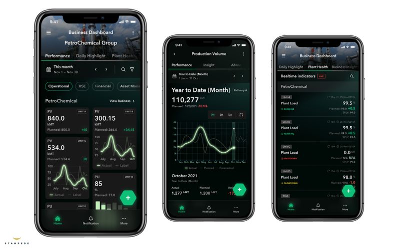
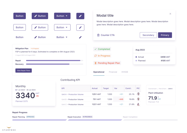
I saw this firsthand while we designed a mobile app for manufacturing plant performance monitoring. Rather than defaulting to a generic enterprise style, we worked closely with stakeholders to channel their brand DNA of efficiency and innovation into the design. We introduced a sleek dark mode interface that highlight key metrics without overwhelming the user, while giving the product a modern, cutting-edge feel. These choices not only supported advanced data visualization but also aligned seamlessly with the company’s future-focused vision.
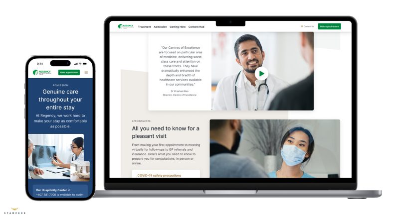
Similarly, our work on the HMI Group hospital website was centered around building trust, an essential factor in healthcare decisions. The brand DNA was translated into the digital experience by focusing on clarity, warmth, and professionalism. We used clean, structured layout to make medical information easily accessible, a reassuring color palette that conveys safety and expertise, and real imagery of doctors and patients to create a sense of reliability and human connection. These design choices helped establish a confident user experience, ensuring patients felt informed and supported at every touchpoint.
Handles the real-world complexity when basic UI kits fall short
One real story stands out. A Global Fortune 500 energy company approached us to revive a project that had failed three times and cost millions. When we looked deeper, we realised the core underlying issue. The previous teams had built solutions without validating their assumptions with actual users. Without a structured design library to support rapid prototyping and testing, each iteration became expensive and time-consuming, making real user validation impractical.
The impact then was clear: users struggled with complex workflows and data visualizations that didn’t match their mental models or daily needs. What could have been caught early through proper user testing had instead led to costly rebuilds.
We knew we had to take a different approach. So we started by asking questions like:
- How can we use a design library to accelerate our user validation process and reduce the cost of iterations?
- What patterns do users actually need for interpreting complex operational data effectively?
- How do we ensure our design system supports continuous user feedback and evolution?
From there, we built a design library that made complex industrial data analysis and reporting more accessible and intuitive. We implemented:
- Legible typography with a clear hierarchy, ensuring key figures stood out for instant recognition.
- Strategic spacing and balanced UI density prevented data overload by grouping related metrics, making dashboards structured yet easy to scan.
- Color coding provided quick visual insights such as greens for positive trends and reds for warning, to help users identify key data points at a glance.
- Visual cues like progress status and last-update indicators enhanced clarity, ensuring users could quickly interpret real-time data without unnecessary friction.
What truly excited us over the years was seeing the design library evolve into a scalable enterprise solution that served diverse user needs, from engineers tracking real-time equipment data to executives analyzing company performance metrics. Despite their distinct needs and technical expertise levels, users experienced a consistent, efficient interface throughout.
Designed for real people and real needs, instead of generic user personas
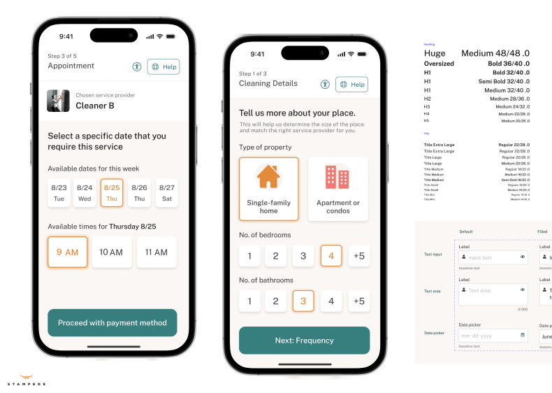
Sometimes, the most valuable lessons come from specialised projects. Take VivaValet, a digital product we designed to make technology more accessible for elders. Generic design libraries would have failed here because they don’t account for age-related accessibility needs like declining vision, reduced dexterity, and cognitive differences. So we needed to go deeper. Through extensive UI research, we studied how elderly users learn, interact, and think about digital interfaces. This led to crucial design decisions, like:
- Increased text size from 16px to 24px for better readability and less eye strain.
- Carefully selected typography optimized for legibility.
- Enhanced touch targets to prevent accidental taps, accommodating users with reduced motor skills.
- High-contrast color schemes tested with vision disability tools, improving visibility.
- Simplified navigation patterns aligned with elderly users’ mental models.
As surprising as it may seem, culture plays a big role in design libraries. What works well in one region may not translate effectively in another. Working across Southeast Asia has taught me that digital behaviors, expectations, and even visual preferences differ dramatically. A one-size-fits-all design library risks alienating users, making cultural awareness a key factor in creating effective, scalable designs.
Through research and testing, I’ve found that cultural considerations impact several design aspects, including:
- Visual hierarchy and UI density – Apps in Asia often have denser layouts compared to Western counterparts. This reflects cultural differences in written language structure. Asian characters convey more meaning per symbol, leading to a preference for compact, information-rich interfaces. Western apps, by contrast, use more whitespace and minimalistic layouts.
- Color meanings and symbolism – Colors don’t mean the same thing everywhere. In the West, red often signals errors or warnings, but for Chinese, it represents luck and prosperity. Similarly, white conveys purity in Western cultures but is associated with mourning in some Asian traditions. Understanding these cultural associations prevents unintentional miscommunication.
- Bilingual interfaces that feel native, not translated – Direct translation isn’t enough. Sentence structures, reading flow, and emphasis vary across languages. For example, Malay and Thai sentence structures differ significantly from English, requiring thoughtful UI adjustments to ensure readability and natural phrasing.
- Local payment behaviors – Even digital payments aren’t universal; different regions have preferred methods. In Southeast Asia, QR code payments and bank transfers are common, while Western users are more accustomed to credit cards and PayPal. A well-structured design library must support these regional differences without overcomplicating the experience.
By embedding cultural awareness into design libraries, we ensure that digital products resonate with real users, fostering trust and engagement. Rather than applying generic user personas, we tailor experiences based on how people naturally interact with technology in different markets, ensuring usability, familiarity, and long-term adoption.
Not self-limiting but continuously evolve to scale
Early in my journey, I could get away with rigid design libraries for smaller products. But enterprise projects taught me a valuable lesson: if your design library can’t evolve, your digital platform can’t either.
A truly effective design library must anticipate growth, supporting new features, products, and even entire business lines as you scale. Ultimately, a robust design library is key to removing friction when your product suite expands, ensuring consistent user experiences across new markets, functionalities, and digital platforms.
How do you know if your design library is too rigid?
A rigid design library often creates more problems than it solves. Some telltale signs include:
- Hardcoded components that break or require extensive customisation when a new feature or product is introduced.
- Overly prescriptive guidelines that don’t allow flexibility for different teams, leading to workarounds and inconsistencies.
- Minimal documentation or poor onboarding, causing teams to misuse or abandon the library altogether.
What does a flexible design library look like?
Now, I build design libraries that are:
- Component-based and scalable, ensuring that UI elements can be easily repurposed for new services.
- Structured for modularity, so teams can mix and match UI patterns rather than being locked into rigid templates.
- Supported by clear documentation and onboarding, ensuring that internal teams and external vendors can adopt it seamlessly
We treat our design libraries as living documents, continuously engaging with stakeholders and testing with real users to identify pain points and opportunities for improvement. This feedback loop ensures our design libraries remain relevant and effective, allowing organisation to grow without sacrificing brand consistency or user experience.

The joy factor, making digital products people love
Even in business contexts, emotional connection matters. When we worked with TNG ewallet on their in app parking, a locally infused microcopy was essential to making this an immediately resonant touch point for Malaysians. Users loved it so much they shared screenshots of our playful writing on social media.
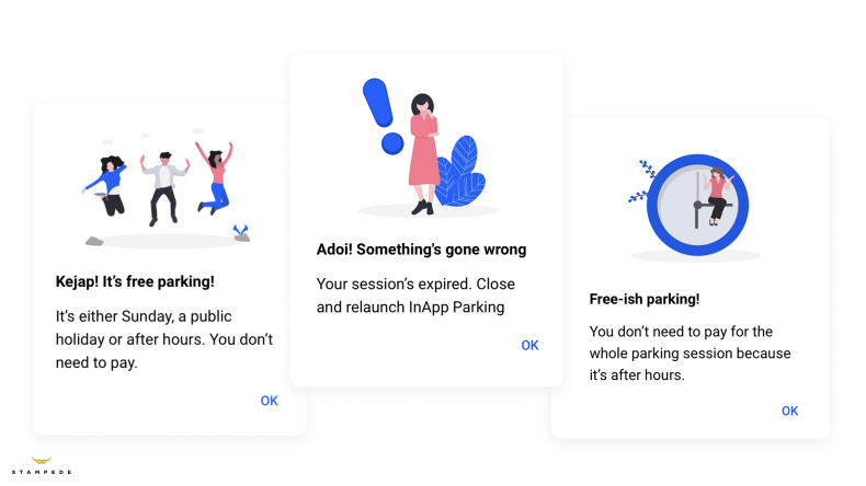
As a Malaysian born and bred UX design and development agency, we know Malaysians well. We believe that adding delightful, culturally relevant details is key to creating memorable experiences. By infusing the local culture into interface elements, microcopy, and overall design, we make digital products feel personal and engaging, even for something as everyday as parking or payment applications. This human touch can transform mundane interactions into moments of genuine delight.
Real business metrics improvements
Remember that Fortune 500 enterprise project we redesigned? The results speak for themselves:
- 90% Monthly Active Users (MAU)
- 30% improvement in Manufacturing Plant Cycle Efficiency
- 50% reduction in plant interruptions
- Expansion across 14 applications
While the design library wasn’t the sole driver of these metrics, it played a crucial role in enabling rapid prototyping, structured validation, and efficient design production, helping teams iterate faster and implement changes at scale.
What surprised me the most was seeing other projects within the same enterprise begin adopting the design library, amplifying its impact far beyond the original scope. With a shared system in place, teams could build upon existing components, reducing duplication and streamlining workflows. This is the testament to what I mentioned in the introduction: a well-structured design library doesn’t just improve a single app; it has the potential to scale across an entire digital ecosystem of the organisation.
Over time, we’ve consistently seen how a well-structured design library accelerates operational excellence:
- Product and development teams release features faster
- Different departments easily maintain a unified brand
- Updates and maintenance become more efficient
- New team members quickly get up to speed
- External vendors deliver high-quality work with fewer inconsistencies
Ultimately, these metrics highlight that a well-structured design library isn’t just about looks; it’s a strategic asset that boosts operational efficiency, ensures user satisfaction, and strengthens brand credibility across the entire organisation.
Hard-won lessons: what actually works
After building design libraries for everything from small startups to major enterprises, here’s what I’ve learned:
Lesson #1: Start with understanding
Instead of jumping straight to UI components, start by understanding your users, operations, and vision. The strongest design libraries are built on deep insights, ensuring they address real needs rather than just assembling UI elements.
Lesson #2: Build for your reality
Focus on creating components that solve your specific challenges. Align your library with your team’s workflow and product requirements so it grows with your needs instead of forcing unnecessary constraints.
Lesson #3: Think long-term
Approach your design library as a strategic investment rather than a quick fix. The most successful libraries support where organisations are going, not just where they are today.
Lesson #4: Test with real scenarios
The true test of a design library is how well it handles your most complex use cases. Every library improves dramatically through thorough testing with users in real scenarios.
In fact, we’ve found that with the right foundational elements in place, you can go from hypothesis to user-tested prototype in a 5-day design sprint. Because the UI components already adhere to consistent branding and standards, teams can focus on testing new ideas, rather than building everything from scratch.
Final thoughts: Building a foundation for lasting impact
A well-designed design library is more than just a collection of UI components. It’s a foundation for digital success. By investing in a robust, flexible library, you can accelerate product development, create user-friendly experiences, and ensure your brand stands out in an increasingly crowded market.
At Stampede, we’ve helped organisations build design libraries that truly transform their digital capabilities. If you’re considering this for your organisation, let’s discuss how we can create something that doesn’t just look good, but delivers real impact. Reach out to [email protected]
