User research is the backbone of UX, helping us uncover what users really want and need, leading to better-informed design decisions and ultimately, more successful products. We had an opportunity to truly implement this with a global bioscience client when they wanted to find out what their employees thought of the company’s internal IT services. Our mission was to collect quantitative user data on the overall IT service experience, in order to uncover user pain points and IT issues faced when getting support and services.
We started by understanding how the company divides up its job functions and roles, so we could then find out how each division used IT services and how satisfied they were with them. These findings would then inform the company’s service roadmap to improve the future IT service experience.
Knowing that we had a large target audience of over 4,000 employees in 40 countries, the best solution for us was to conduct a global survey. Now, the million-dollar question: how do we run an effective survey?
Here are five lessons and best practices we gathered from our survey design journey:
1. Break out of the box: Adapt existing research methods to your needs
Effective survey design boils down to being able to capture all that you seek within your survey questions and structure.
Our survey design challenge was to accommodate:
- the company’s complex organisational structure, where employees may hold roles that overlap multiple divisions. We needed to validate the assumptions made to ensure that we had accounted for all employee work scopes.
- the fact surveys are usually quantitative and therefore limited in the qualitative depth we can collect
We managed to overcome these concerns by designing a mixed-methods survey. We prioritised which questions needed qualitative questions most, and made them optional so users did not feel compelled to answer them in order to complete the survey.
The quantitative questions allowed us to collect responses from a large group of global employees, whereas the qualitative questions gave us insights and a deeper understanding of the respondents’ behaviours and thoughts.
2. Keep it short and sweet: Only ask relevant questions
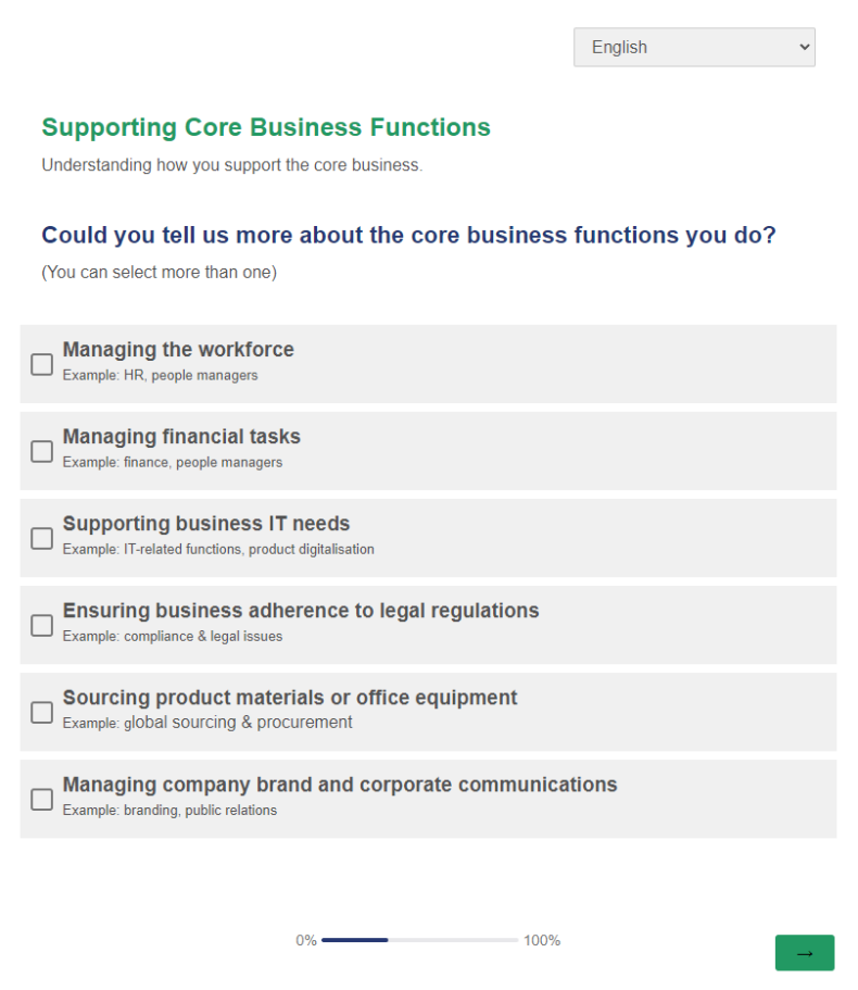
As the employees’ job scopes tended to overlap and extend into multiple divisions, we faced the challenge of making sure each employee only saw questions that were relevant to them. We introduced conditional questions which allowed for this flexibility. We only asked what applied to them, based on their answers given in the key conditional questions. These were placed early on in the survey to accommodate branching off into relevant survey sections.

By asking relevant questions, we will keep the survey short and respondents were more engaged when completing the survey.
3. Simple is best: use plain language
Through our pilot testing, we learned our questions were sometimes too long or used words that were unfamiliar to the respondents. This challenged how we would standardise our typical question structure for the most effective outcome, which was to gather accurate and insightful data.
We ended up just keeping it simple. For question phrasing, we avoided using heavy, technical jargon and chose to use clear, easily understood terms instead. To make sure our respondents understood the question being asked, we included a description and some examples to better explain what the question meant. Keeping the questions succinct also makes it mentally less taxing for the survey respondents.
4. Know your audience: cater to demographic needs
Being familiar with who you are collecting survey data from is important to run an effective survey. Our target audience was a very diverse and international group who were multicultural and multilingual. We discovered from our pilot survey testing that not everyone is proficient in communicating in English, and they preferred using their first language instead.
In order to not let language become the barrier to getting good user data, we worked with some of the employees to translate the survey into the company’s 7 most used languages: Danish, German, English, Spanish, French, Portuguese and Simplified Chinese. A key factor to note is that when doing translations, the nuance and meaning should not be lost in the process. This is so all users have a consistently similar understanding of the questions.
5. Look and feel matters: design a familiar experience
Survey response rates are another telltale sign as to whether you are running an effective survey. A visually pleasing design improves respondents’ experience and willingness to complete the survey. For our global survey, we used the company’s brand colours to highlight elements and anchor the survey design. The colour usage and font styling helped define the overall survey structure and hierarchy of survey elements, such as the question, description and answer options.
Another good rule is to keep your related questions grouped in survey sections. This helps the respondents understand what is being asked easily, without breaking their train of thought.
Customise and own your surveys
Effective survey design doesn’t have to be complex; you can tailor your solutions to your users’ needs and capture both quantitative and qualitative data easily. Be ready to explore ways to collect data needed through survey design while understanding the strengths and limitations surveys have as an exploratory and validation tool. When in doubt, test it out and refine your survey design accordingly.
Happy designing and researching!
