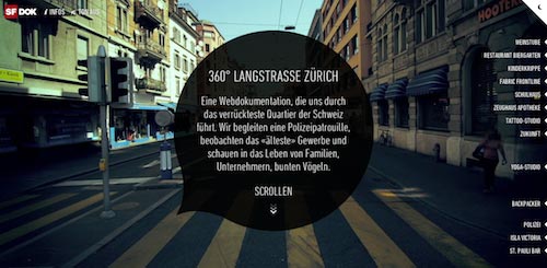
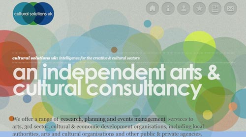
It’s official: all the guys (and the girls) in Stampede are crazy about parallax scrolling effect. It has found its way into almost every requirement and statement of work we have – it is almost like we are trying to find an excuse to use and experiment with its capability. Furthermore, it’s the in thing. Every web folk should know it.
Parallax? Well son, elaborate.
If you must know, parallax scrolling effect is like the coolest magic trick to hit the web design shores at the moment. Before this it was used widely in video games for years. According to Line25, the effect became popular when it was implemented in the background of Silverback app website. Back then it was only used as an Easter egg – visible only when the browser is resized. Now the effect has since evolved and seen as part of a scrolling feature of a web site, where multiple backgrounds seem to move at different speeds.
Hm, I am intrigued.
But how does it work?
You are lucky. Here I have in my sleeve is a showcase of three of my favorite websites with this effect – let me show you how awesome it is. Don’t only take my word for it – please also click on the links and experience it for yourself.
#1 – 360 Long Street Zurich
Concept and design by Hinderling Volkart, Zürich, Switzerland.
If you are being observant after you are done picking your jaw off the floor, you would notice that 360 Long Street Zürich is filled with eye-catching elements. It is another one of those little big details discovery in user experience.
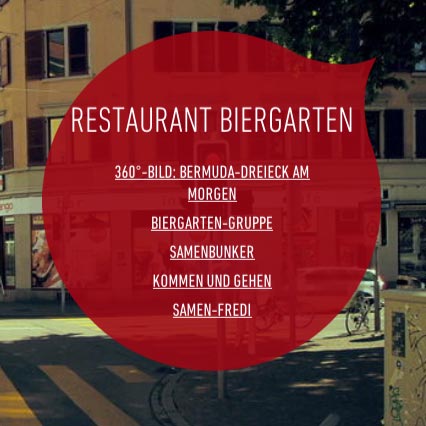
These bubbles in red animate as you encounter them by scrolling through the street along the way. Click on the information underlined and you will be taken to another realm – for example, another person’s room where you can further explore his/her room by more scrolling and listen to his/her favorite music.

The icon on the top right of the browser will let you experience the street life in Zürich whether it is day or night. And if you are careful enough to notice, every people we see on the streets have their faces blurred.
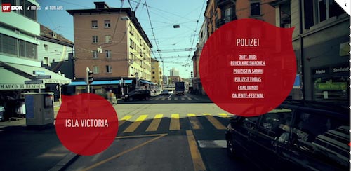
The parallax utilization in this website is made by extracting images from a video scene. When scrolling started, the menu on the right screen will fade out and animated video images will appear until video ends. A high resolution image will appear when scrolling stops.
As you scroll, flying bubbles will move from the bottom to the top, in left and right curve directions.
#2 – Cultural Solutions UK
Concept and design by Hoohaa Design.
Cultural Solutions UK is one of the websites with parallax scrolling effect that I had my eye on. Staying true to the nature of a designer, I could not help noticing some eye-catching elements implemented in this website.

… like these cute icons distribution to the buttons.

Or the fact that the animated background will follow the cursor along the header. (You have to give this a try yourself to see how it works.)

Not to forget the noticeable heading designed with good color contrast and excellent choice in typography.

You gotta love the scrolling news ticker for its Twitter feed too!
Unlike 360 Long Street Zürich website, the parallax utilization for Cultural Solutions UK is not that heavy and complicated. The effect is mostly applied to the menu buttons, but it is enough to add that wow factor to the website.
#3 – Smart USA
Concept and design by Smart USA itself.
I believe this is my favorite out of all three. Everything in the website – the title, the description and the visuals are so appealing you wish you had worked in this.
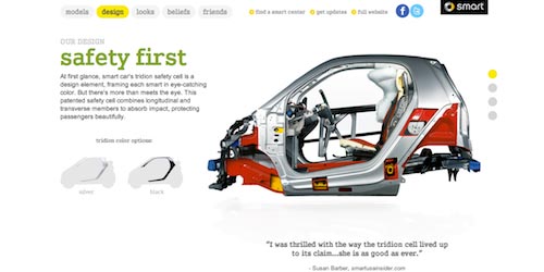
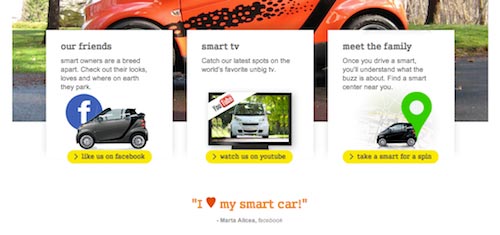
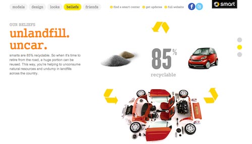
How the parallax effect works in here that as you scroll in the homepage, the car would zoom in closer to you. In fact, most of the navigations are done by scrolling, but if you get tired of doing so, you can always click the buttons in dots at the right corner of the site.
Cool! So, how do I learn how to achieve this effect?
Parallax scrolling effect is done with the help of well-defined images, jQuery and CSS3. There are many tutorials you could find around the web – among these are ones done by WebDesign Shock, Richard Shepherd and Theme Forest. You could also go see behind-the-scene works that goes into the making of Nike Better World website, the pioneer of parallax scrolling effect in web design.
Awesome! I will go create one now!
Good luck!
