Constructs, our resident curated content miniblog on front-end development was born out of the idea that we at Stampede, of course, love sharing every bit of knowledge we have hoarded. Created in May 2014 and was shared to public 2 weeks later, Constructs is updated daily with tips, tricks, articles and demos from brilliant web developers from all around the world.
I was tasked to update and curate the content daily at Constructs, which is really exciting. Here’s why.
Sharing & Learning
Before this, the designers and developers at Stampede are always Googling for solutions whenever we encounter any roadblocks. When we found the solutions, often times we just set it aside in our own bookmarking tools. One day, we decide, “hey, why not share the solutions we found with everyone too?” and that was how Constructs was born – to compile all the tricks, hacks and trips every one of us have collected from amazing people.
But just taking in the advice would not be right – we want to give as well.
Guest Post
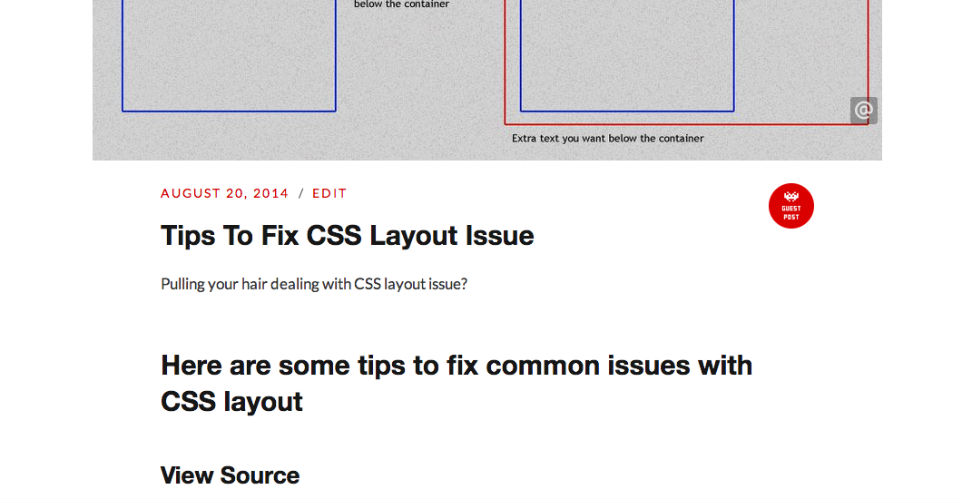
Stampede is a team of brilliant people who do brilliant work and solving a number of user experience design and development every day, sometimes effortlessly. We decided what better than this than to create a Guest Post section to feature tips from favourite front-end developer, Syazwan Hakim and web analyst, Shaiful Borhan.
These guest posts are easy to identify, there is a little badge located at the most right along the article headers.
Top Posts
Here are some of the top posts in Constructs:
Pure CSS Parallax Effect
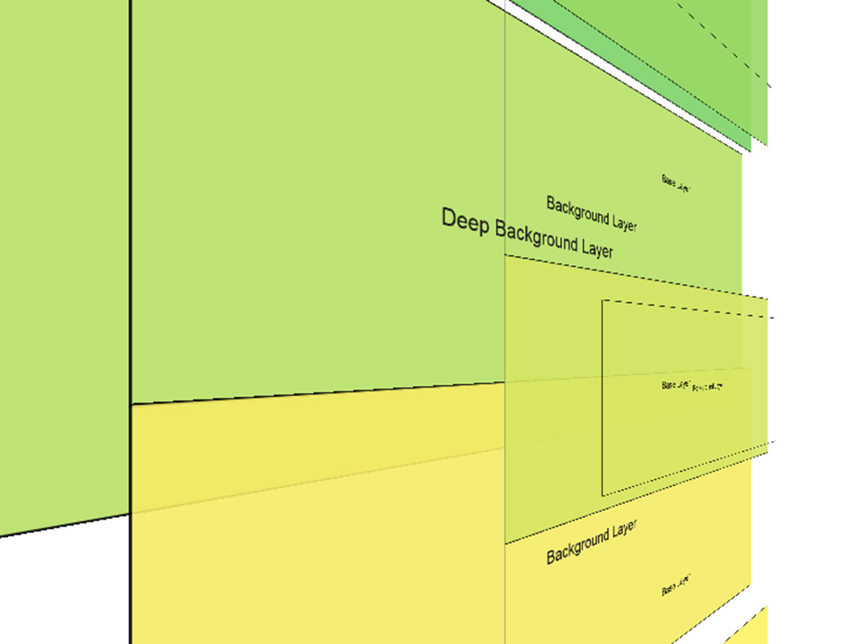
Parallax effects are almost always handled with JavaScript and, more often than not, the result is not very impressive. In his blog post, Keith Clark found a way to achieve purely CSS parallax effect thus removing all the web performance issues. The result is consistent frame rates and perfectly smooth scrolling. You can also combine the effect with other CSS features such as media queries or supports. When used for the right purpose, CSS parallax effect engages user better and gives them that extra delight while scrolling down your website.

Bootstrap VS Foundation
At scotch.io, Chris Sevilleja loves to talk about Foundation 5 framework by ZURB. Foundation 5 is a great front-end framework that is a solid alternative to Bootstrap. It does have a few features that Bootstrap doesn’t, hence it deserves a look at the features before being dismissed. In this post, Chris outlined a cheatsheet about the difference of Bootstrap vs Foundation in terms of CSS elements, class names and also grid names.
CSS Animation Effect Libraries
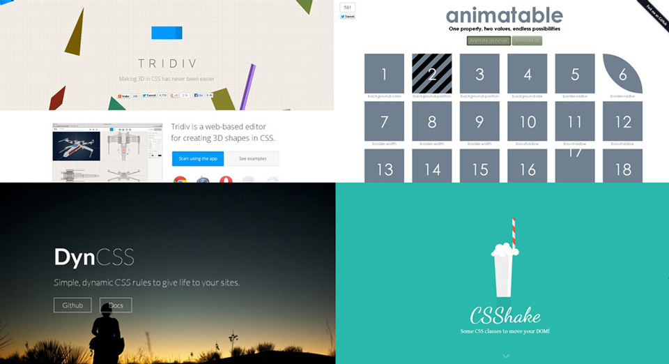
Clever use of animation on websites can certainly make them look more attractive and eye-catching to end users. However, poorly coded animations can easily hog down system resources especially on mobile devices causing the page to feel laggy. Codegeekz author Gavin has compiled a list of 18 CSS animation effect libraries that should help you get started with animating your websites or simply for poking around.
CSS Glitch Effect
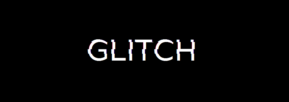
Chris Coyier showed us the mechanics behind Lucas Bebber’s stunning CSS effect called Glitch. Chris created three copies of the desired area via pseudo elements and these copies are positioned right on top of each other and they can be controlled individually. View more to see his complete guide to create the CSS glitch effect.
Pure CSS Drawings Cartoon Character
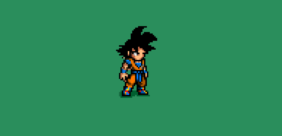
Front-end developers’ creativity in “drawing” using CSS never cease to amaze me. This is not limited to static illustration only but also includes animated CSS drawings. Check out the link below to view a collection of cool CSS drawings of cartoon characters by cssdesignawards. Love the pixelated Son Goku!
Steps To Draw With CSS
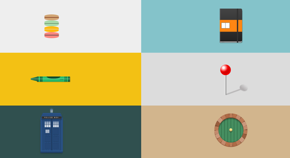
With the latest advancements in CSS, creating images or icons is no longer a rare thing. By using only one div, you can pretty much “draw” purely in CSS. In this article by Lynn Fisher and Robert Nyman, the authors walk through the basic steps to draw with CSS. As mentioned in this related post, CSS pseudo classes are the basis of this technique in addition to using various borders, background colors or gradients and shadow combination to produce generic shapes.
5 Thing Front-End Developers Should Learn In 2014
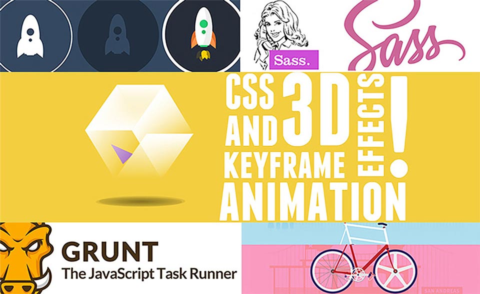
The web industry operates at a breakneck speed and so all front-end developers must continue to learn and keep up to date with the latest trends, methodologies, languages and techniques. In this compact yet excellent article by Joe Howard, you will find 5 useful skills you could master this year that will help you remain at the forefront of the latest web development know-how. Think SASS, Grunt, SVG, CSS animation and custom parallax.
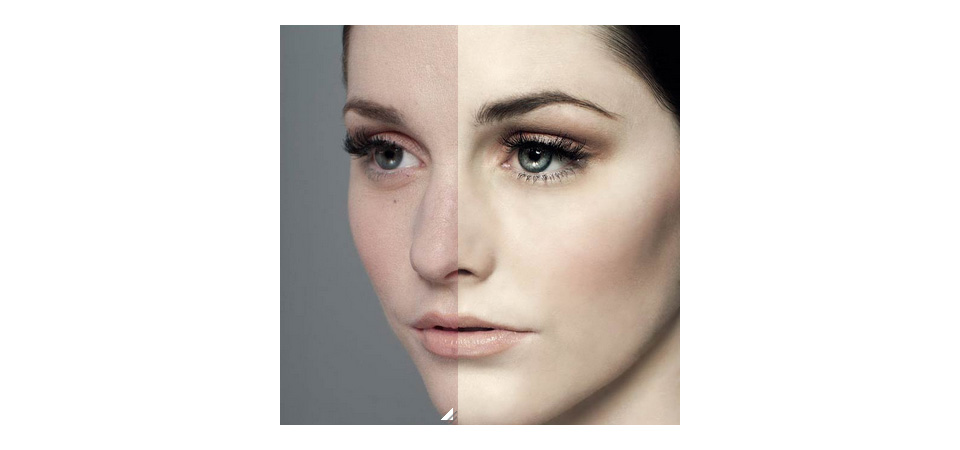
Pure CSS Image Comparison Slider
An image comparison slider is a good design approach allowing user to compare differences between two images. After seeing post about “Before and After” by Dudley Storey, Lea Verou has created an experiment to create the same effect by using minimal and purely CSS code without JavaScript. The original markup shows images as CSS backgrounds, so it posed a problem for screen readers. Instead, Lea overlaid a div on an image and made it horizontally resizable through the resize property.
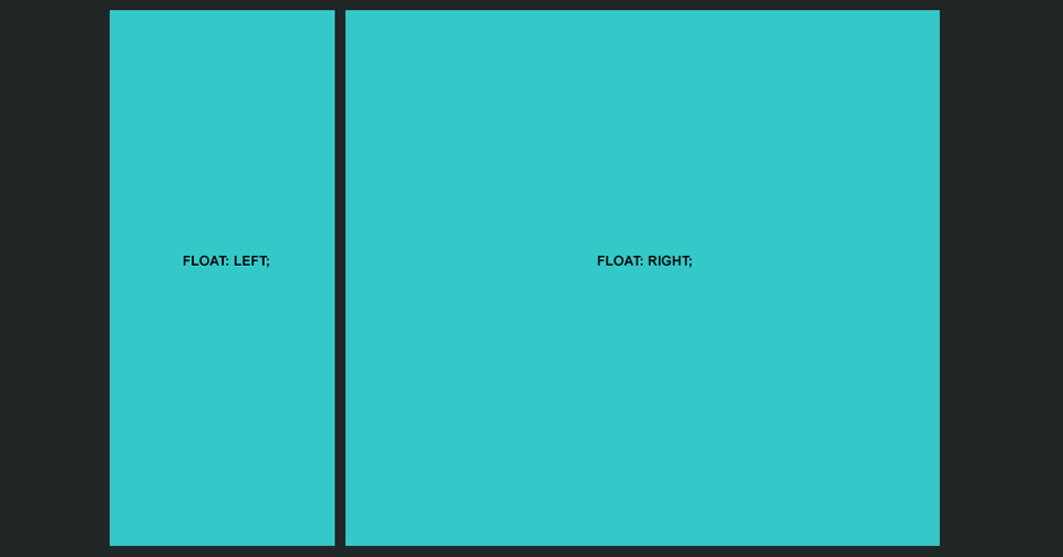
Alternative Using CSS Float Properties
If you have been designing for the Web at all over the past decade you are undoubtedly familiar with the CSS float property. Since the industry adopted the principle of tableless layouts, floats have been the weapon of choice most of us use to lay out our web pages, but is it the best choice?
Conclusion
Over a few months of running Constructs, I have learned a lot from the articles and demos scoured around the Internet as well as those shared by Syazwan and Shaiful. It also inspires me to be experimental and apply some of the ideas into my projects. We also share our Constructs posts in our Google+ page and some of them have received so many positive feedback. It really made me happy to be able to also inspire people in our industry as well.
Feel free to visit our Constructs and tell us what you think!
