 Stampede Design
If you’re like me then you’ve been getting your news from subscribed Facebook feeds and bookmarking websites that publish content that is of keen interest to yourself.
When was the last time you actually read a newspaper or a magazine?
It’s an obvious trend where the media is moving to, and that is from print to digital. In the last 10 years there has been a noticeable shift of designers who have moved from print to digital, not because the print industry is falling behind but rather what the Web has to offer.
Chances are the reason why you’re reading this is because you’ve thought about dabbling in the arts of web design. While the design methodology of both forms are similar, there are distinct differences that you should know before making the jump. Let’s take a look at the essential preparations needed before taking the leap.
What do you already have?
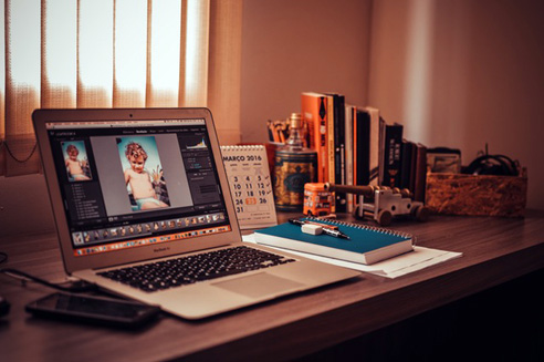
For starters, be glad that you already have the fundamentals of design. You understand object placement, spacing, colors, typography, all of which are translatable from pamphlet to webpage. Your skill and knowledge in image processing software such as Illustrator and Photoshop are still relevant because you’ll still be needing these programs to create a website’s key design template and mocks for webpages.
What you need to know
Layout
While much of the fundamentals shared between print and web are the same, the layout is for each can be very different. In print, your creative brief tells you what physical medium you’re going to be designing for. This can range from posters to giant billboards. The size of the medium is already fixed and you can begin designing a layout that harmonizes all the elements
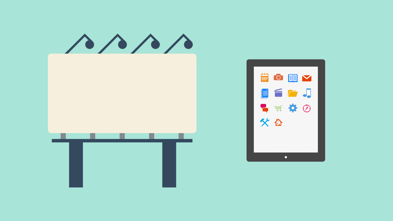
When it comes to digital, things will be a lot more different. No longer will you be designing for fixed mediums as digital design encompasses websites, electronic newsletters, interfaces for smartphones and more. These options comes in various screen sizes because people will be viewing your design on different devices. If you’re designing a website for example, your design may look great on a desktop (1280 pixels in width or higher) but may not be functional on a smartphone (average 360 pixels by 640 pixels, width x height).
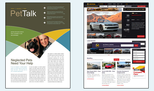
Print vs Web Layout
Now that the differences can be seen, this is why designing for digital should to be more simplistic as it allows the design to fluidly transform itself to fit multiple mediums. You might be tempted to go crazy with design elements overlaying one another but do so at your own discretion. Elements that are positioned on its own are able to be resized or transformed easily.
Color
You might be wondering, how can the usage of color be any different from print to digital? The principles of color still stand firm between both forms, but at the same time there are differences that you might want to know in order to help you transition from paper to browser.
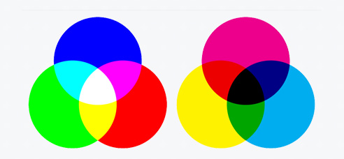
(Left: RGB, Right: CMYK)
As you already know, when you design anything that needs to be printed, the color mode that you’ll be using is CMYK. While we won’t be covering why it’s done so, but if you’re interested you can check this video that details the process of how printers work and why CMYK is being used for it.
The color mode that you’ll need to get used to when you start designing for digital is the RGB mode. Computer monitors give off a light known as RGB which has a larger color gamut than printing. This allows the computer to can display a million more colors than what can be achieved with printing.
Typography
Typography is the art and technique of arranging type and it is more than just making words legible. The typeface that is being used must be able to work with the layout, grid, color scheme and overall feel of the design.
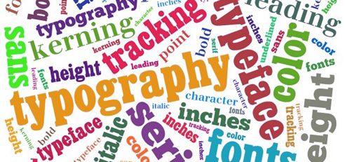
When it comes to print, typography can range from being clean and structured to large and bold. Serif-type fonts are generally preferred for this medium to attract readers to the printed material. In digital however, the situation changes. While the creative use in typography is still practiced, the most important point is making sure the text is readable at all times. Due to this, sans-serif fonts are preferred due to its readability on many types of devices. Users who read text digitally via smartphones & tablets won’t be able to read cursive text properly creating great discomfort.
One thing to note overall is that different licensees are required for both print and web individually. In most cases the fonts for web-use are very much cheaper than its print counterpart.
Media
In terms of media elements, this is where we will see digital shine the most. When you’re designing for print the media elements that you can work with are images and typography. On the other hand, digital design has more leeway to work with because of the advances in technology. Video and audio media play a great part in the user’s experience on a webpage or other digital platforms.
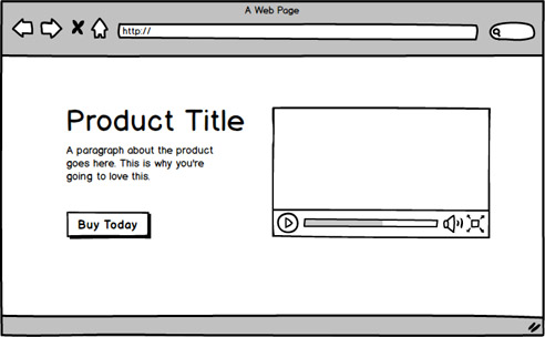
Wireframe example of a video player on a web page.
You’ll need to understand how these rich media can be put into your design in a way that the user can interact with it and at the same time gain its benefit. Also, get used to saving these assets in its appropriate file formats such as JPG, PNG and other web-related image file formats.
User Experience
The print medium provides little to no interaction with the reader and because of this, the design must be able to capture the reader’s attention and present the information in a way that is understandable. Standing out without pushing the reader away is very important when designing for print.
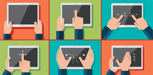
Digital mediums such as websites and virtual UIs provide users with a lot of interaction. For example, websites have links to other sites and are able to play both video and music. Also with the increase of internet bandwidth worldwide, there has been an increased usage of animated images (GIF). JavaScript gives life to websites by creating smooth animations for menus to slide from the side or a content box expanding to show more information when clicked on.
You also need to understand how the user will be interacting with your design especially for touch screen devices. Are they going to tap on this button? Are they going to swipe this carousel to show more content? Changing your mindset from static to highly interactive may be a challenge but its definitely worth doing when you’re moving from print to digital.
Testing
Testing your design can be a challenging experience. To test print designs, one method is to print it out and get it examined. Seeing your design on something else other than your workstation screen can tell you many things like which element stands out, or whether the typeface is readable. Print testing is very important because once the actual design is being pushed out into public, you can’t go back and fix anything.
Always test your design.
For digital designs, testing can be even more of a challenge. For example, if you’re designing a website you’ll need to test your design on different layouts such as mobile, tablet and desktop. Unless you’re designing mocks for all these screen sizes, one method of testing the design is through blank wireframes that follow your layout. However, the best way to test your design is when it is fully developed into a working model (like a fully functional webpage). One good thing however, is that your design can be modified even at the later stages of the production process. This is digital design’s biggest advantage.
I hope that this article has helped you understand what you’ll need to know and adapt yourself for when moving from print to digital design. If you’ve experienced the same jump from print to digital, why not drop us a comment down below about your experiences and challenges doing so.
