Every Friday, some of us at Stampede will hunch over our desks, designing anything we want for two hours. We thought it would be nice to share the results of each Creative Burst. All work is property of Stampede so if you want to use them, do ask nicely.
Wan Shariff


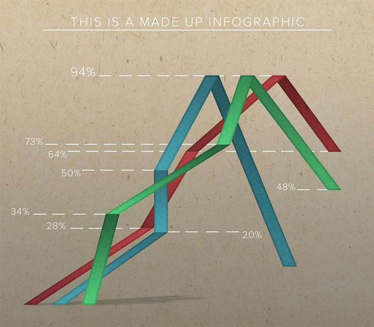
This week, I did a mock infographic. With so many discussions out there about skeumorphism vs flat design, I realized that I have been comfortable doing flat design. I wanted to go out of my comfort zone and try to make a graph that is as realistic and appealing as possible. The bigger goal is of course to make better design through practice.
Shaza Hakim

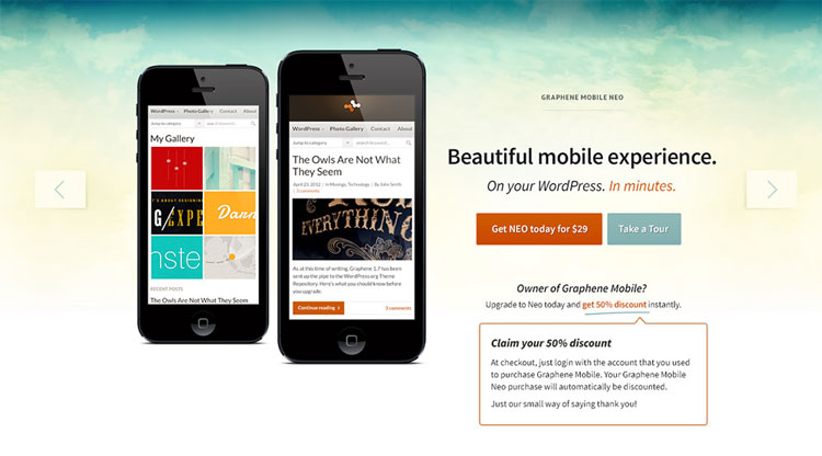
Graphene Theme homepage design

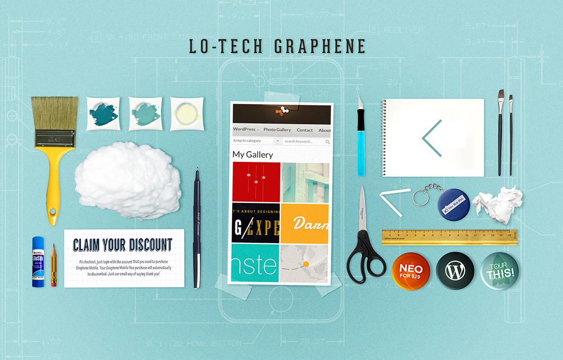
Graphene, deconstructed.

One of my favourite tumblr sites is Things Organized Neatly where everyday objects are organized and arranged in grid and orderly perfection.
Recently I also came across a similar post by Wan on Stampede:Curated and seeing a machine gutted down to its smallest part is strangely inspiring and calming. I see deconstruction as an attempt to understand things and I like the appeal of simplifying complicated stuffs.
I also think that design is not limited by tools. When we were in school, all of us took craft and art classes. We used pen, paper, scissors, paint, scraps of things to express ourselves. My Malaysian childhood memories include buying color papers every school terms, innocently smelling exorbitant amount of paper glue and smuggling my mom’s potatoes and lady’s fingers to art classes and use them to stamp heart and star shapes.
So this week’s burst is a culmination of the two ideas. I recently redesigned the Graphene brandsite in collaboration with my brother, Syahir Hakim who is the developer of the immensely popular Graphene WordPress theme.
In this burst, I took a closer look at the homepage design and began deconstructing it. I started by asking myself : What would I do to produce a similar design on paper, without using any digital tool? Then I went lo-tech.
For example, the cloud background on Graphene can probably be recreated by dabbing a ball of cotton on wet paint. Not terribly artsy, but it’s a start. A screenshot could actually be a magazine cutout glued on an iPhone blueprint. We can also look at things as metaphors. There are scissors, glue and scotch tape for cutting and pasting, a Facebook keychain for enthusiastic fans of the page and badge buttons as replacements to the website’s call-to-action.

This has been a more challenging burst than usual. Only after reading Wan’s burst have I realized that we share a similar goal this week – to design outside of our comfort zone. Comments welcomed.
Zana Fauzi


This week, I went and explore better design through sense of inclusion.
Tribalism/sense of inclusion
- Generally, people are subjected to tribalism, or sense of inclusion where everyone want to belong to some kind of groups one way or another.
- Gen Y, or milennials are more highly guilty of this due to the rise of technological advancement where people can easily get connected.
- Sense of inclusion probably leads to social media, where everybody has the chance to self-promote themselves in order to be included.
- It also inspired me of the feedback form idea.
The idea
- I looked around my room and try to see the most boring thing ever – then I saw my heater fan.
- And then it struck me, hey Argos, the online website for electrical appliance is a pretty functional e-commerce website, but how about enhancing it?
- For your information, Argos is closing down most of its physical outlets in order to focus on their online medium – this website – along with long-time competitors like Amazon.
- In order to compete with Amazon, whose website, although fully functional and intuitive, can be really bland on UI aspect. I figured out they need a less conservative idea to get through in this challenging online business landscape.
- What better way to do this through a sense of inclusion. How about a section of electronic appliances where customers submit tips in a form of text or videos on how they use the appliance
- E.g. pots and pans – people submit recipes, vacuum cleaner – tips on cleaning, washing machine – homemade tips on how to take stains off laundry effectively etc.
Examples of apps using sense of inclusion
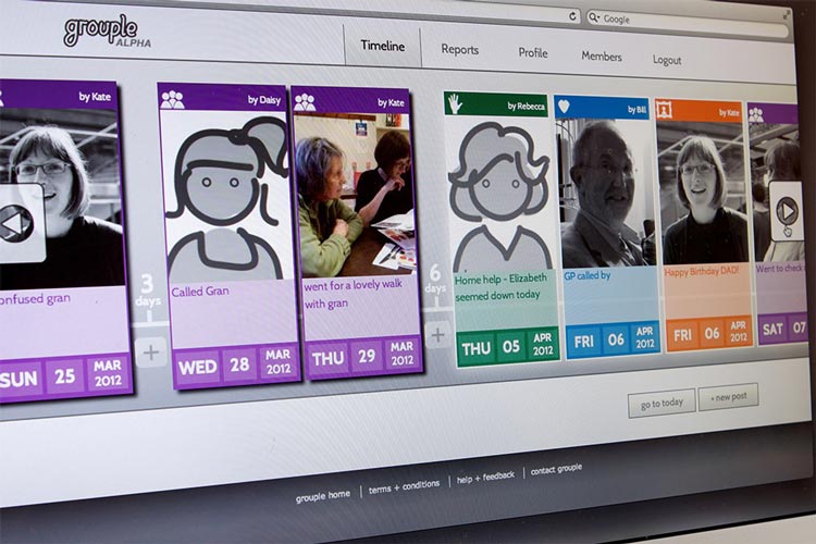
- Living with Dementia researchers found that the reason carers often are taken aback to share their experience taking care of dementia patients is due to the sentiments they received, and and they feel isolated. Hence DesignCouncil developed an app to promote sharing between the carers to record the patients’ progress.
- Sugru is a brand of self-setting rubber that can be formed by hand. Users can submit tips and videos on how they use Sugru to fix, modify and enhance items in their daily lives.”
