 Stampede Design
Recently I was given a side-project to design a note-taking app from scratch. It’s my first app as well as UI/UX design since I started working with Stampede and it’s also my foray into mobile app design. I couldn’t be even more excited yet at the same time, really apprehensive of how it would turn out.
Design is a funny word. Some people think design means how it looks. But of course, if you dig deeper, it’s really how it works.
– Steve Jobs
The requirements
These are the requirements given by Shaza, my Creative Lead in order to build the app:
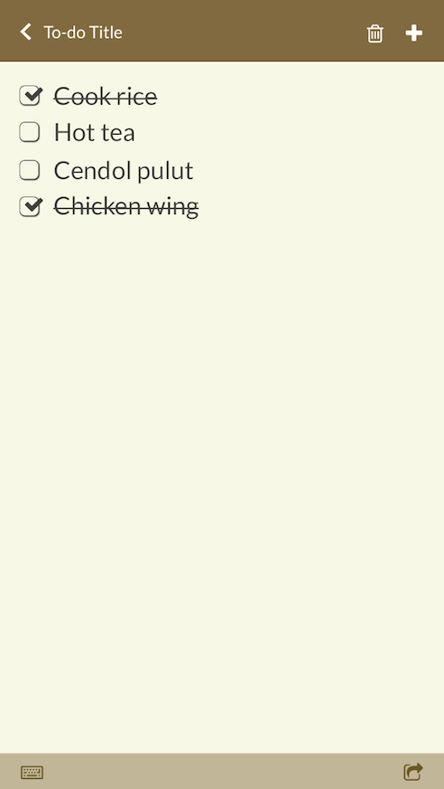
- The note-taking app will have two options, a blank note or a to-do list.
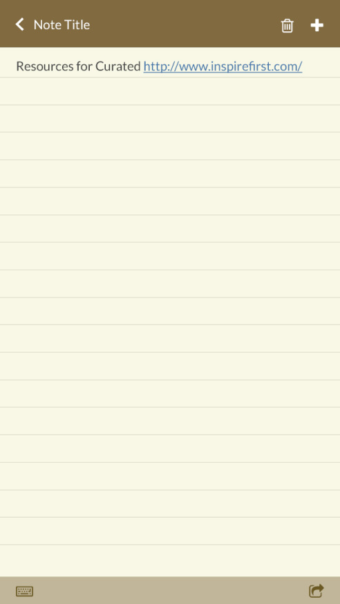
- It will have titles and content but no text formatting except URLs will be automatically converted to links by the app.
- Every note will be clearly separated and can be archived or deleted.
- There will be a search function and user will be able to email the note to anyone.
She would assume the role of the client who is going to determine and evaluate whether this project is a success (or not, hopefully that will not happen).
Stage 1: Brainstorming
The next step was to merge all these bits and pieces of requirements and put them together into one concept of a user interface.
I started out by doing a research on the existing note-taking apps in my phone and in the Apple App Store. Since I am using iPhone 4S at the moment, I am using the native note-taking app as a benchmark, combining it with the functions of other note-taking apps which work well in my experience – for example, Evernote.
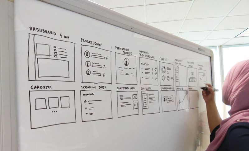
Once I have figured out which features might work well in my app, I started sketching up wireframes and flows by hand. I found that it actually eases my mind a lot, this whole sketching with hand thing. There are no lags on the computer, or to worry about how the weight of the stroke after using a digital pen is not clear, light or heavy enough. Sketching gives me more control of my creative process.
At the same time, I have had many discussions about the contents and the progress of the app design with Shaza.
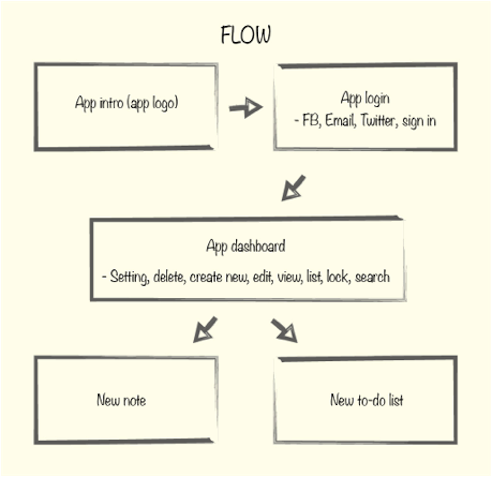
Through flowchart and wireframes, I finally was able to get a clearer picture on how to start designing it.
Stage 2: Design
It’s good to come up with a brand to be able to decide the concept for the app. With this in mind, I started to look for a name for the app. I wanted something catchy but yet simple and easy to remember – something like Basecamp or Teux Deux.
So I came out with “Goat Note”, which rhymes with “got note?”.
Satisfied with my app name, it is easier for me to decide on the colour scheme and app design.
Once all of these important decisions were made, it was time to detail everything visually. I spent hours in Photoshop drawing out all the necessary elements for the app.
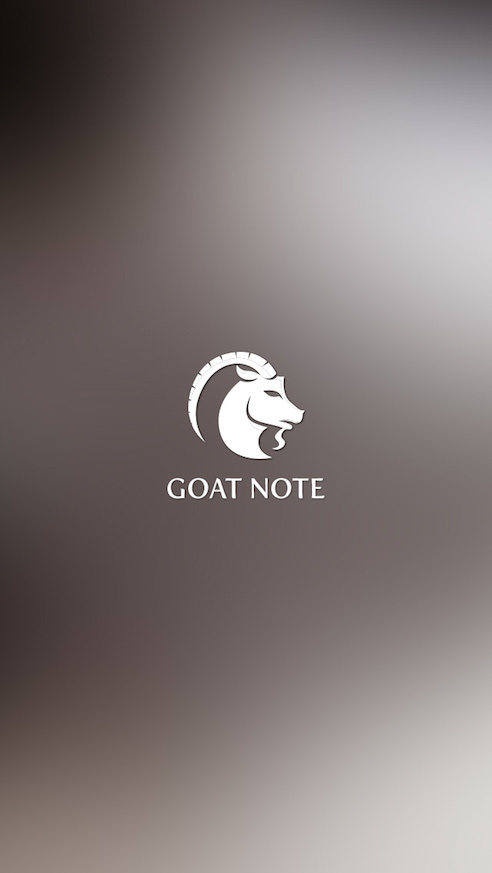
When opening the app, the logo will appear on its own first with greyish brown blurred image as background.
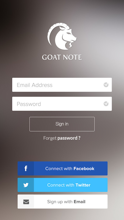
After loading for about 3 seconds, the login page will appear. New users will be able to sign in via Facebook account, Twitter account or sign up using email. This gives them users the flexibility to sign using any of these accounts of their choice.
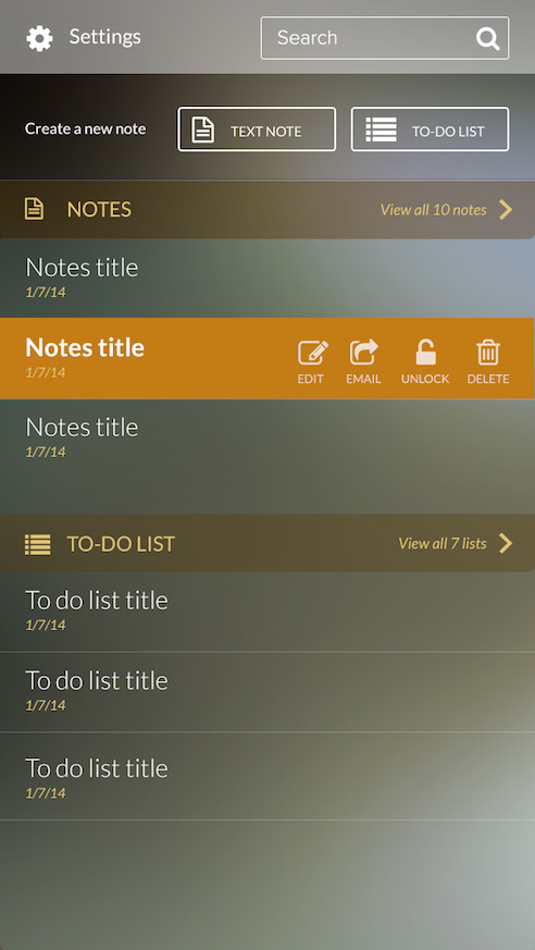
- The app dashboard will have separated list on notes and to-do list. Setting icon and search bar are placed at the top, followed by “Create a new note” option.
- Notes and to-do list will be displayed up to 3 latest list and if the user wants to view more they can do by clicking on the “View all 10 notes”. The number will change depends on how many list the users have.
- To view option for “Edit, Email, Unlock and Delete” function, users will have to swipe to the left on the desired list.
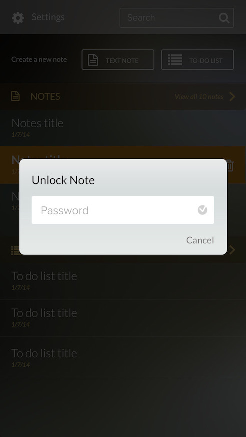
A modal will appear for unlocking/locking function.
Users can also delete, email and create new note or to-do list here.
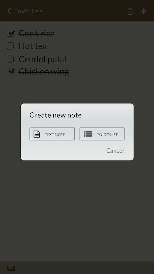
A modal will appear in case a user wants to create new note.
Learning Experience
In the final process of the design, I was also required to present the app to the whole team.
As a designer, nothing is ever complete to me. Although I have worked so hard in making sure the app is in its best shape, the app is still imperfect and requires a number of improvements. Hence, pre-presentation jitters. Thank goodness the team is always ever supportive of me – giving a stream of ideas after ideas for my Goat Note app.
The processes of putting together the entire requirements, and at the same time making it beautiful, desirable, up-to-date and engaging were all new to me and very exciting. I learned that to be able to design an app that really work for and resonates with users, you will need to place yourself in the users’ shoes instead of your own (as a designer) and be a technological enthusiast.
Result? I was soon revealed that this assignment’s goal was not to measure whether I succeed or not, but rather, for me and for the rest of the team to understand the processes it take to design an app, or design anything for that matter – from research to brainstorming to sketching through a number of reiterations. It is always a fun process in the end.
Will I want to design another app? Yes why not!
