Every Friday, some of us at Stampede will hunch over our desks, designing anything we want for two hours. We thought it would be nice to share the results of each Creative Burst. All work is property of Stampede so if you want to use them, do ask nicely.
Wan Shariff


While browsing for inspiration for my burst, I came across music-related poster designs that caught my attention. Since I haven’t done any poster design for my burst before, I gave it a try. I always liked Blues music. I use Robert Johnson’s picture because he was a Blues legend back in the early 30’s. I chose these typefaces because they look old and bring up the aesthetic values of the 30’s. The vintage feel was made from a old paper texture, image of Robert Johnson — where I applied various kind of grunge brushes to make it look aged. I wanted to evoke the same feelings on the types but it didn’t work out the way I wanted. So, I used the same texture, made it darker than the background and applied it onto the types.
Shaza Hakim

Login screen. View original version.

Account Overview screen. View original version.

I felt like working on user interface this week so I looked at my browser’s history and realized that I pretty much abused my Maybank2u‘s bookmark. Maybank is one of the biggest banks in Malaysia and its Maybank2u service was the earliest adopter of online banking in Malaysia. So I designed a new interface for Maybank2u. I had sufficient time to design the Login and Account Overview pages. As a regular user, I focused on tasks I tend to use most: checking my account balance, transferring money and paying bills. Some of these simple information are buried deep into the existing Maybank2u website and require 4-5 clicks to get to. My favourite function of this new design is the Quick Transaction panel. It will allow me to do transaction from anywhere on the site. I can also add recipient on the fly by clicking on the +Add New link. What about you? Would you use this interface? Comments welcomed.
Zana Fauzi


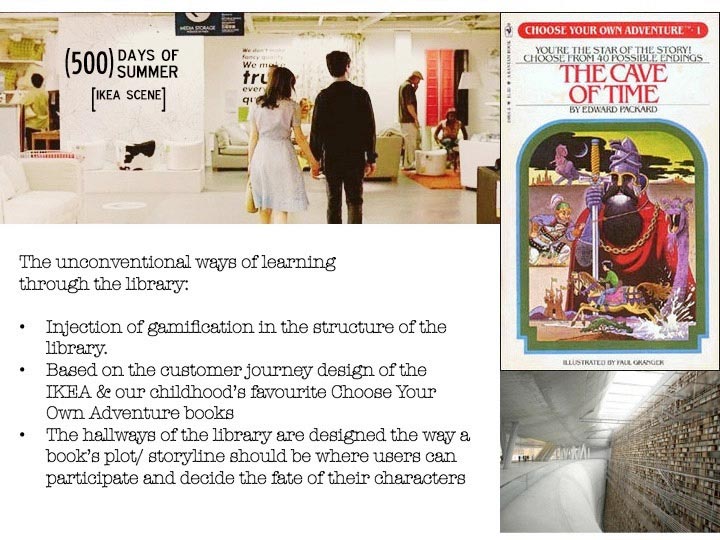
Libraries have always been one of my favourite places but unfortunately for some people, unless if it is for studying or revising, libraries would be the last place they go to. I have always been looking for ways to make libraries interesting to people – aside from renovating the interior, I thought maybe we could explore the unconventional ways of learning e.g. if you want to learn a new language, you watch movies in that language. Back to libraries and learning in general:
Our mistakes so far:
- Most of the times we do not delve far into the real issue of why people are not interested in learning
- We always try to solve the problems by putting technology first as a solution instead of a medium
- So we have all these touchscreens, we have all these devices to get people interested in learning
Why is that people are not interested in learning?
- Subject is way too boring
- No time
- No motivations – BIGGEST ISSUE – if we can boost their motivation, the subject will no longer be found boring, and people will make time for it.
How to boost their motivations?
Take one scenario as an example: Libraries are mostly made of shelves and shelves of books
- People who go there mostly who are really interested in reading
- Or they have to be there because they have to study
Let’s inject a bit of gamification
- people like a bit of competition
- people like to be seen as important and to have an authoritative view over something
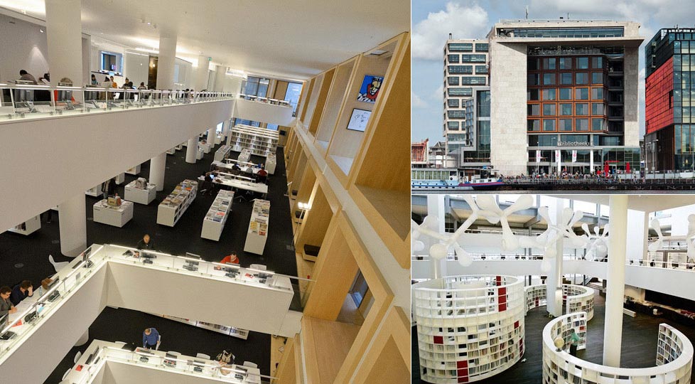
Based on IKEA – you see how IKEA is always made up of a maze where you have a choice – you can go through the entire maze and complete it and along the way you would pick up something anyway, also you would have a choice to exit it if you don’t want to complete the whole journey. We can also add up a bit of spice where people can participate in this storytelling journey – if you remember during your childhood days there are these books of which you are presented with choices and every choice lead to something else, that’d be one way to get people to participate with learning. E.g every week, one book would take a turn to be presented through the hallways of the libraries where people can also participate in this story. It would be really interesting to have Victor Hugo’s The Hunchback of Notre Dame in one week where people can decide the fate of Quasimodo (of course, without affecting the original storylines the way some films are made) and experience the ambience of the streets of Barcelona in the library’s very own rendition of Carlos Ruiz Zafon’s Prisoner of Heaven the next. P/s: I also attach some photos of Amsterdam’s public library which had me ogling when I was there in the city.

