 Stampede Design
This week on Creative Burst: Wan designed a music player app for fans of rock ‘n’ roll, Shaza experimented with color pairings and Zana went subversive with her Powerpoint flat design.Every Friday, some of us at Stampede will hunch over our desks, designing anything we want for two hours. We thought it would be nice to share the results of each Creative Burst. All work is property of Stampede so if you want to use them, do ask nicely.
Wan Shariff
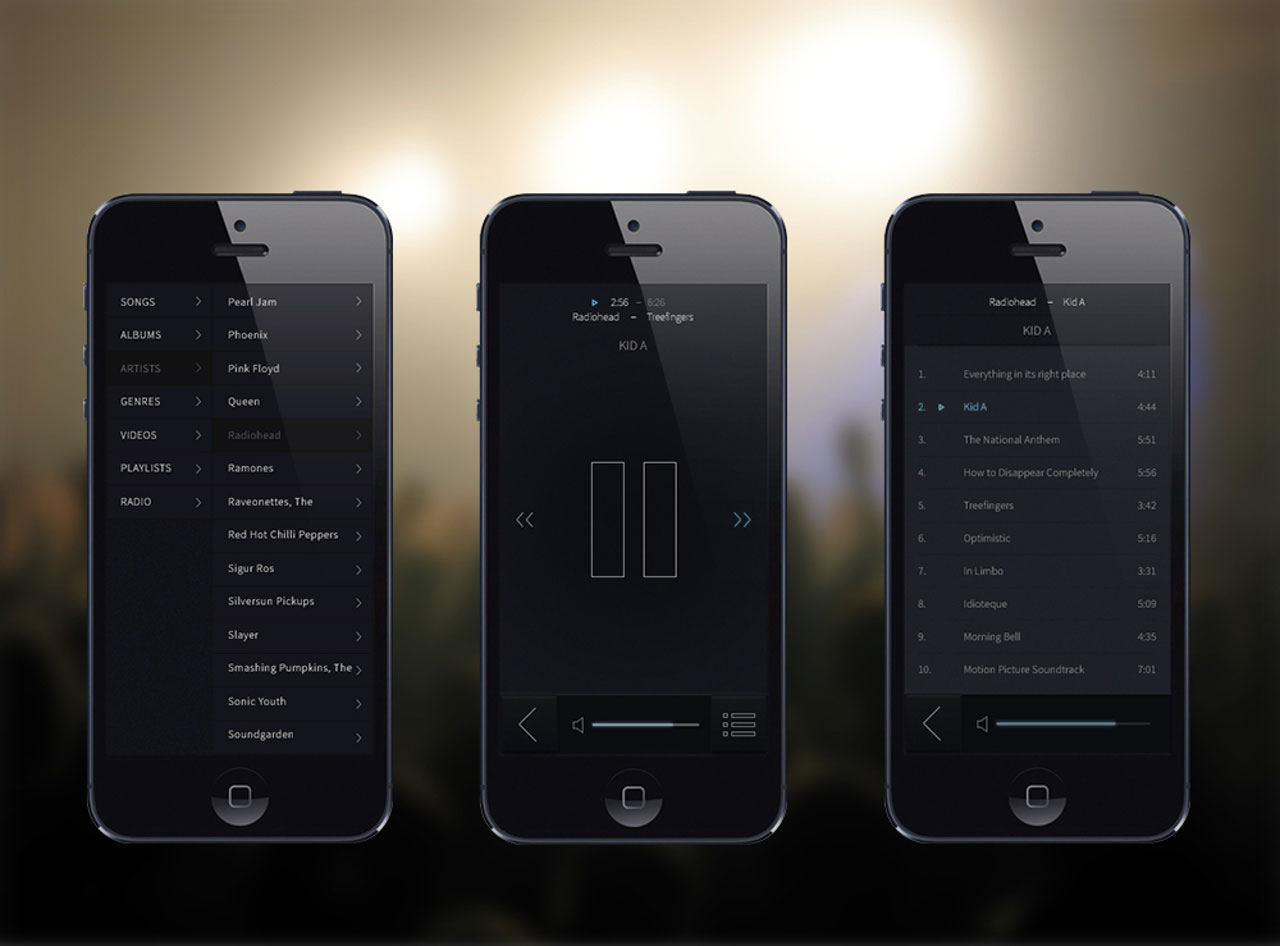

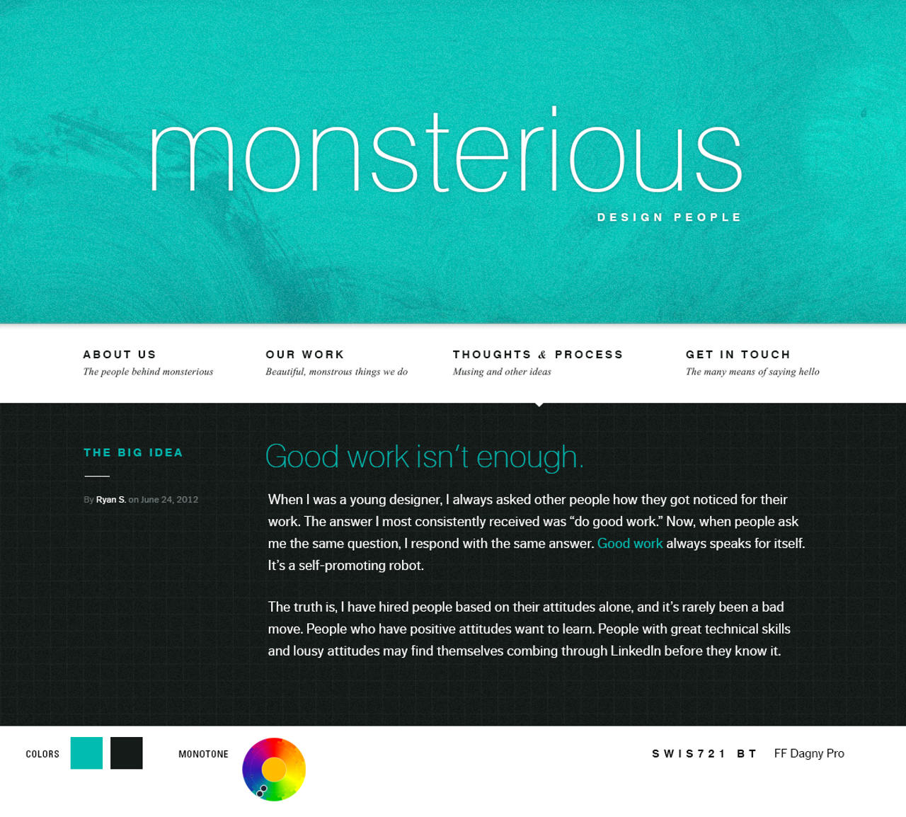
Shaza designed an e-book reader app few weeks ago and I decided to give mobile app design a try. I love listening to music so I designed a simple yet direct music player app.
As a regular user, I find most music player have many features that are unnecessary and unused. My idea of a good music player app is one that has only the necessary features but does the job well. Less is more.
I also wanted to design an interface that appeals to people like me. Since I’m into rock ‘n’ roll, I gravitated towards black as the base color. The subtle light effects is used to imply interactivity, e.g. increase/decrease volume, play/pause, next track and so on. This burst also served as my hands-on experience working on mobile app designs.”
Shaza Hakim

Working with colors is something I truly enjoy. All those experimenting different color combinations, using them to set design mood and trusting your gut feelings on what works.
How you arrive at a decision when choosing colors is difficult to explain. To some designers, it’s pure intuition, honed by many years of experience. So I try to simplify it to two basic principles: the relational position within the color wheel and the amount of contrast you need.
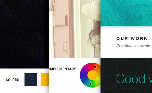
I used three different color modes: complementary high contrast, complementary low contrast and monotone. For each burst, I began with a starting color and then run the hex value on Color Scheme Designer to identify its complementary or monotone counterpart.
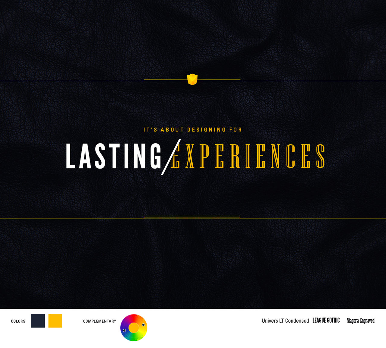
In the first burst, the strong contrast between dark grey/blue and yellow instantly draw attention to the text. The leather texture adds a little dramatic flair to contrast the background from my rigid typography.
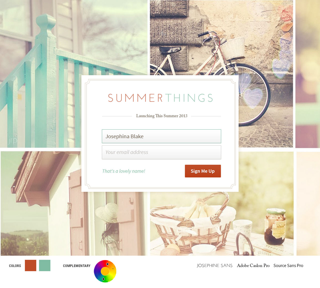
With this color pairing, at first I toyed with the idea of making the box Tiffany blue and placing Chinese Red text on it – more on color names here – but contrast between the two is so poor that it will render the text illegible. Instead, I switched direction to using white as base and the two colors for text and UI elements. I also included a cool UX bit of complimenting user on their name as they fill the form. Zana shared this feature with me a few weeks back and I think it’s genius.
We’re now back to my familiar ground: slider, navigation and content area. The colors used on this design are all different tones samples from the original green. Light textures are used – the brushwork in the upper-half signifying chaos and movement and grid in the lower-half for establishing order and structure. The blog post copy is taken directly from this brilliant article from Happy Cog.
Every designer have their own style and preferences. As a designer, what is your thought process when working with colors?”
Zana Fauzi

My dissertation is mostly what I think about now, so I decided to make a poster/flyer documenting the essence of my topic.
The dilemma: my Macbook Pro’s – where my Photoshop is – battery is kaput and my MacBook Air is without Photoshop.
So what I did was download bits and bobs of clipart online (e.g the paper plane & the map) as well as images and texture from Google. I then fire up Powerpoint (gasp!) and did my best imitation of a flat design. As a replacement for Photoshop, I use Pixlr to edit images.
Hey, a woman’s gotta do what a woman’s gotta do.”
