Every Friday, some of us at Stampede will hunch over our desks, designing anything we want for two hours. We thought it would be nice to share the results of each Creative Burst. All work is property of Stampede so if you want to use them, do ask nicely.
Wan Shariff
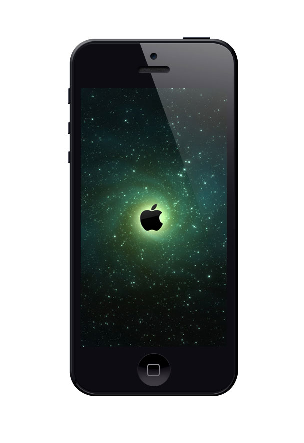

I recently prepared a high-res PSD template for iPhone 5. In my work, I found it useful to have a working version of iPhone 5 that I can use to present my design concepts convincingly.
This template was made fully in Photoshop and available for download here. All effects are controlled via layer styling. It can also be modified – you can adjust the lighting angle where you see fit. This is going to be useful for me when presenting mobile app or responsive designs.”
Shaza Hakim
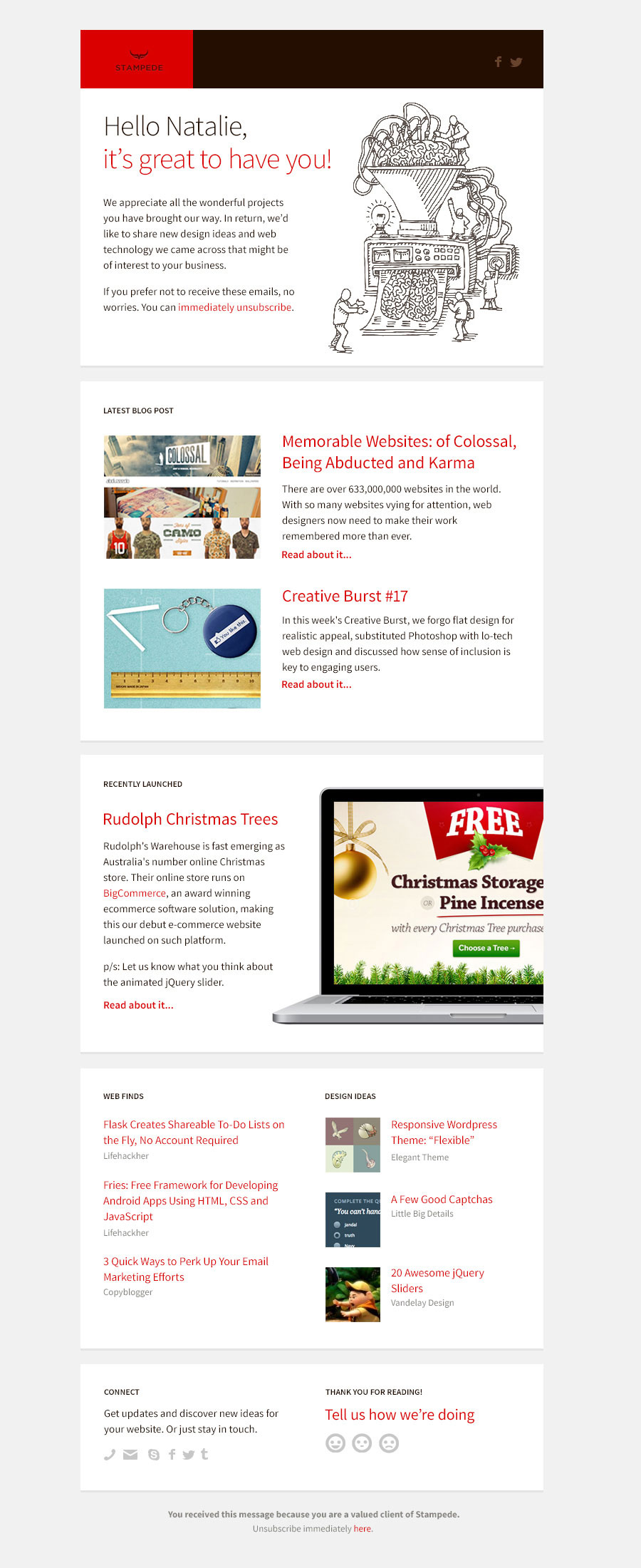

Stampede’s clients are the reasons why we never had to do any marketing. They are the best, and they spread the word for us. In return, I wanted to extend them our spirit of sharing.
I have never looked at email newsletters as an avenue of sharing. Digging in deeper, I realize what’s missing is this question:
How does your email marketing benefit your audience?
Most traditional email marketing is exactly that – marketing. It tells your audience what you are selling, but it doesn’t address what’s in it for them. Stampede’s message must be different. We want to provide more value to our clients and we want to share with them things that matters to them.
To achieve that, I must start with this perspective: The newsletter must be about our clients, not us. What excites them? What are the new trends or technologies that can bring value to their website? What can improve their website’s conversion? What can get them excited? Can they get both at half the cost? Can Stampede make that happen?
The Copy
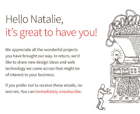
The copy must be personalized, just like us sending them from our inbox. An ideal tone would be informal and conversational, just like when we have discussions with clients over Skype or voice conference.
Every client has different needs – we have clients who run e-commerce business, SEO services, professional consultation, travel businesses and many more. A good mix will consist of a general web news as well as specific niche articles that are relevant to their business. We need to cover the macro and micro for every client. It might seem unattainable or inefficient at first but human factor is one of our core assets, so maintaining that level of personalization is important and necessary.
The Design
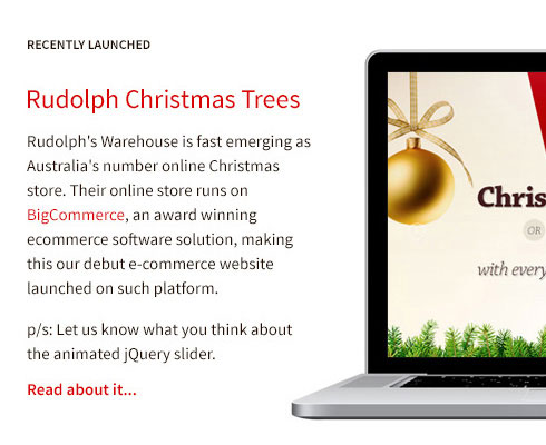
The design should be simple enough to be built into a responsive newsletter template. Many people read email on the go now and losing this edge is going to cost us the readership. The newsletter should contain images that are not crucial to the message even when not loaded. Sections can be clearly arranged in their own containers.
I would highlight Stampede blog because it’s an excellent place for our clients to discover new design and interactive ideas, especially with the weekly creative burst editions. When there are new project launches, we can include it as well so clients can refer to the latest trend and recognize the benefit behind new web technologies.
I noticed that while responsive web design has been circulating for years among web developers, many end-users are still in the dark. We often get questions like “What is responsive design?” from clients. The web community should always remember that we are not building websites for another web designer or developer. We are building websites for our end user. Some clients prefer to see a working prototype in order to visualize how the moving elements will work on their website. Launches are great opportunities for them to do just that.
Relevant Resources
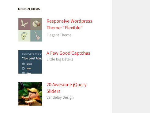
This is where we share curated, fresh and useful roundup of articles, tools or trends. Imagine how this simple section can open up new ideas and possibilities. The idea is to bring news relevant to their website goals. Example, I once mentioned this cool animated jQuery slider to an e-commerce client in passing. It has never been done by any of his competitors and it brings extra shine to his products. He was excited to have it on his website and Stampede was available to get it done for him.
Rate Us
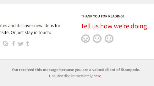
I begin to conduct quick customer survey once every 6 months with Stampede clients this year and I have learnt so much from it. I recommend every service-oriented agency to do similar survey. If you have built a strong relationship with your clients, they’re just as invested as you are to see you succeed, to become better at what you do.
So at the bottom of the newsletter, I have included three universally-understood icons: a happy face, a “meh” face and a sad face. I drew this inspiration from the popular accounting app, Xero.
Clients can rate our current customer service with just one click/tap. We’re sending them a message that “We want to be better at this. Tell us what you think.”
I hope you have found my (elaborate) thought process useful. As always, I’m excited to learn new ways of bringing real values to our clients. Come on people, share up!”
Zana Fauzi
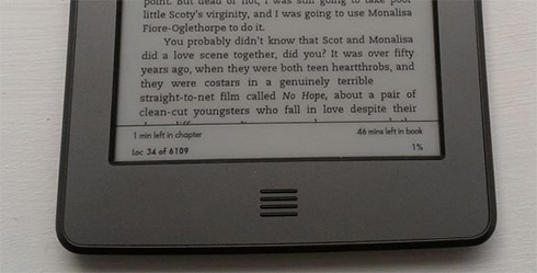

I read academic journals a lot for my dissertations and due to the amount of papers, I prefer to read these journals in e-book format. However, I’m limited by the formats available.
The university offers these journals only in pdf format, and what I would do is I would download these pdfs into my computer and sync them to my Kindle. The problem with pdfs in Kindle is they do not work the way the proper file format for Kindle would, which is .prc and .mobi. Hence, I could not change the font size, I could not highlight and make notes while reading. It is also a hassle to download the pdfs into computer and then sync to Kindle.
The Current Situation
Instead of focusing on the question, “Why don’t I just convert the pdf to .mobi or .prc to make my life easier?” I decided to focus on, “Why don’t we improve the user experience for students preferring e-books, straight from the root?”
In my university, every device needs to be registered on the university network before being allowed to use its internet. This includes the Kindle. But what good would it be if I am not allowed to download the journals wirelessly from the library? As for Kindle e-books in general, Amazon allows every purchased e-book to be sent wirelessly in .mobi format to the Kindle soon after checkout.
My Solution
For every pdf journal featured in the library, it would be good to have them in .mobi and .prc format too for Kindle. There will be a user interface to emulate Amazon’s when the journal is sent wirelessly to the Kindle. Because the e-book is in .mobi format, it preserves the convenience such as font resizing, highlighting and the ability to write notes which will make it much easier for students.
Also, because every electronic device needs to be registered with the university before using the internet network, the university can track which journals were downloaded to prevent or track security breach – if there is any, or plagiarism.
I actually sent this suggestion to the university, so let’s see how this goes.”
