Every Friday, some of us at Stampede will hunch over our desks, designing anything we want for two hours. We thought it would be nice to share the results of each Creative Burst. All work is property of Stampede so if you want to use them, do ask nicely.
Wan Shariff

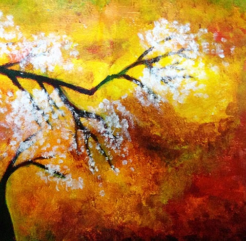
This week I did a little painting. The medium I used was acrylic paint. It has been quite some times since last I paint with acrylic.
Recently I started painting just for fun and I found that it provides a good distraction to my mind after a very busy week. Not my best painting though, but the process was really relaxing.
It started out a few days back when I felt like painting right after work, before I went to bed. I even sleep better since.”
Shaza Hakim

Stampede is recently engaged by the team at Joota to introduce improvements to their existing user experience. Joota uses card interface and in doing my design research, I came across many examples of flat design and the subsequent argument against skeumorphism.
But what really interests me was colors. Take away the flatness and you will realize how heavily color-dependent flat designs are. Look at a flat design and you will immediately notice how they are made of palettes that you know shouldn’t have worked in traditional design sense. The rules we all learn about color pairing and matching seems to have taken a back seat in favour of barely-adolescent combination of colors. We are talking colors akin to unicorns galloping over saturated rainbow here!
DesignModo describes it as such in the article “Making it Work: Flat Design and Color Trends”:
“When it comes to color, flat design schemes often trend as super-saturated and bright, more retro or monotone. That’s not to say these are the only options, but as the trend has evolved they are the most popular.”
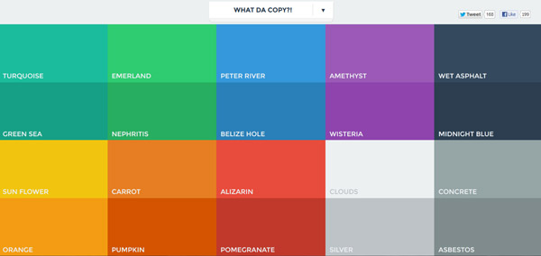
Popular flat design colors in flatuicolors.com
There also seems to be more constraints introduced in this trend compared to its predecessors. You either go flat or you don’t. And because flat design is often expected to perform the double duty of being responsive as well, every interactive surface is designed in generous proportions. The average size of a human finger pad is now the defining factor of next-gen web design.
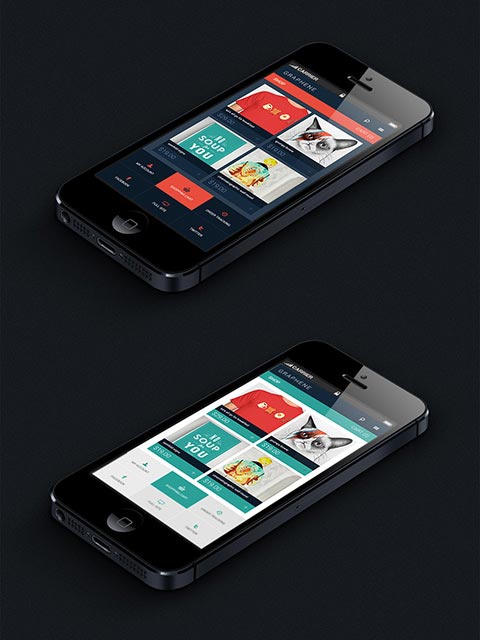
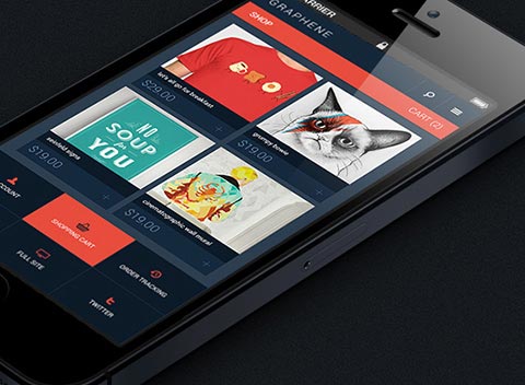
Taking this line of thought one step further, I wonder how the limitations of flat design affect my workflow. In my down time, I do design practice on Graphene WordPress theme. We are thinking to explore other web services in the future so for this burst, I did a mockup of a Graphene mobile store.
Color restraint seems to be one of the key consideration when designing flat interface, so I prepared two versions of the same interface to see how the color works. I found that it forced me to think harder about space. Whereas previously I could do away with miniscule link text, now I can no longer afford having my user miss their first tap. How this spatial consideration correlates with colors and the lack of depth perception is quite an enjoyable puzzle to figure out.”
p/s: If you’re interested, Behance, in my opinion, has one of the best showcase of flat user interface design. They also sometimes feature the best work from Dribble and other design galleries so you’ll be pretty much covered.”
Zana Fauzi

I travel a lot these days, and some of friends back home often asked me to send postcards from the places I have visited to them.
The problem is I never really did, because here’s what I found out: holiday postcards are littered with generic stock images. Although they can be personalised with our own handwriting, I still think they are bland, and my friends deserve more than that.
Brainstorming and association
I own a Polaroid camera, and back when filmpacks were easy (though not cheap) to obtain, I often took pictures and sent them in the post as postcards. E.g I sent this Polaroids to my favourite advertising planner, Russell Davies many many years ago. As you can see, the handwriting is unmistakably mine.
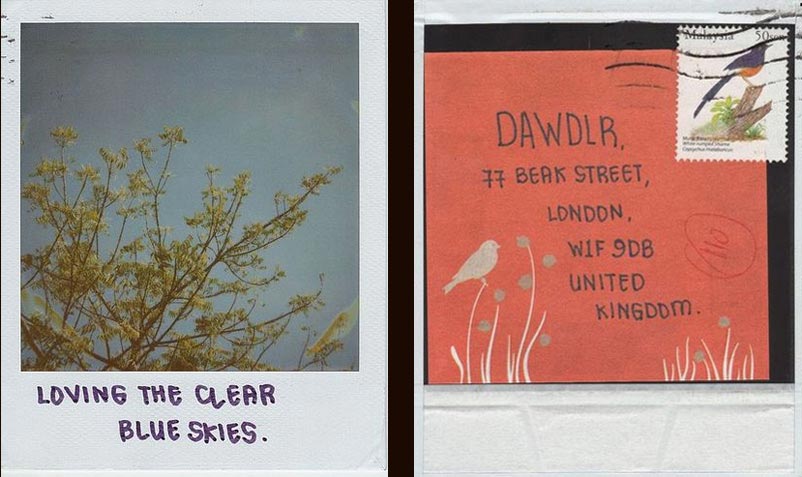
I bought this too before leaving for London and ran out of them already.
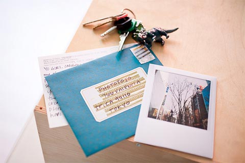
I also own one of these Scratch Maps too:
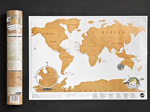
I had a conversation with Wan yesterday about there should be balance between digital and analogue. And although I instagram-ed a lot during my travels of which I consider my way of sending ‘postcards’, I figure out one thing should be kept analogue and highly personal – sending physical letters & postcards.
Solution
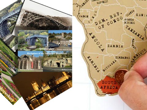
A postcard with a scratch map of the areas/provinces/districts etc. of the city. When the traveler goes to the certain part of the city e.g. Joordaan in Amsterdam, they will scratch that part and it will reveal a photo of a landmark in Joordaan. Of course, they can scratch the whole map if they have visited the whole city. I was also thinking if there should be a personalised service where travelers’ own photos can be turned into scratch map postcards. That would be nice.”
