 Stampede Design
Every week, the designers at Stampede will spend a 2-hour session designing whatever they feel like. We call it our Creative Burst. This is my latest burst.
Hello, Meet Your Average Crazy Book Person
I am a huge fan of Jules Verne’s Around the World in Eighty Days. Back when I was a kid, I remember it as an animated cartoon series that I used to watch every Saturday morning on our national TV. When I could afford to buy my own books, this was the very first book that I had to get hold of. Now, I read this book at least once a year.
I have also recently discovered Librivox, where you can listen to audiobooks. There’s a huge collection of works by Jules Verne and the story is so wonderful to listen to, especially when I’m cooking (cough) or exercising (cough cough).
But most importantly, I love books. Anyone who comes to my house knows that. Anyone who ever go on vacation with me will learn that I carry half empty luggage to fill with books bought in foreign cities. I don’t use iPhone, but while Android has many excellent e-book readers, they’re still lacking in the user experience department.
I am, most decidedly, not a delighted user.
So today I wanted to see if I could design an e-book reading app for myself. My goals were to keep the app simple, use existing e-book reader conventions and most importantly, design to delight your average crazy book person. Me.
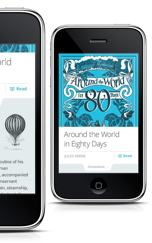
The Cover
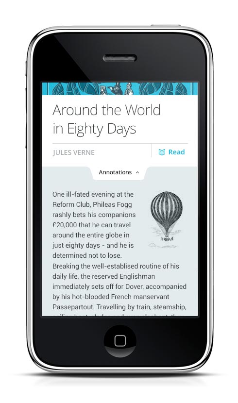
A crazy book person loves book cover, and yet, many e-book readers out there give very little thought about the cover page. A classic like Jules Verne’s often come with illustrative, intricate book covers — e-book readers can capitalize on this and delight their readers by making the cover the screen’s focus point.
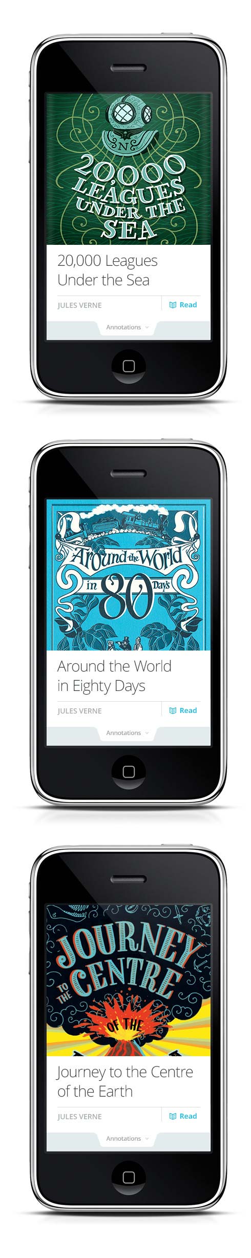
The most important function when you get to the cover is to start reading. The second important function is to provide a summary or annotation of the book. In my design, pulling the Annotations bar up will bring up the Annotations section. The book cover, title, author and Read link will remain visible even as user scrolls down to view the rest of Annotations.
The Chapters
The chapter dividers are yet another overlooked part of an e-book. Many e-books have elaborate chapter title and yet typical reader lumps them into the first page of every chapter instead of giving them the attention that the author intended.
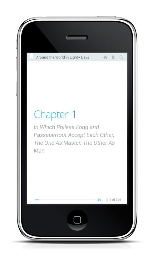
In Around the World’s case, I have featured each chapter and its title into a distinct page. To a reader, a chapter is the dramatic pause before the next event unfolds. An author artfully arranges his work with care. We should respect that.
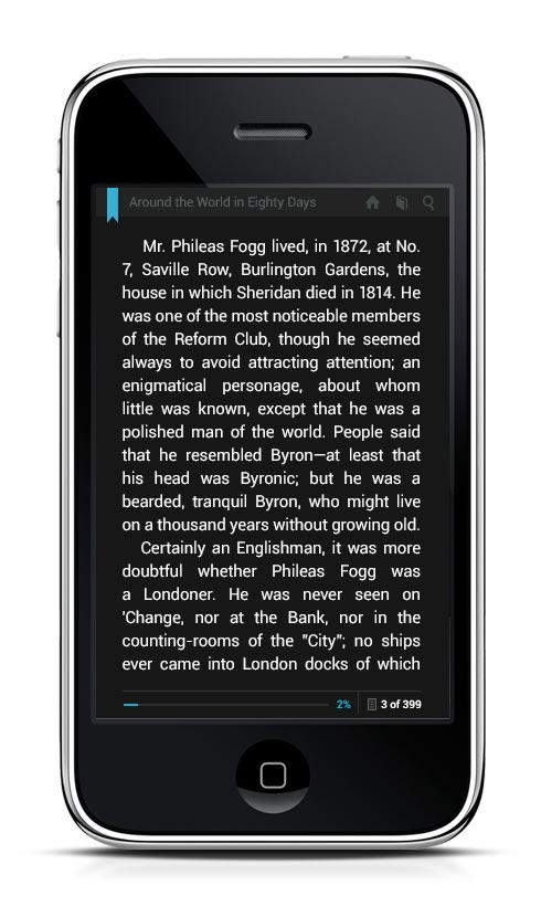
The Interface
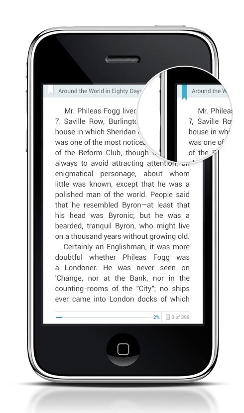
Bookmarking is so very important. The moment you start reading, it becomes the most used interface in your e-book reader. So I designed a bookmark icon on the top left of every page. Instead of pressing the hardware key on your phone to bookmark a page, you can now tap on the icon and it will turn to blue and extend a few pixels more into the screen.
The next time you open this book, the app will take you to your bookmark. You can then undo the bookmark or continue reading and set another bookmark. It’s similar to dog-earing your favourite book. I find that this simple gesture evokes a strong emotional response. I must have this.
The home, book and search icons are all regular conventions in an e-book reader app. Home will take you to the app dashboard, book will take you to your library and search will allow you to find another book in your digital library. The lower bar shows your current reading progress in terms of percentage and number of page.
There’s an opportunity here to calculate the estimated time for you to finish the book if you keep reading. I will keep that in mind.
Day vs Night
Night mode is especially useful for conserving battery and reading in low light condition. Let’s face it – how many of us read before sleep and then woke up startled when we dropped the phone/iPad on our face, right?
Okay fine, maybe just me and Zana.
Color choice is an important consideration here. I chose bright blue because it gives superb contrast when paired with both white and black.
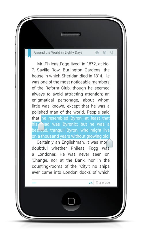
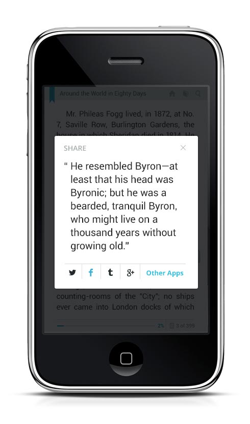
Sharing Quotes
We’re all sharing nowadays but when I come across a good quote from an e-book, it’s such a pain to share it in the simplest format to another app. So in my design, long-pressing a row of quote in the reader will trigger a sharing window. Quotation marks are already appended to the text so now you can share to the usual suspects or to another app like Gmail or Pocket.
I’ve had a really great time with this. The 2-hour time constraint actually helped narrow my focus. By letting practicality take a back seat for once, I was able to look at the problem differently and design something that feels good to use.
That’s what I find so refreshing about creative bursts. It’s quite the mental sprint so you have to time it well to be able to execute your design vision within the allocated time.
What started as an initiative to learn something new, quickly transformed into an avenue for us to refuel our inspiration tank and let our creative muses go nuts. There are no other constraints except time. It’s as liberating as it is daunting.
Now if you will excuse me, I will go and start planning my own Around the World in oh So Many Days.
Au revoir!
