Stampede Design
At Stampede, we practice a culture of staying up-to-date with the industry as much as we can. How we do that is through training in the form of modules to keep our skills sharp and ever-ready. I came from a more generic design background where UI/UX was part of the job, and the training was especially important to me. To get real about UI/UX design, I knew I had some serious leveling up to do.
In the first couple of months at Stampede, I was assigned to an intense training regimen. Instead of some run-of-the-mill online course, the team at Stampede came up with a personalised course that would help me sharpen my strengths while shrinking my weaknesses.
Currently, my training still continues, and is constantly being adjusted to what I need to improve the most; efficiency. This meant that I could not dwell too long on looking for a perfect solution every time for design problems. Instead, I had to look for the best solution in the allocated amount of time.
Rapid-fire design skills
To meet this goal, a training module was developed by Zana, who is in charge of our training. It was named ‘Rapid-fire Design Skills’, and was designed for me to complete a small design assignment every day within half an hour. These are one-off designs like a single screen mock for an app for website.
Within those 30 minutes, I needed to do as much as I could while delivering the best results as possible. There were times where I exceeded the limit because I could not muster up the willpower to stop working on those assignments.
That highlighted another reason why this training was relevant to me, because I’ve had trouble completing things until it felt perfect. The problem; it was never perfect to me.
When I got this assignment, it reminded me of the time where I started waitressing in my gap year and the management told me, soon I was going to learn to carry seven plates, when I could only carry three. I knew that I would never be able to carry seven, 500g plates and £200 worth of fancy dinner for them.
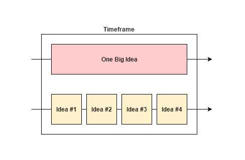
To explain it better, here’s a diagram.
When I told this to Shaza, our design lead — she said it was fine not to carry seven plates at the same time, but only if you can deliver them three by three in the same amount of time.
I realised that the point of this training was not so much delivering a perfect solution in a short burst, but rather what I could come up within that time. It focused on making me churn out drafts and ideas quicker, to increase my production speed and eventually get closer to the solution.
Understanding the brief
The first step is to read and fully understand the design brief. This is the most important step because the moment you misunderstand what needs to be done, it’s like setting yourself up for failure. At present, this step sits in my weak spot.
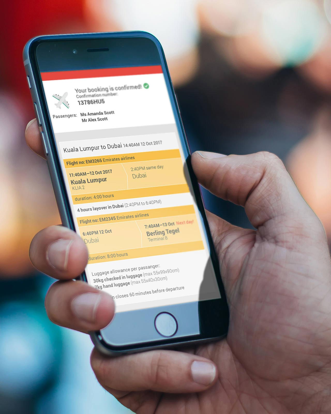
The Brief: A flight booking confirmation UI in desktop showing destination to and from, time of departure and arrival, flight time, class, price, and CTA to book this flight with at most three colour schemes.
Such a case was when one of the briefs I received, requested for a flight booking confirmation screen. I thought this was pretty straight-forward in the beginning but what happened was that I initially did not notice some of the elements that needed to be in the design. These elements were the flight and payment details, along with a ‘Book Now’ button on page. So the result of that mishap was a screen that users would see after they had placed a booking. The screen I needed to design was the one before that step.
Sample of the mock I designed.
The lesson I took from this was that, even with little time at my disposal, comprehending the brief is never a waste of time. In fact, this is the best time to ask questions to ensure that you fully understand the goal of the design.
Understanding the who and the why
Once I understand what needs to be designed, the next step would be to figure out who would be interacting with it. This step is where the UX part of my skills are tried and tested.

Users are varied, but understanding them is important.
Although the designs I’m working on are just a part of the training, I have to give it serious thought and empatize on who would be using this product. In the case of the flight booking website, the ‘who’ are the users looking to travel, and the ‘why’ is the reason they are booking tickets on the page. By repeatedly putting myself in the shoes of other people, I have gotten better at creating user-centric designs in a shorter span of time.
Research existing solutions and consider whether it works or otherwise
While it is great to come up with an original solution to solve a design problem, many times we do not need to reinvent the wheel. There are many common problems that have been solved in the past by someone else, and sometimes as an industry as a whole.
What I am trying to do at this step is to find out existing patterns that users are familiar with and would expect from it. Take for instance the hamburger menu. Mobile app users are highly familiar with this icon and the moment they see three parallel bars, it can only mean one thing; a menu.
Executing the design
Once these three steps above have been fulfilled, I can finally come out with a solution to the original problem statement. This step is the one others would consider as actual ‘designing’, where I arrange and manipulate elements of the design on the screen.
The most important factor is to make sure the design ‘functions’.
A large bulk of my time is spent here, and the goal of the training to speed through the assignment. I do not have the leisure to fine tune the visuals, so none of that pixel-perfect magic here. The most important factor is to make sure the design ‘functions’.
As this is an ongoing training for me, so far I have completed eight assignments (at the time of this post):
- A mobile translation app screen
- A desktop to do app
- A mobile currency converter
- An emoji keyboard web app
- A colouring app
- A flight confirmation screen
- A Journal app
- And a translation app screen
Did it pay off?
While the first few drafts can feel very unsatisfactory, continuous effort can help any designer to become more productive. The balance is coming up with something that meets your own quality standard while getting the solution out as fast as possible. Once you get the ball rolling, it’s only a matter of time where you’ll arrive at that quality of work you’re proud of, while staying on time.
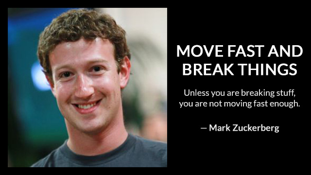
Mark Zuckerberg, CEO of Facebook once said this, “Move Fast and Break Things”. As I work on this training more and more, I find myself gradually getting faster. Indeed I am also breaking things, but from there I know where I can improve and better myself as a designer.