Every week, I was given an assignment by my Creative Lead, Shaza to find three most memorable websites in my opinion and deconstruct the reasons what makes them so. This week, an online shopping portal and two arts and design websites caught my eye.
This is Colossal
A website’s name serves as the first impression to attract users to visit regularly. In this case, This is Colossal is definitely easy to remember. The name is simple and catchy yet expresses the notion of grandeur the website offers.
The base colour of this website is dark greyish blue, which is nice because blue is my favourite colour (a little bit biased here). The other colour tones used in the website also reflect calmness, which makes me feels comfortable while I’m browsing about.
This is Colossal is also constantly updated with a variety of posts about arts, design, architecture, interior design and many more. The design is not fairly interesting, but it is simple and direct. The hierarchy is easy to figure out as it works from middle to left onward.

Header is the first thing that users usually see in a website. I like how the header is prominent, with the logo highly noticeable on top of the header picture. I also like how they differentiate search functions from navigation – the search bar is located at top right and the navigation is on top left with a with a contrasting yet complementing typeface.
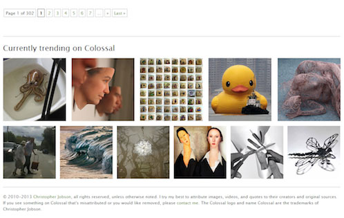
Unlike other blog pages where related posts are located in between articles, This Is Colossal places their at the bottom, right before footer. This way, they eliminate distraction as user goes through the articles.
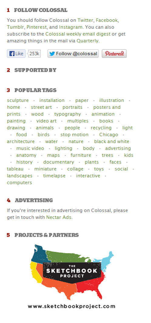
The sidebar is also non-obtrusive to allow focus on the website’s primary content.
Abduzeedo
According to the founder, Brazilian designer Fabio Sasso,
The blog’s name means ‘abducted’ in Portuguese. I changed its spelling from ‘abduzido’ to ‘abduzeedo’ so I could add the name of the company I founded in 2004, ZEE.
Just like This is Colossal, Abduzeedo is catchy and impossible to forget. I remember back when I was still studying, I always refers to this website for helpful tutorials and inspiration. At the time, it was still using the Zee logo.
As a student back then, my design resources were pretty limited. In my college, I was a little different from other design students. I have always wanted to do more than what I was assigned in school, but my knowledge of designing was far from robust. Abduzeedo has been my sources of tutorials and inspirations where I got to learn a few good designing techniques, even until now.
I love how each tutorial in Abduzeedo would show you different techniques to achieve the same results.
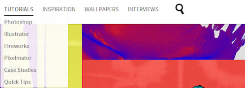
Posts are divided into categories such as tutorials, inspiration, wallpapers, interviews – making it very easy for users to locate what they’re looking for.
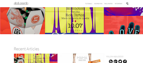
The header area changes constantly to highlight the latest featured posts. The factor that stays constant is the logo – it remains as the centerpiece together with the navigation.
The layout has a good, strategic eye-movement hierarchy. As each page is only limited to 8 posts, this makes it easier for users to digest the information comfortably. The website’s colour palette comprises of only 4 colours with yellow used for the footer logo. Placed in the footer, it anchors the whole bottom section and is a good design decision. If placed on the primarily white content area, the yellow might not pull sufficient contrast and would have been distracting to readers.
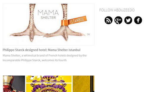
It also features a simple, yet distinct sidebar for social media buttons.
I also like the minimalistic search bar design, in which the bar will only appear when the magnifying glass icon is clicked.

What I like most is that based on the tutorials, you can post your artwork after learning from the tutorials. This actually encourages most new designers to get directly involved with the community as well as promoting their artwork.
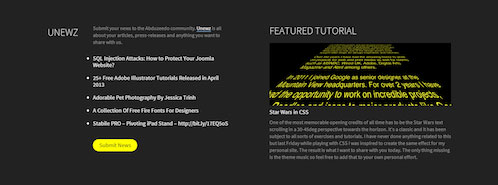
Featured and news articles are located right above the footer. The news area displays more tutorials from other similar websites – widening the resource pool for designers.

The footer is centre-aligned which comes with two choices of language – English and Spanish. Fabio remains true to his heritage and demographics of his readers.
Karmaloop
My friend recently introduced me to Karmaloop and I have been a regular visitor since. It is an online shopping portal selling street clothes and brands I usually wear/like. Being a fan, I have made several purchases from the website itself.
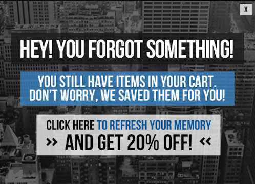
Here’s one feature I really like: if you are a member and have items in your cart but did not complete your checkout, the website will subtly remind you the next time you are logged in. Pretty handy, huh?
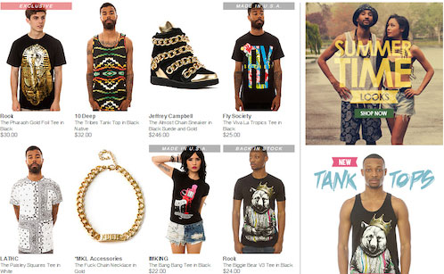
On the homepage, featured items are placed on the left-hand side. On the right, you will see a sidebar showing new season collection, new items and new brands. Apart from having a name which is unique enough to remember, Karmaloop comes with a navigation where you can choose items to browse and purchase from categories such as brands, gender, on sale and many more.

Every week they will give away coupon vouchers that reinforces every promotional message. It is located right below the navigation – you certainly won’t miss it. These promotions include free shipping, 20% off for certain items and other offers that are difficult to resist.

The subscription form is obvious enough for you to notice, located right above featured items on the homepage. There are also social media sharing buttons so if you feel like sharing your finds on Facebook, you are free to do so!
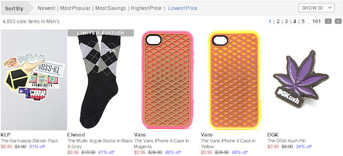
Another useful feature is the filtering option. This is where you can sort items based on brands, types of clothing or from lowest price, highest price and more according to your interest. That’s always useful if you on a tight budget.
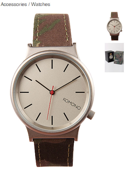
You can also zoom in the product photos to have a better view of the item before you finalize your purchase.
Karmaloop also has their own smartphone app, making it easier for me and other users to browse our favourite brands on the go. Sadly, a few brands featured in the website does not ship to Malaysia.
Conclusion
With the memorability assignment, I find that in order for websites to be memorable to me, it has to be any one of these: with quirky/ catchy names, easy navigation and also serves my personal interests.
For example, Karmaloop sells brands that I like, This Is Colossal supplies my daily dose of inspiration and Abduzeedo provides design tutorials useful to my profession. I’m positive I will find more exciting and unique features that makes a website memorable in future assignments. I will keep this thread updated.
What about you? What are the websites that are the most memorable to you, and why?
