 Stampede Design
I am a graduate in graphic design and I joined the Stampede team just a few weeks back. Prior to this, I have minimal knowledge about web design and what it takes to be a good web designer. Graphic and web design share the same underlying principles, so I’m all geared up to make the transition. In the process, Shaza assigned me a new task everyday for a week. Each day, I was to make a short 10-minute presentation about a particular design topic.
These are the few things I’ve learned so far:
1. White Space
White Space in Web Design
White space is the spaces around elements in the design to help them stand out or separate from the other elements. Without it, designers will stumble when establishing content hierarchy. A simple example is using white space to distinguish the relation between header and body content, and body content with the next header. White space is therefore very useful in grouping information into clusters and make for easier website reading.
Legibility (micro level)
White space at the micro level (leading, kerning, and tracking) can help improve or destroy the legibility of a Web page. This controls readibility of the text. If a web text is easier to read, the probability of user digesting the information is higher.
Tone (macro level)
White space at the macro level (spacing around the biggest objects on the page) can convey a sense of elegance or down-market quality to a design. We also use white space to naturally control user’s eye-movement and lead them from one information cluster to the other.
2. Drop shadows & Gradient
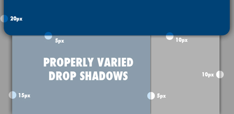
Drop-shadows and gradients are two of the most common design elements on the web. They’re handy effects for web designers because they’re attractive, useful and easy to create with any graphics program. But they have a dark side: they’re frequently abused.
When using drop shadow, always remember – “The subtler, the better”.
What Do Drop-Shadows and Gradients Do?
The illusion of space connects the imaginary to a world we are comfortable living in. Visual metaphors create perceived affordance. Drop-shadows and gradients are basic tools for creating the illusion of space. By mimicking the effects of light in the real world, drop-shadows and gradients communicate information about metaphorical objects, imaginary light sources and their relationships.
3. Masking layer

A mask is an entity which controls the behavior of a collection of pixels. Generally speaking, this control centers around the relative transparency, or opacity of a given layer or collection of layers. When combined with Photoshop’s ability to stack different layers, masks become an incredibly powerful tool, which helps give designer or digital artist with extremely precise control over the interaction between the different layers.
The Clipping Mask
Clipping mask functions more as a one-to-many type entity, in that it can actually effect multiple layers at the same time. A clipping mask is also, by its very nature, multi-purposed. While a Layer Mask exists as a modification to a layer, a clipping mask actually is a layer, which interacts with one or more of the layers directly above it.
4. Usability
Usability is making your website easy for your visitors to find the information they need, when they need it. It’s a huge ground for discussion but among the things that I’ve learned is to always include a tag for the most obvious element on a web page. Implement a 27 characters wide site search and place it on top of your website. Don’t use extensive graphics and design elements. Include a site map page and register a sitemap XML document in search engines.
Don’t break a user’s workflow. Allow every action to be canceled if necessary. Create easily scannable web content and place the most important information on top of your web page. Don’t design graphic elements that looks like a button, but is not. Present meaningful feedback and don’t forget that feedback works both ways. Use unobtrusive Javascript and graceful degradation. Avoid CAPTCHAs, use more usable methods instead.
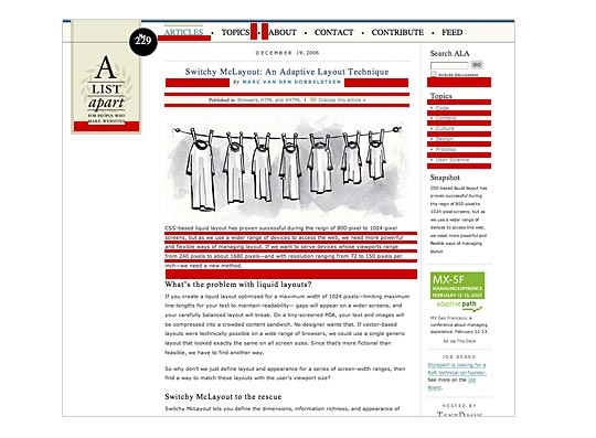
5. Typography
I tested a variety of different fonts and sizes, and also the text leading to identify the fonts, sizes and text leading that provide best legibility and viewer readibility when designing websites.. In the process, I have come to understand the difference between font rendering in Photoshop and browsers. I also found it important that every font I use match the right tone to the design themes.
Here is the screenshot of the end result – thanks Shen for the awesome session!

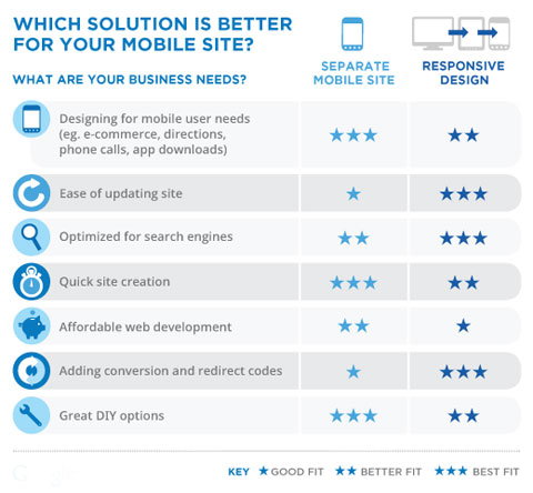
6. Responsive Web Design vs. Mobile Website
Responsive Web Design
Responsive websites “respond” to their environment. It adapts to the browser screen sizes from full-view desktop, tablet and even mobile viewing seamlessly that none of the contents are missing of misbehave.

Why responsive?
Day by day, the number of devices, platforms, and browsers that need to work with your site grows. Responsive web design represents a fundamental shift in how we’ll build websites for the decade to come.
– Jeffrey Veen
Mobile Site
Mobile sites are designed for the small screen, with the needs of mobile users in mind. A mobile-friendly site can help your business connect with customers and increase sales, but a bad mobile experience can drive your customers to your competition.
Why Mobile?
As time passes, mobile has become one of the largest medium for users to go online. Users expect their mobile experience to be as good as their desktop experience. A bad mobile experience can cost you customers. Mobile users also tend to connect with the businesses in their local area so businesses like yours can drive purchases with a mobile-friendly site.
Responsive Web Design vs. Mobile Site
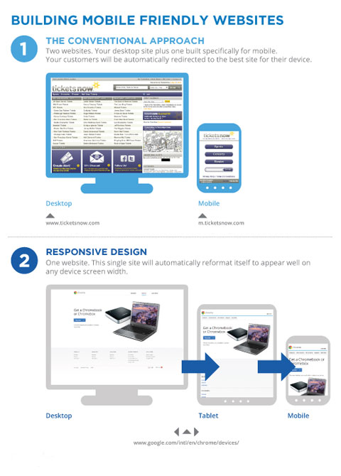
Things to consider before choosing between Responsive Website or Mobile Website.
All thoughts welcomed!
As you can see, these are all new and exciting stuffs to me. I appreciate everyone’s comments, ideas, corrections and notes. I will also be sharing more web design tips and things I learn along the way at Stampede – so stay tuned. Woohoo!!
Main photo credit: Hellvetica by Rachel Katstaller
