 Stampede Design
What is responsive design?
Responsive design has allowed designers and developers to create brand consistent websites that not only look incredible through a computer but will respond to the resolution settings on mobile phones and tablets. It is the ideal solution to creating separate sites.
You have one site, with all products and services and this site will respond to the device where it is being viewed through. It also incredibly clever, time saving and well, in a nutshell – a designer’s dream. It also adds a lot of convenience for users on the go, for they don’t have to go to their laptops or desktops to check the websites, instead they can directly check on their smartphones.
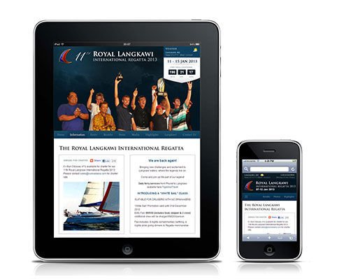
Royal Langkawi International Regatta
My first full-fledged responsive design website is for the upcoming Royal Langkawi International Regatta 2013. It is an annual yacht race event held in the scenic island of Langkawi, with 2013 being their 11th year of running.
This year, more than 35 yachts and over 250 sailors from about 12 countries are expected to participate. Currently the Regatta has a different website dedicated for mobile users, and although it is good enough, it is not exactly streamlined to the current main website.
This is where we step in.
Project Stakeholders
The ‘we’ I am talking about here comprised of:
- Shaza as the design and user experience consultant
- Zana as the project manager
- Syazwan as the project owner
Syazwan has been instrumental in every single Regatta project. He is equipped with 4 years experience managing the website as well as being the on-site developer. Over the years, he has developed a familiar understanding of the event and the participants’ browsing behaviour.
Working closely with them, I am entrusted to update the design for the Regatta’s responsive website.
The project
To enable seamless viewing in all devices, our job is to take the existing design and extend it into a responsive website. Apart from that, we must take into account that it should enable pulling updates from a source throughout the race.
To add up more to the challenge, we are to launch the website two weeks before the race day starts on 7 January 2013, which means – very soon!
Why responsive?
With mobile traffic now accounting for around 12.5% (and rising) of all website visitors it’s high time we must start putting effective mobile design at the top of our to-do list. If we fail to do so, be prepared to be missing out on a huge sector of the market. (Source)
In the case of the Regatta, the participants rely heavily on their mobile devices to check results, race highlights and to log race disputes as they are always on the go on the days of the events. It saves time because they will not have to go do all these on their laptops or desktops.
Turning responsive will also improve the process of updating results and news on our end.
(Coming up – Towards responsiveness: Part 2)
