When was the last time you did something for the first time?
For me, it was about 4 months ago. New to the team, the least experienced but with spirits aflame to absorb as many things as possible, I was assigned to create my own responsive website.

I was free to choose my own theme. Being an inline skater, I decided to design and develop a responsive website for my skating club, SKROLS. The website will revolve around skater’s profiles, skating news, events and products. The goal is for me, as a new front-end developer, to learn and understand the process and challenges of designing and developing a website from scratch. At the same time, the project is also intended to assess my problem-solving skills.
Challenge accepted.
Designing the website
I was a naive one, yes I was. I used to think web designing was easy. You fire up Photoshop, adjust your layers here and there, make sure the colours are nice – you are ready to go. Boy, I was wrong.
Designing is more of a philosophy – it is a process where everything needs justifications. For every element you put in the design, for example size of containers, colours, height, button interaction, etc. they all come with good reasons. That is a lesson learned for me. So if you ever felt like designing is easy-peasy, it is not. Go hug your designers today.
Thanks to Shaza and Dahlia who had been hovering over me while teaching some Photoshop techniques while I was working on my website design, as shared above. Not bad for a first-timer, eh?

Developing the website
I chose to develop this SKROLS website using Bootstrap 3 as the framework. The reason being is because it has CSS media queries to support responsiveness in websites along with some wonderful features in CSS components and jQuery plugins.
In developing responsive websites, it has to be mobile first – start from small devices to larger devices e.g. mobile devices to desktops. I learned that developing websites becomes much easier when you are understand and had been thoroughly involved in the design from the start. This process is even easier for me, especially when I have designed it from the start.
Thanks to Iwan for providing the tips, overseeing and reviewing my SKROLS website from start till finish.
Conclusion
Thanks to this assignment, I learned that in order to do front-end, it is good to understand the depth of work it takes to design a website – the navigation, the interactivity – in short, fully understand the requirement. It was also both challenging and fun trying to come up with my own website design and developing it from scratch.
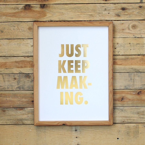
In the meantime, I will keep experimenting and creating my own side projects in order to sharpen my skills. Never stop creating, just keep making.
(Just Keep Making print is from Holstee.)
