 Stampede Design
3 weeks ago, Wan briefed us the idea of having a responsive website and the purpose behind it. In the final instalment , he will elaborate on further.(3 weeks ago, Wan briefed us the idea of having a responsive website and the purpose behind it. In the final instalment , he elaborates on further.)
What are the processes involved?
When I was handed the assignment from project stakeholders, one of the first tasks I had to do was to establish goals and direction of this project.
I decided to tackle this by interviewing Iwan for his Royal Langkawi International Regatta (RLIR) updates experience. From the interview, I managed to gather all the information about the race that I needed. Coupled with the experience of doing the RLIR updates myself afterwards, I found that all the information given was very helpful for me.
Before all the process started, I need to understand the concept:
- The more we know what the audience wants, the more we can help them in searching for the information they are looking for.
- Less time for audience to spend looking for this information would result in happy users.
After understanding the concept, I was to locate the target demographics, the devices in use, etc. This was to specify the visible content based on most clicked area, which helps us in turning the website responsive.
From the targeted demographics, we got to establish specific focus areas according to their importance during the race week.
Finally, based on all existing asset (RLIR website artwork), I proceeded to redesign the layout for 3 different sizes of browser- full resolution desktop, tablet size, and mobile size.
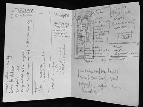
My notes and sketch for the RLIR wireframe.
I also did a research on the best practices for handling dropdown navigation for the responsive. I was to understand the difference between desktop tablet and mobile usability. This way, I managed to identify what it takes to help the users interact better with responsive design.
Once all was done, I was to present the solution to team members. I admit they were very merciless during the reviews process, but this is to ensure that our work is always up to the best quality.
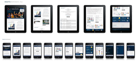
Responsive mobile testing on devices
Once the design part was done, I was to hand over the design assets to front end developer (it’s Iwan, in this case) for him to code it. In the meantime, I was also responsible to oversee the deployment process to make sure my design works in sync with Iwan’s code.
The product
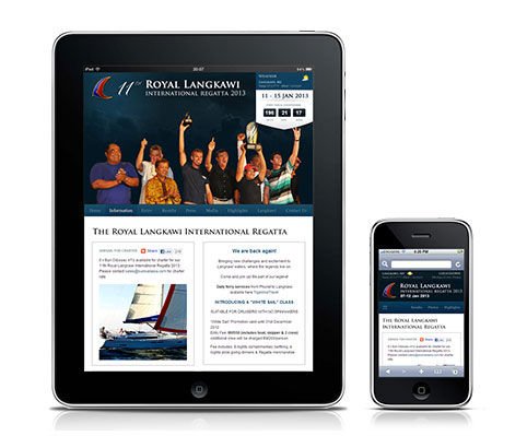
The finished product, in all its glory.
You may also browse it here http://www.langkawiregatta.com.
So, what have I learned from this experience?
Seeing as this was my first experience on designing a responsive website, after going through the processes altogether I am now very much prepared for my upcoming responsive projects.
I also learned that even after the design process and the design is handed to the front-end developer, my responsibility does not stop there. It is important for designers to be involved in every phase of the project and I learned this by having the chance to oversee how my responsive design materialised itself into a finished product right before my eyes – and having so many people praising it too!
In conclusion, I enjoyed this project very much and I look forward for more responsive projects to come.
What do you think? We would love to hear your feedback about our work, so do share in the comments section.
