User Experience
8 Clean and Minimal Ways to Display E-Commerce Products
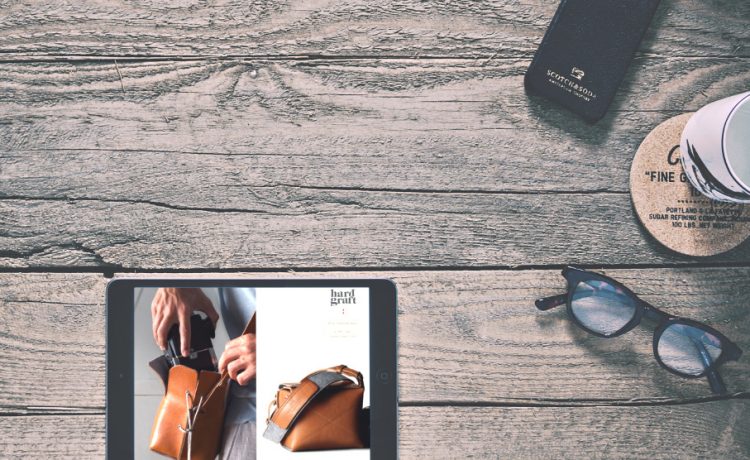
An e-commerce store design sometimes gets in the way of the product and overwhelms user. How do we design product displays that are clean and minimal? Keep Reading
Articles / Tag / ux
User Experience

An e-commerce store design sometimes gets in the way of the product and overwhelms user. How do we design product displays that are clean and minimal? Keep Reading
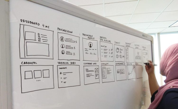
Dahlia walked us through the process of designing a mobile note-taking app, from ideation to user interface design. World, say hi to Goat Note! Keep Reading
Projects

We've just launched the new Stampede website (yay!) so here's Shaza saying thanks to all the wonderful people who made it happen. Also, find out things in the work at Stampede. Keep Reading

Brimming with positivity, Michael talks about his earliest days building User Journeys, how usability concept has grown tremendously over the years and how that first email to Stampede started it all. Keep Reading

Welcome to the first instalment of A Day In The Life Of series, where we shall feature every team member in Stampede about how we go through typical work day. To kick off the series, here is our very own Shaza Hakim. Keep Reading
Projects

The team has successfully launched the website for Connect Cuba in time for the campaign launch! We are excited to be part of this movement to empower the Cuban civil society to communicate freely with each other and the world. Keep Reading
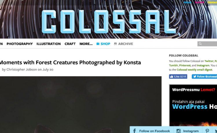
Every week, Wan was assigned to look for three websites he likes the most and why. This week, he presents the first three of his findings. Keep Reading
User Experience
Realising how important time tracking software is, Shen takes a look at two of the most widely-used ones - Harvest and our beloved Toggl. Keep Reading
UI Design

Mujib believes that running a working team is like running a kitchen - no matter how bad the recipes are, if you own a great team of cooks and helpers, everything is going to turn out just fine. Keep Reading
UI Design

Shaza has been planning and designing websites for quite a while now and in recent years, the same notes keep creeping into our clients' revision request: "Reduce the header height, move sections upward, try to keep everything above the fold." Here's why you should stop worrying about the fold. Keep Reading